
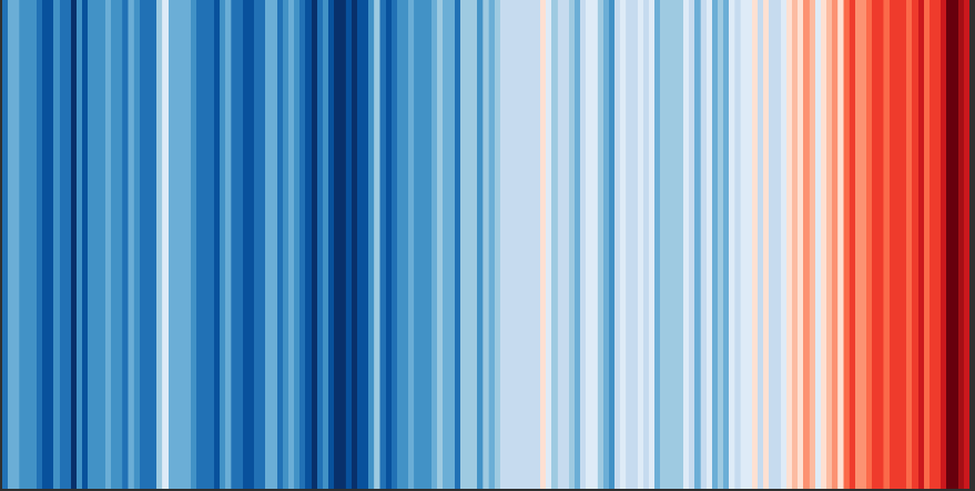
Recently many readers may have noticed how alarmists and activists have been using the so-called stripe chart (see following chart) to illustrate the warming the planet has recently experienced.
The popular stripe chart was created by “lead scientist” Ed Hawkins of the National Centre for Atmospheric Science, University of Reading, NCAS, UoR.
Source here.
Pretty colors sway dimwitted alarmists
The stripe chart depicts the global temperature trend, but only since 1850, and is designed of course to make the recent warming look dramatic through the use of darkening fire red stripes on the right side.
But note that the real temperature difference between dark blue and dark red is ONLY about 1°C!
Naturally a regular, boring old line curve is all one needs, but it just doesn’t produce the dramatic panic reaction propagandists love to see from their gullible followers.
For the very easily duped masses among us, who skipped too much school and whose low intellect allow them to be easily swayed by pretty colors, the red stripes of the present are all it takes to mislead and create the desired panic.
The colored 150-year stripe chart is a classic propaganda tool for brainwashing the many dimwitted among us.
2000-year stripe chart
If colors work well to drive home a point, then let’s use them to illustrate global temperature trends going back 2000 years. So, what happens when we create a stripe chart going back 2000 years:
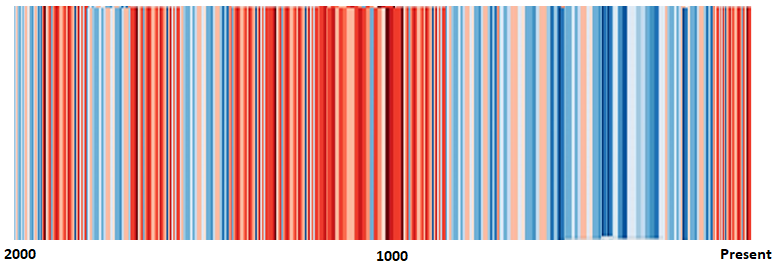
The above rough stripe chart is based on R.W. Spencer 2007, going back 2000 years. Clearly we see the long Medieval Warm Period in the middle and today’s warm spell on the right side.
Suddenly all the drama disappears and the propaganda is exposed for what it is. Today’s warming is in reality nothing new.
So the next time someone shows you this cherry-picked, only back to 1850, propaganda stripe chart, then show them what it looks like going back 2000 years. Imagine what a stripe chart of the entire Holocene would look like. Be my guest. I’d be happy to post it.
Note that the 2000-year one I created above is rough only. You’re welcome to improve on it.
via NoTricksZone
November 2, 2019 at 09:20AM

Reblogged this on Climate- Science.press.
LikeLike