
About two and a half years ago, I penned, or typed, “Randomly blows the wind.” In that story I reporting on a paper by Drew et al predicting the power frequency of a future wind farm fleet, based on historical data for the UK’s wind field. The results were not promising for a country planning to put all its chips on renewables. So much for models.
Then, six weeks or so ago, Paul Homewood reported on a dataset summarising the last five years’ worth of wind generation. He was kind enough to send me a copy: I was interested in whether, over the five years from 2019 to 2023, variability in supply had changed.
Several factors impinge on this question. For example, the widening distribution of wind farms (it is said) will contribute to stabilising outputs, since far-flung sites will be experiencing somewhat different weather. Meanwhile, acting in the other direction, greater capacity overall means that measures of dispersion like standard deviation will go up, with no change to the fundamentals. In other words, the same swing as a percentage of output results in a greater swing in absolute output.
The paper I reported on back then talked about several properties of the wind fleet, namely:
- Power frequency distribution, as mentioned
- Power ramps, both up and down
- Lulls and their duration.
So, with access to some actual output data, what do we find?
Power frequency distribution
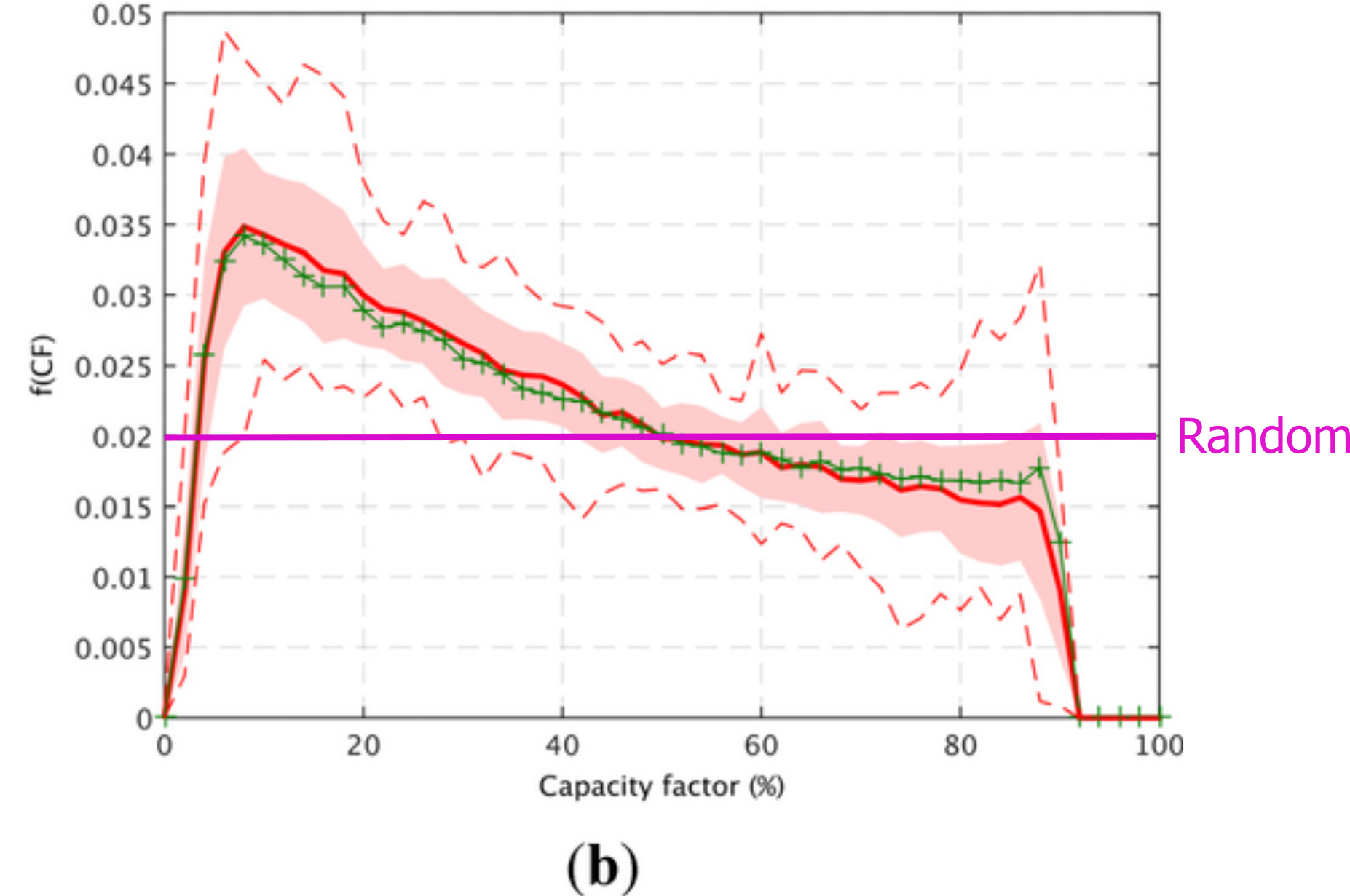
In my note of 2021, I remarked that the power frequency distribution of the modelled future wind fleet strongly resembled a random uniform distribution, where no output has a higher chance of occurring than any other. This was a slight exaggeration, but the curve was very flat (see figure below). It was not, by any stretch, a normal curve, say centered around 35% capacity. Instead, it was horrifying, bad enough to instantly disqualify the idea of relying on wind power.
So, what about the real-world data? We now have five years of real power frequency output. Here’s how the years 2019-2023 looked for wind-generated leccy in the UK (x scale is capacity factor):
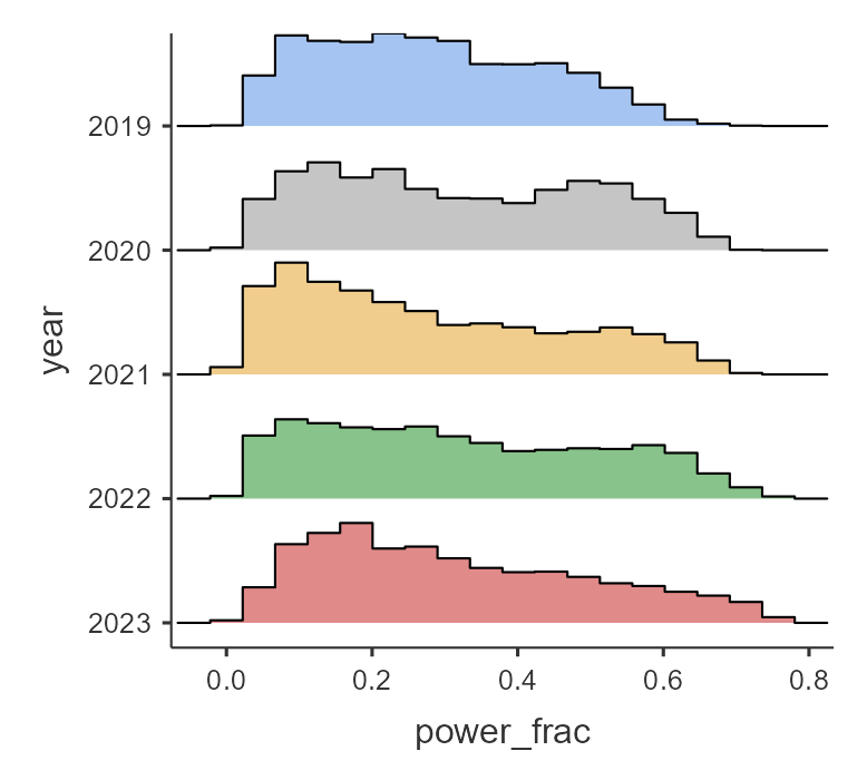
This set of histograms show that the situation is bad, and (to judge by the way the distribution seems to be getting squashed) seems to be worsening. On the plus side it looks as if higher capacities are more frequent in later years. And indeed, the maximum output of the wind fleet goes up by year (remembering that the offshore capacity of higher nominal turbines with higher theoretical efficiencies also goes up each year). But while the maximum output inexorably rises, the mean does not.
| Year | Max output, proportion | Min output, proportion | Mean output, proportion |
| 2019 | 0.703 | 0.0155 | 0.279 |
| 2020 | 0.708 | 0.0135 | 0.317 |
| 2021 | 0.724 | 0.0130 | 0.276 |
| 2022 | 0.763 | 0.0135 | 0.322 |
| 2023 | 0.767 | 0.0087 | 0.316 |
Swings
What about ramps, or the swinginess of wind? This is a vital question, because a sudden lull creates the necessity of a rapid grid response (as does a sudden ramp up in output). The next figure shows the frequency of power changes (MW) for each year. The mode is 0, as you might expect (the next half hour’s output is similar to the current half hour’s). However, swings of 500 MW within half an hour are not at all uncommon in all years. There is a suggestion that the histograms get flatter and wider year by year, showing an increase in swinginess. Note that this is not unexpected, because the same swing as a proportion results in a greater swing in absolute power output as the overall nominal power goes up year on year. It does though counter the idea that more dispersed wind farms might lead to greater stability.
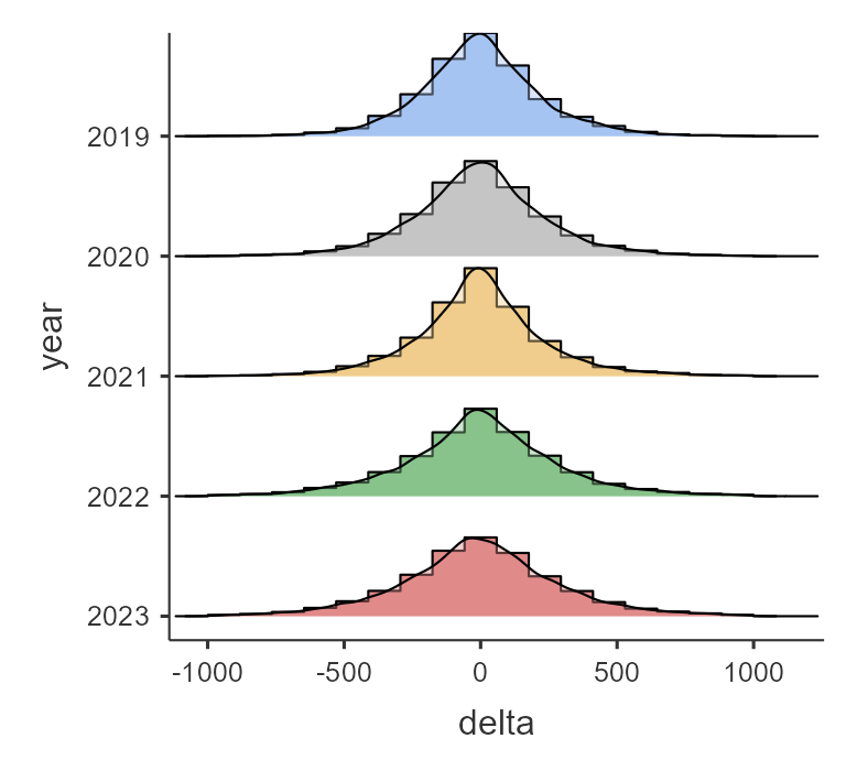
The histograms are clipped – the actual min and max swings within 30 minutes are “off the chart.”
| Year | Max downswing in 30 mins (MW) | Max upswing in 30 mins (MW) |
| 2019 | -1929 | +2193 |
| 2020 | -1285 | +1533 |
| 2021 | -2999 | +1969 |
| 2022 | -1462 | +1702 |
| 2023 | -2289 | +2451 |
The biggest swing in the series was in 2021, when c. 3 GW went AWOL between one half hour and the next.
Lulls
For this part of the analysis, I must thank my son Dan, who wrote and executed the code to calculate the frequency and duration of lulls in the data set. The next figure is a histogram of lull durations across the full five years. Here, as in the paper I reported on in 2021, the definition of a lull is <10% capacity. As you can see, there are a large number of short lulls, plus a few of long duration. A lull of 250 half hours is 125 hours is c. 5 days. There were two lulls of this length over the five years.
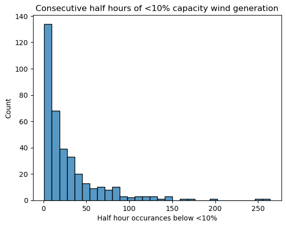
Those lulls are going to prove deadly for a government hoping to power the UK with (ugh) “clean” energy. I described a battery storage system in Assault and Batteries which retails at £75 million and stores 196 MWh. The back of my envelope says that to store and supply 10% of the existing wind nominal output for five days would take nearly 1,600 of those giant batteries, and the cost of building them would be north of £100 billion. And remember that the figure above shows output below 10% for 5 days: that 10% you’ve put in storage only gets you up to less than 20% output. And when you need the power… how much are those batteries going to charge you for it, knowing that any price is better than a blackout?
Conclusion
The variability shown in this dataset should kill off any pretense that wind power can achieve anything for the UK other than long-term decline. Not all electricity is equal. The electricity that comes when you want it, where you want it, trumps the kind that comes and goes as it pleases.
via Climate Scepticism
June 14, 2024 at 02:06PM
