
Temperatures Following Hansen’s Zero Emissions Scenario
“It doesn’t matter how beautiful your theory is, it doesn’t matter how smart you are. If it doesn’t agree with experiment, it’s wrong.
– Richard P. Feynman
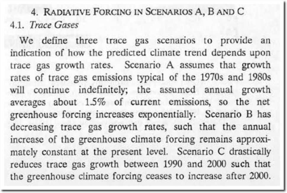
In 1988, NASA’s James Hansen made temperature forecasts for three emissions scenarios. Scenario A was increasing emission growth rates. Scenario B was decreasing emission growth rates. Scenario C was no emissions after the year 2000.
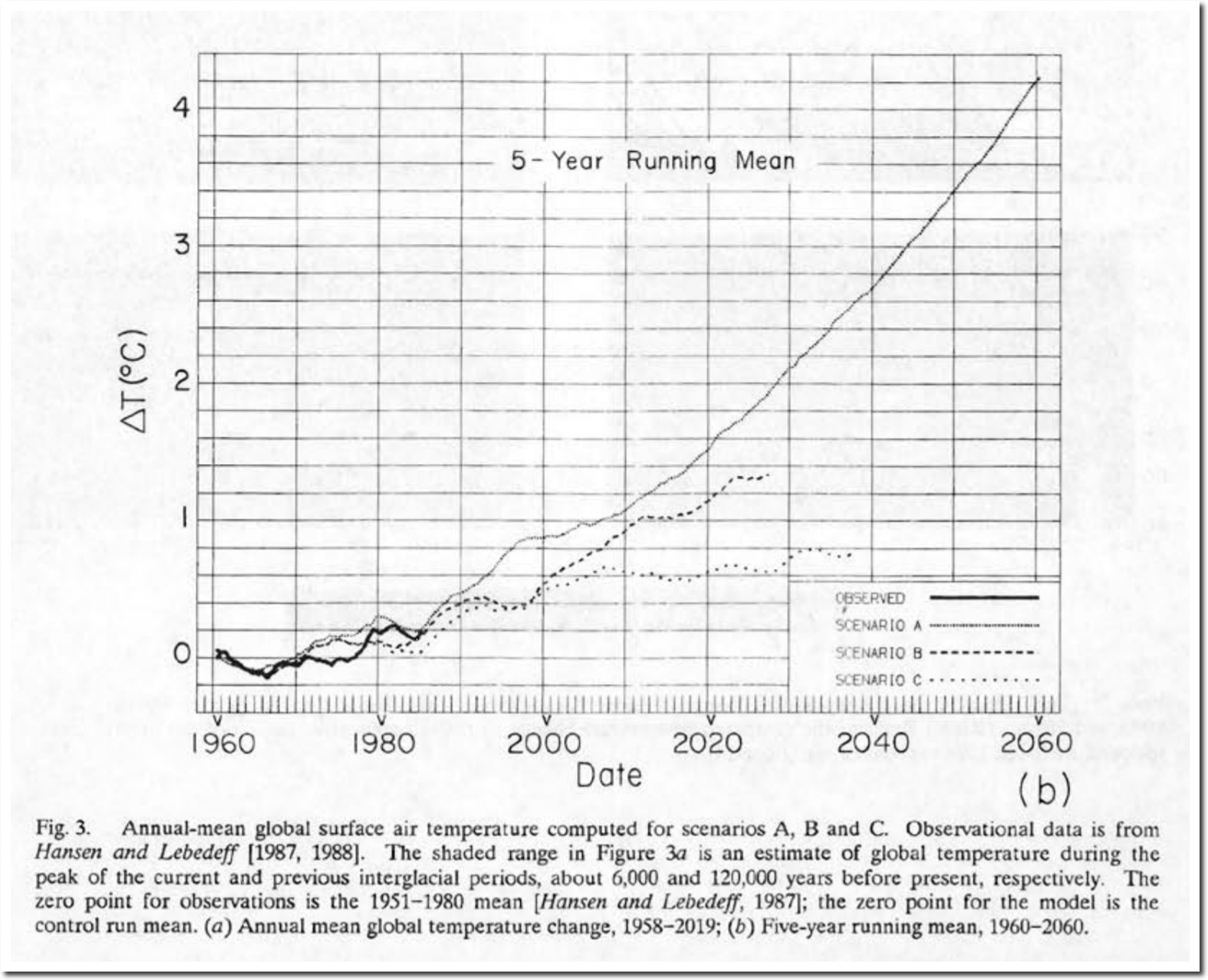
So how did Hansen do? The graph below shows the five year mean of lower troposphere temperatures measured by satellite.

Wood for Trees: Interactive Graphs
The next graph overlays the satellite lower troposphere temperatures in red, on Hansen’s 1988 forecasts – at the same scale and normalized to the early 1980’s.

Troposphere temperatures have tracked Hansen’s zero emissions scenario. If (your theory) doesn’t agree with experiment, it is wrong.
via The Deplorable Climate Science Blog
January 10, 2019 at 11:09PM
