
‘veI been looking into claims for concern because of rising CO2 and temperatures, and this post provides reasons why the alarms are exaggerated. It involves looking into the data and how it is interpreted.

Source: Met Office Hadley Centre observations https://www.metoffice.gov.uk/hadobs/hadcrut4/data/current/download.html
First the longer view suggests where to focus for understanding. Consider a long term temperature record such as Hadcrut4. Taking it at face value, setting aside concerns about revisions and adjustments, we can see what has been the pattern in the last 120 years following the Little Ice Age. Often the period between 1850 and 1900 is considered pre industrial since modern energy and machinery took hold later on. The graph shows that warming was not much of a factor until temperatures rose peaking in the 1940s, then cooling off into the 1970s, before ending the century with a rise matching the rate of earlier warming. Overall, the accumulated warming is 0.8C.

Source: NASA GISS https://data.giss.nasa.gov/modelforce/ghgases/Fig1A.ext.txt
Then regard the record concerning CO2 concentrations in the atmosphere. It’s important to know that modern measurement of CO2 really began in 1959 with Mauna Loa observatory, coinciding with the mid-century cool period. The earlier values in the chart are reconstructed by NOAA from various sources and adjusted to be consistent with the modern record, It is also evident that the first 60 years saw minimal change in the values compared to the post 1959 rise after WWII ended and manufacturing was turned from military production to meet consumer needs. So again the mid-20th century appears as a change point.

It becomes interesting to look at the last 60 years of temperature and CO2 from 1959 to 2019, particularly with so much clamour about climate emergency and crisis. This graph puts together rising CO2 and temperatures for this period. Firstly note that the accumulated warming is about 0.8C after fluctuations. And remember that those decades witnessed great human flourishing and prosperity by any standard of life quality. The rise of CO2 was a monotonic steady rise with some acceleration into the 21st century.
Now let’s look at projections into the future, bearing in mind Mark Twain’s warning not to trust future predictions. No scientist knows all or most of the surprises that overturn continuity from today to tomorrow. Still, as weathermen well know, the best forecasts are built from present conditions and adding some changes going forward.

Here is a look to century end as a baseline for context. No one knows what cooling and warming periods lie ahead, but one scenario is that the next 80 years could see continued warming at the same rate as the last 60 years. That presumes that forces at play making the weather in the lifetime of many of us seniors will continue in the future. Of course factors beyond our ken may deviate from that baseline and humans will notice and adapt as they have always done. And in the back of our minds is the knowledge that we are 11,500 years into an interglacial period before the cold returns, being the greater threat to both humanity and the biosphere.
Those who believe CO2 causes warming advocate for reducing use of fossil fuels for fear of overheating, apparently discounting the need for energy should winters grow harsher. The graph shows one projection similar to that of temperature, showing the next 80 years accumulating at the rate as the last 60. A second projection takes the somewhat higher rate of the last 10 years and projects it to century end. The latter trend would achieve a doubling of CO2.
What those two scenarios mean depends on how sensitive you think Global Mean Temperature is to changing CO2 concentrations. Climate models attempt to consider all relevant and significant factors and produce future scenarios for GMT. CMIP6 is the current group of models displaying a wide range of warming presumably from rising CO2. The one model closely replicating Hadcrut4 back to 1850 projects 1.8C higher GMT for a doubling of CO2 concentrations. If that held true going from 300 ppm to 600 ppm, the trend would resemble the red dashed line continuing the observed warming from the past 60 years: 0.8C up to now and another 1C the rest of the century. Of course there are other models programmed for warming 2 or 3 times the rate observed.

People who take to the streets with signs forecasting doom in 11 or 12 years have fallen victim to IPCC 450 and 430 scenarios. For years activists asserted that warming from pre industrial can be contained to 2C if CO2 concentrations peak at 450 ppm. Last year, the SR1.5 lowered the threshold to 430 ppm, thus the shortened timetable for the end of life as we know it.
For the sake of brevity, this post leaves aside many technical issues. Uncertainties about the temperature record, and about early CO2 levels, and the questions around Equilibrium CO2 Sensitivity (ECS) and Transient CO2 Sensitivity (TCS) are for another day. It should also be noted that GMT as an average hides huge variety of fluxes over the globe surface, and thus larger warming in some places such as Canada, and cooling in other places like Southeast US. Ross McKitrick pointed out that Canada has already gotten more than 1.5C of warming and it has been a great social, economic and environmental benefit.
So I want people not to panic about global warming/climate change. Should we do nothing? On the contrary, we must invest in robust infrastructure to ensure reliable affordable energy and to protect against destructive natural events. And advanced energy technologies must be developed for the future since today’s wind and solar farms will not suffice.
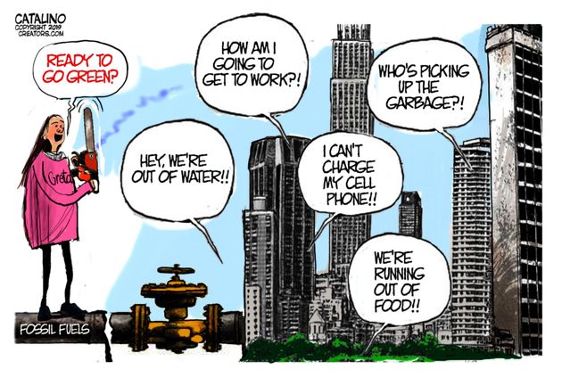
It is good that Greta’s demands were unheeded at the Davos gathering. Panic is not useful for making wise policies, and as you can see above, we have time to get it right.
via Science Matters
January 28, 2020 at 10:37AM

Reblogged this on Climate- Science.press.
LikeLiked by 1 person