By Paul Homewood
This has to go down as one of the most fraudulent climate studies yet!
Want to know how sea level in your area is changing due to global warming and other factors? Our ‘report cards’ can help. Updated by the Virginia Institute of Marine Science each year as annual tide-gauge data become available, they display recent sea-level trends and project sea-level height to the year 2050 for 32 localities along the U.S. East, Gulf, West, and Alaskan coasts.
Report Card Components
Our report cards have 3 components: the 2050 projection, recent trends in the rates of sea-level change, and an explanation of processes affecting sea level at each locality.
The annotated chart below, using the latest data from Norfolk, Virginia, briefly explains the data and statistical approaches we use in our 2050 projections. Visit an individual locality for details on all its report-card components. You can also compare sea-level trends, projections and processes among localities and by region. For full technical details, read our report.
https://www.vims.edu/research/products/slrc/index.php
Let me tell you why.
Below is the actual tide gauge record for Norfolk, Virginia (Sewells Point), which is the Anyport example used.
https://tidesandcurrents.noaa.gov/sltrends/sltrends_station.shtml?id=8638610
It is clearly difficult to see any signs of acceleration there. But look closer – the record starts in 1927, so why does the VIMS Report Card begin in 1969?
Indeed, this is not just a one off. As their Abstract states, all of the calculations in their study begin in 1969, despite much longer data records at most US sites:
https://scholarworks.wm.edu/reports/1111/
This is also confirmed in their Press Release, which states:
The team’s web-based report cards project sea level to the year 2050. The analysis now includes 51 years of water-level observations, from January 1969 through December 2019. The interactive charts by locality are available online at www.vims.edu/sealevelreportcards.
But why should this choice of dates matter?
Let’s look at New York, which has one of the longest running gauges:
https://tidesandcurrents.noaa.gov/sltrends/sltrends_station.shtml?id=8518750
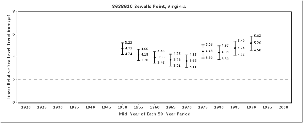
Again, there is no long term acceleration. But NOAA also chart 50-year running trends.
This shows that the rate of sea level rise rose in the first half of the 20thC, peaking at 3.86mm/yr in 1950. (Bear in mind, these are mid point trends, so the peak was 1925 to 1975).
Following that, sea level rise slowed until 1970, before rising again. However, the current rate of 3.38mm/yr is still less than that earlier mid 20thC peak.
In other words, they have cherrypicked their starting point to coincide with the slowdown at a time of global cooling. As sea level rise returned to earlier levels, it is inevitable that this would create an artificial acceleration.
https://tidesandcurrents.noaa.gov/sltrends/sltrends_station.shtml?id=8518750
If the VIMS study had included all of the available data, it would have been forced to conclude that sea level rise had not accelerated since the early 20thC.
Does any of this matter?
VIMS then goes on to extrapolate from the acceleration since 1969, projecting sea levels to be 370mm higher in 2050 than 1992 – an annual rate of 6.38mm, effectively double the current rate.
https://www.vims.edu/research/products/slrc/localities/nyny/index.php
But from a statistical viewpoint, there is no basis for this assumption. You might just as well chart UK temperatures from January to June, and then claim that they will carry on rising at the same rate.
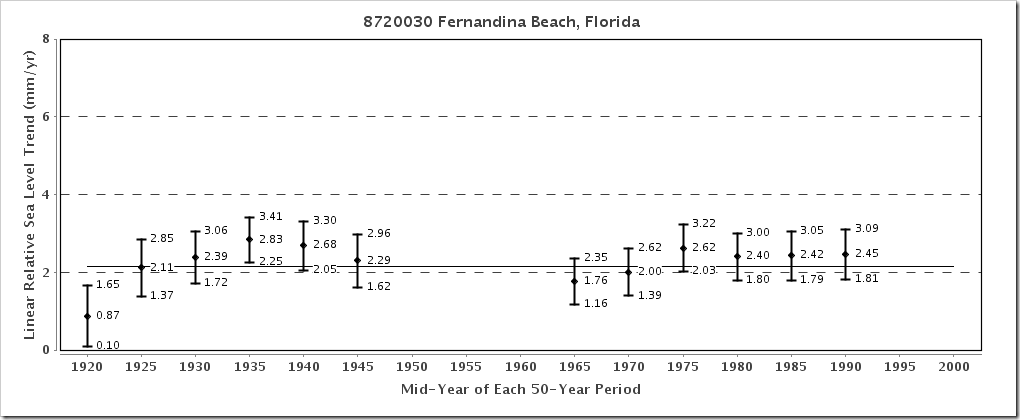
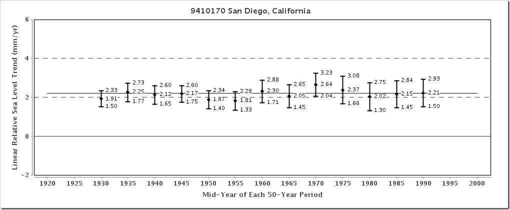
This pattern of a slowdown in sea level rise post 1950 and then a return to earlier levels exists at all US sites, and on all coasts:
https://tidesandcurrents.noaa.gov/sltrends/sltrends_us.html
I don’t have a crystal ball and don’t claim to know what sea levels will be in thirty years time.
But this exercise is plainly not fit for purpose, and was presumably published with the sole intention of creating false alarm.
via NOT A LOT OF PEOPLE KNOW THAT
February 19, 2020 at 08:26AM


