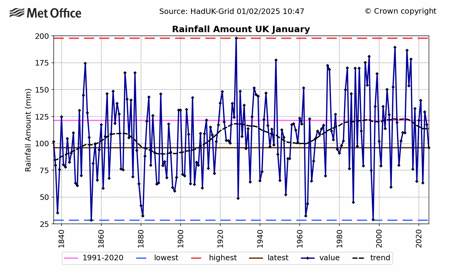
It’s been a mild start to the year here in England. In fact, according to the CET, it’s been the 14th warmest January since the start of records in 1659.
No doubt fingers will be pointed at global warming, but as the above chart shows, we have simply had mild weather of the commonly seen before. The difference is that it lasted virtually all month.
Moreover we have had warmer Januaries way back in the past. The warmest was in 1916, followed by 1921, 1796 and 1834.
This updated version of the iconic “Pale Blue Dot” image taken by the Voyager 1 spacecraft uses modern image-processing software and techniques to revisit the well-known Voyager view while attempting to respect the original data and intent of those who planned the images. Credits: NASA/JPL-Caltech
For the 30th anniversary of one of the most iconic views from the Voyager mission, NASA’s Jet Propulsion Laboratory in Pasadena, California, is publishing a new version of the image known as the “Pale Blue Dot.”
The updated image uses modern image-processing software and techniques while respecting the intent of those who planned the image. Like the original, the new color view shows Planet Earth as a single, bright blue pixel in the vastness of space. Rays of sunlight scattered within the camera optics stretch across the scene, one of which happens to have intersected dramatically with Earth.
The view was obtained on Feb. 14, 1990, just minutes before Voyager 1’s cameras were intentionally powered off to conserve power and because the probe — along with its sibling, Voyager 2 — would not make close flybys of any other objects during their lifetimes. Shutting down instruments and other systems on the two Voyager spacecraft has been a gradual and ongoing process that has helped enable their longevity.
This simulated view, made using NASA’s Eyes on the Solar System app, approximates Voyager 1’s perspective when it took its final series of images known as the “Family Portrait of the Solar System,” including the “Pale Blue Dot” image. Move the slider to the left to see the location of each image. Credits: NASA/JPL-Caltec
[At the original post is a slider object which makes the caption of these two images above make sense ~cr]
This celebrated Voyager 1 view was part of a series of 60 images designed to produce what the mission called the “Family Portrait of the Solar System.” This sequence of camera-pointing commands returned images of six of the solar system’s planets, as well as the Sun. The Pale Blue Dot view was created using the color images Voyager took of Earth.
The popular name of this view is traced to the title of the 1994 book by Voyager imaging scientist Carl Sagan, who originated the idea of using Voyager’s cameras to image the distant Earth and played a critical role in enabling the family portrait images to be taken.
Additional information about the Pale Blue Dot image is available at:
The Voyager spacecraft were built by JPL, which continues to operate both. JPL is a division of Caltech in Pasadena. The Voyager missions are a part of the NASA Heliophysics System Observatory, sponsored by the Heliophysics Division of the Science Mission Directorate in Washington. For more information about the Voyager spacecraft, visit:
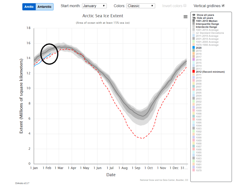
In recent years the Arctic sea ice has shown great resiliency and is currently at higher levels for this time of year when compared to all but two years going back to 2005.
While still at below-normal levels, Arctic sea ice extent is higher now than it has been during 13 of the last 15 years for this time of year with the only exceptions being 2009 and 2008; map courtesyNational Snow and Ice Data Center
Overview
Sea ice covers about 7% of the Earth’s surface and about 12% of the world’s oceans and forms mainly in the Earth’s polar regions. Specifically, much of the world’s sea ice is found within the Arctic ice pack of the Arctic Ocean in the Northern Hemisphere and the Antarctic ice pack of the Southern Ocean in the Southern Hemisphere. While the Antarctic sea ice extent is currently running at levels very close-to-normal, the Arctic sea ice extent is below-normal and has been running generally at below-normal levels since the middle 1990’s at which time there was a long-term phase shift from cold-to-warm in the North Atlantic Ocean sea surface temperature pattern. In recent years, however, the Arctic sea ice has actually shown great resiliency and is currently at higher levels for this time of year when compared to all but two years going back to 2005.
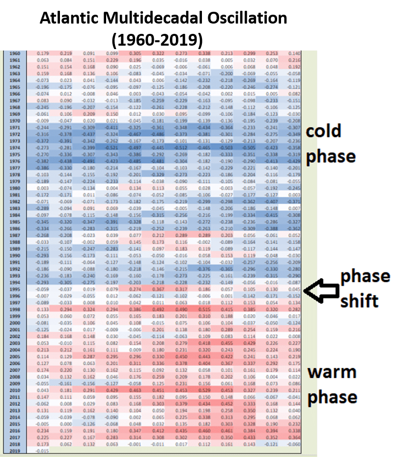
Atlantic Multidecadal Oscillation (AMO) monthly index values from 1960 to 2019 with negative (cold) sea surface temperature phases shown in blue and positive (warm) phases shown in red. A long-term phase shift from cold-to-warm took place in the middle 1990’s and Arctic sea ice extent flipped at that time from consistently above-normal levels to below-normal; AMO index data courtesy daculaweather.com
Atlantic Multidecadal Oscillation (AMO)
The Atlantic Multidecadal Oscillation (AMO) is a climate cycle that affects the sea surface temperature pattern of the North Atlantic Ocean on multidecadal timescales. The northern Atlantic Ocean switched sea surface temperature phases from cold-to-warm back in the middle 1990’s and this shift was directly correlated with the flipping of Arctic sea ice extent from above-normal levels at that time to generally below-normal thereafter until present. The sea surface temperature phase in the northern Atlantic Ocean is tracked by meteorologists with the Atlantic Multidecadal Oscillation (AMO) index and it has generally been in a positive (warm) phase since the middle 1990’s. In those initial years after the AMO phase shift, the Arctic sea ice extent dropped rather steadily. Over the past several years, however, the Arctic sea ice extent has stabilized with much more of a sideways trend as compared with the clear downward trend of the late 1990’s and early 2000’s.
Arctic sea ice extent (solid blue line in circled region) is currently below the 1981-2010 median (solid gray line) for this time of year, but it has been quite resilient in recent years and is now within the interdecile range (light shade of gray) and above the record minimum year of 2012 (red dashed line); map courtesyNational Snow and Ice Data Center
Polar vortex
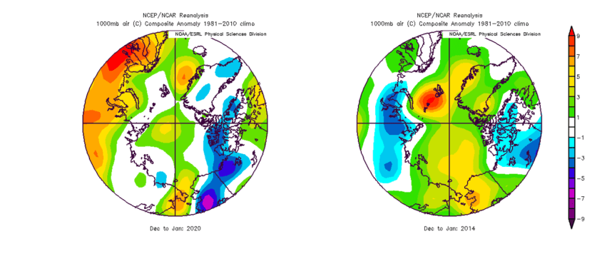
This winter season has been rather favorable for the build-up of ice in the Arctic region with sustained cold and sea ice extent actually currently exceeds all but two years (2008, 2009) going back to 2005 at this stage of the winter season. This winter season has been somewhat typical for the Arctic region with overall temperatures for December and January not far from normal. Part of this can be attributed to the fact that the polar vortex has been stationed over the polar region more often than not this winter season. A polar vortex is a low-pressure system of cold polar air – a normal weather phenomenon – but in some recent winter seasons such as 2013-2014, this feature was occasionally displaced to lower latitudes or even broken up into multiple pieces. The result of this change to the more typical positioning and/or magnitude of the polar vortex in the winter of 2013-2014 was for abnormally cold air to frequently push into North America and, often times in that particular winter, there was less sustained harsh cold for the Arctic region compared to normal. Temperature anomalies for December and January of this winter season of 2019-2020 show overall fairly close-to-normal temperatures over the Arctic region with pockets of above-normal (e.g., near the North Pole) and below-normal (e.g., Alaska, Greenland) whereas the winter season of 2013-2014 featured generally above-normal temperatures throughout the polar region. One thing to note is that even above-normal temperatures during the Arctic winter season will be well below the freezing mark allowing for some buildup of ice in the region. The Arctic sea ice extent will typically reach a yearly peak during the latter part of their winter season which ends in late March.
Temperature anomalies are shown for the Arctic region for the December/January time periods from this winter season of 2019-2020 (left) and 2013-2014 (right). Overall temperatures were relatively close-to-normal this past and January (white represents normal), but averaged above-normal (yellow, green, red) during the same two months in the winter of 2013-2014 when the polar vortex was occasionally displaced to lower latitudes or broken up into multiple pieces. Maps courtesy NOAA/NCEP, NCAR reanalysis
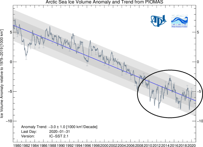
Sideways trend in Arctic sea ice volume since 2010
In addition to sea ice extent, an important climate indicator to monitor is sea ice volume as it depends on both ice thickness and extent. Arctic sea ice volume cannot currently be observed on a continuous basis as observations from satellites, submarines and field measurements are all limited in space and time. As a result, one of the best ways to estimate sea ice volume is through the usage of numerical models which utilize all available observations.
Arctic sea ice volume from the University of Washington’s PIOMAS numerical model which is updated on a monthly basis (details on the PIOMAS model are available here)
One such computer model from the University of Washington is called the Pan-Arctic Ice Ocean Modeling and Assimilation System (PIOMAS, Zhang and Rothrock, 2003) and it is showing a sideways trend in Arctic sea ice volume since around 2010 which followed a downward trend since the AMO phase shift in the middle 1990’s.
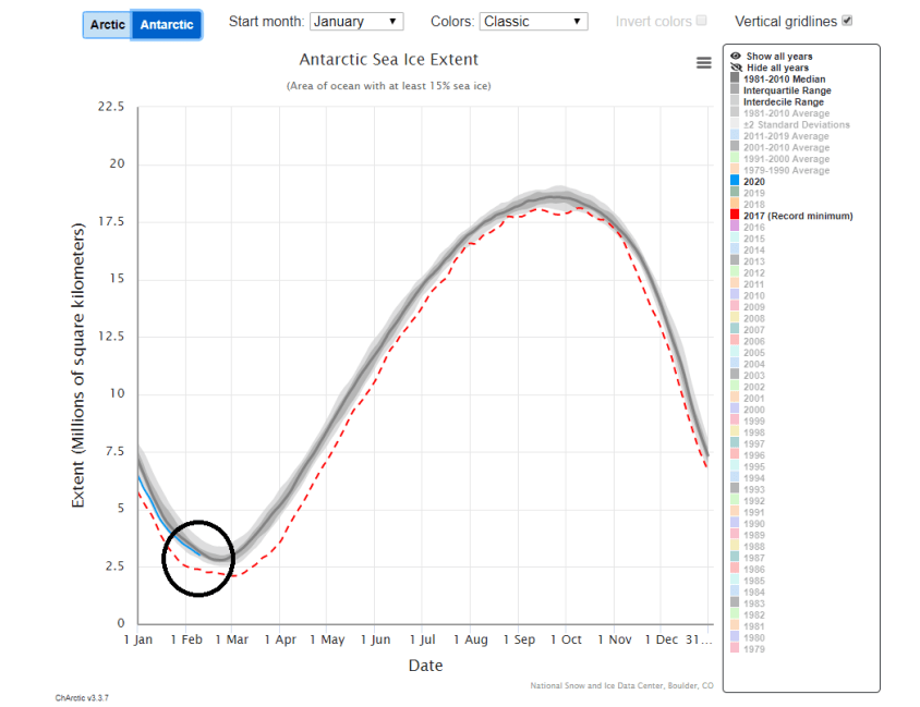
Antarctic sea ice extent (solid blue line in circled region) is currently very close to the 1981-2010 median (solid gray line) for this time of year and well above the record minimum year of 2017(red dashed line). Map courtesy National Snow and Ice Data Center
Global Futures report ignored benefits of GDP growth
A quite startling piece of prestigitation here, we have proof that less is more. True, this is about the “science” of climate change so perhaps not all that remarkable given the manipulations that take place here.
The claim from the WWF’s Global Futures report is that the effects of climate change will cause significant damage to the global economy:
Loss of nature will wipe £368bn a year off global economic growth by 2050 and the UK will be the third-worst hit, with a £16bn annual loss, according to a study by the World Wildlife Fund.
Without urgent action to protect nature, the environmental charity warned that the worldwide impact of coastal erosion, species loss and the decline of natural assets from forests to fisheries could cost a total of almost £8tn over the next 30 years.
It said the loss appeared to be modest at just 0.67% of global income in 2050, but the estimate was conservative and the total was likely to be much higher should areas like the Antarctic deteriorate at a faster pace, causing greater warming and higher-than-forecast sea levels across the world.
The problem with the claim is that it’s nonsense.
The paper is here. Here is actually what they’ve done.
One possible future is called SSP5. This has high economic growth and also high future emissions. Another is SSP1, this has lower economic growth and also emissions.
We’re fine so far. They also say that higher emissions will cause more damage than lower. We’re fine with that as a logical assumption, something internal to the case being built. Then they say that higher emissions will cause damage to ecosystem services, these damages will lead to a reduction of GDP from what it would be in the absence of those emissions/damages. All of this is equally fine as a chain of logic. Sure, it may or may not be true but it’s logically valid.