Month: February 2020

NOAA Relies on ‘Russian Collusion’ to Claim January Was Hottest Month on Record

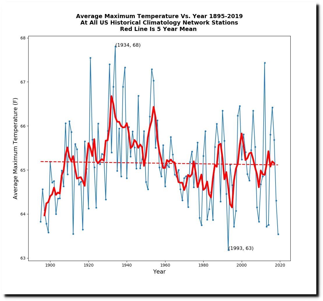
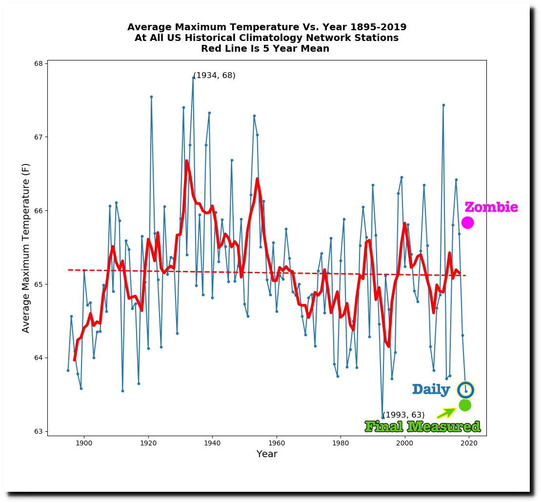
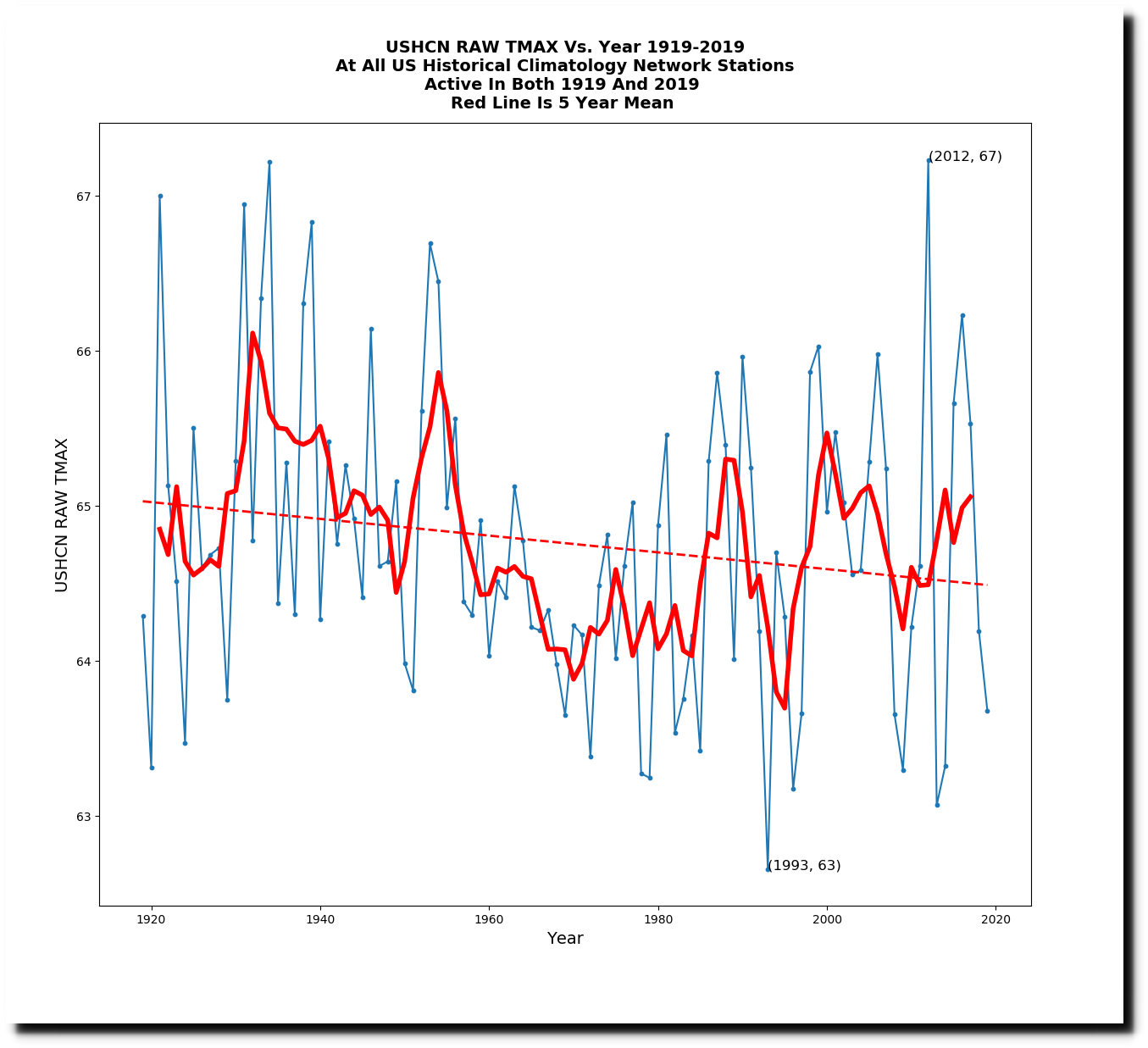
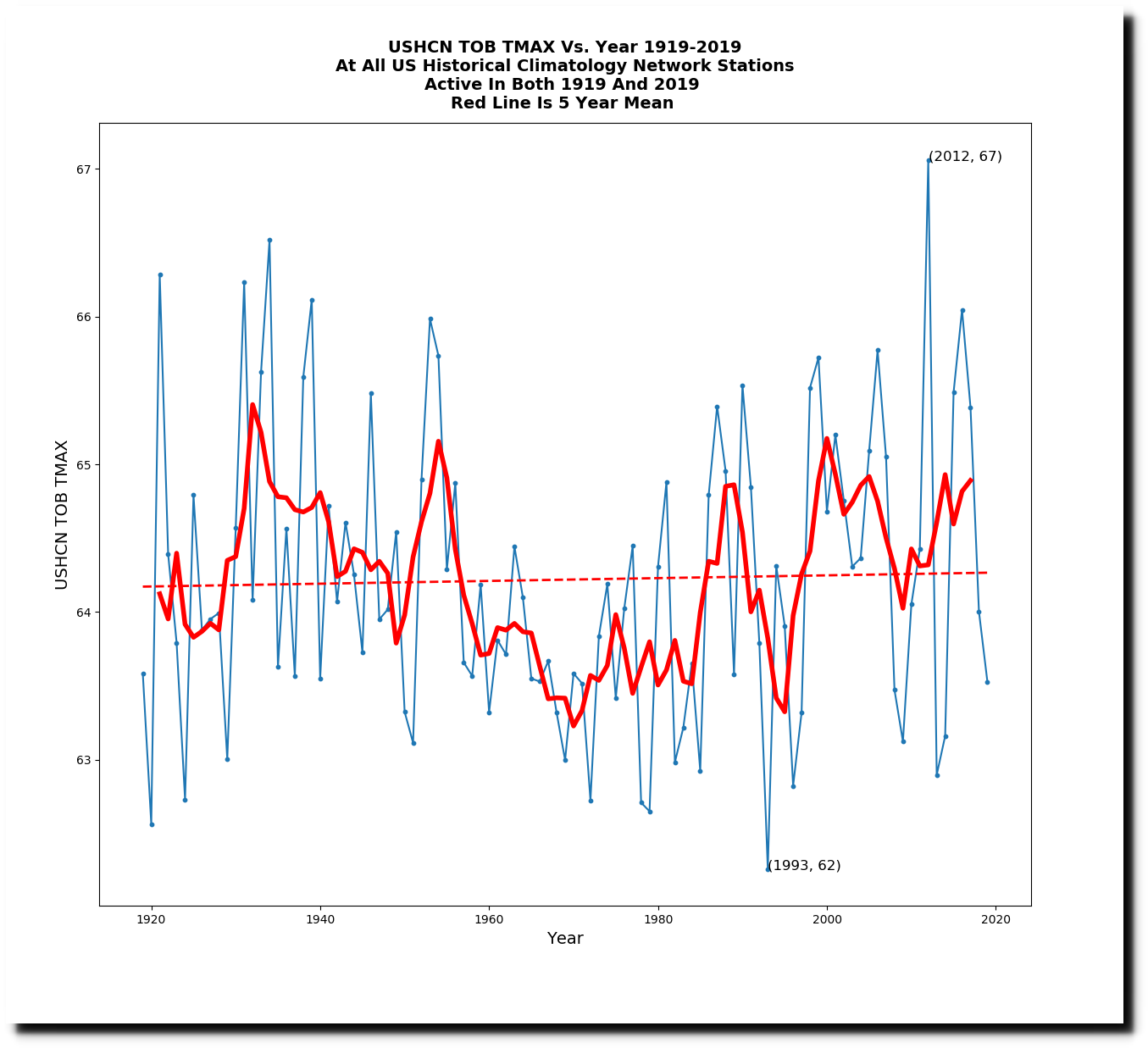
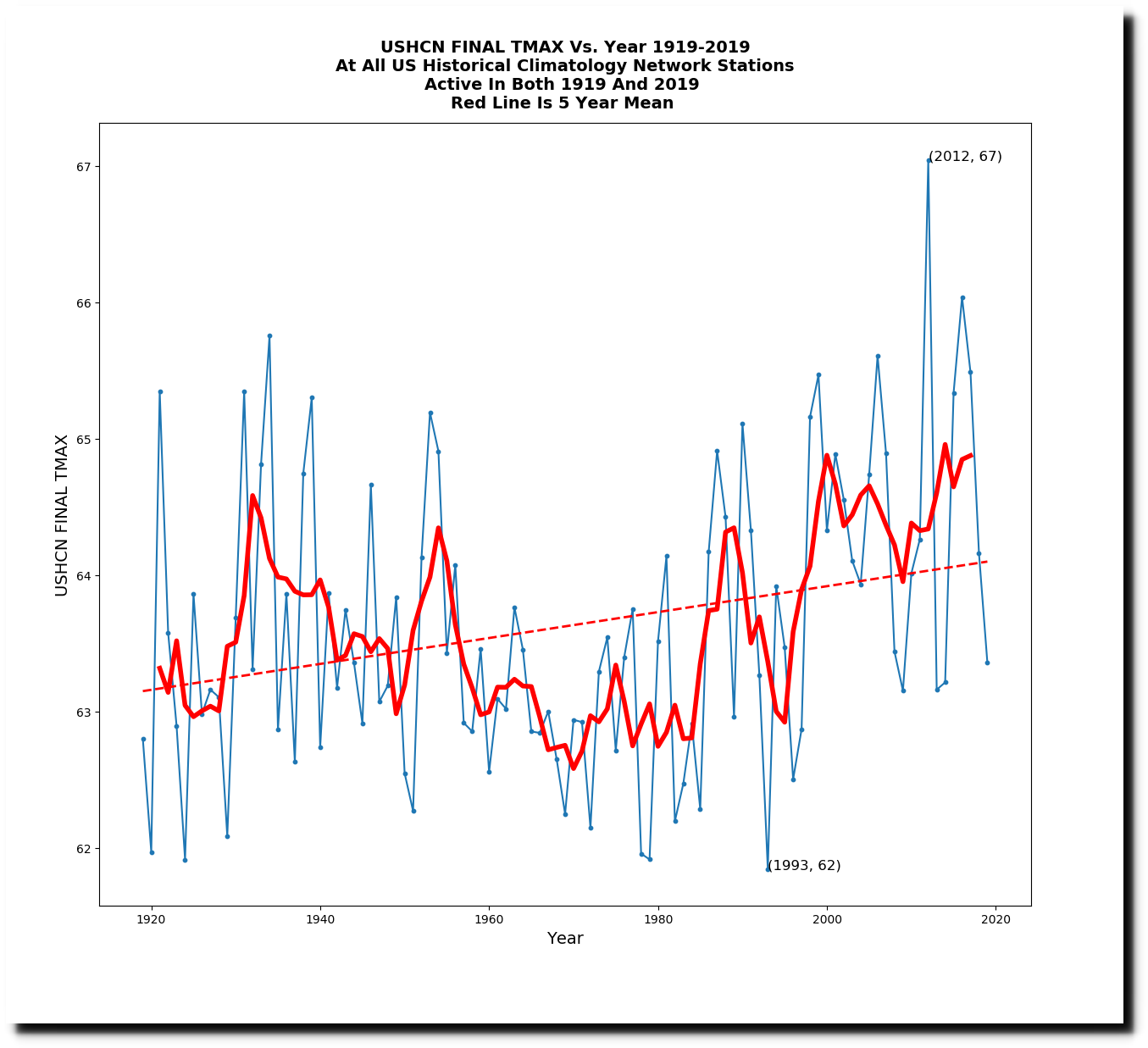
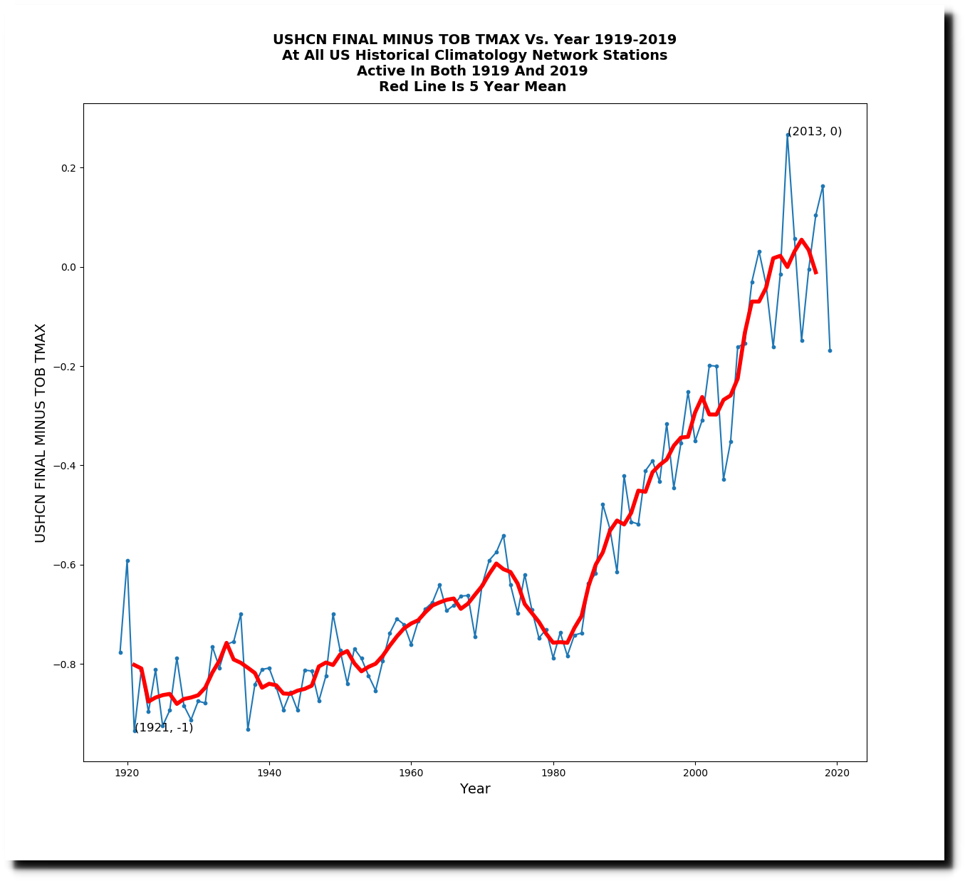
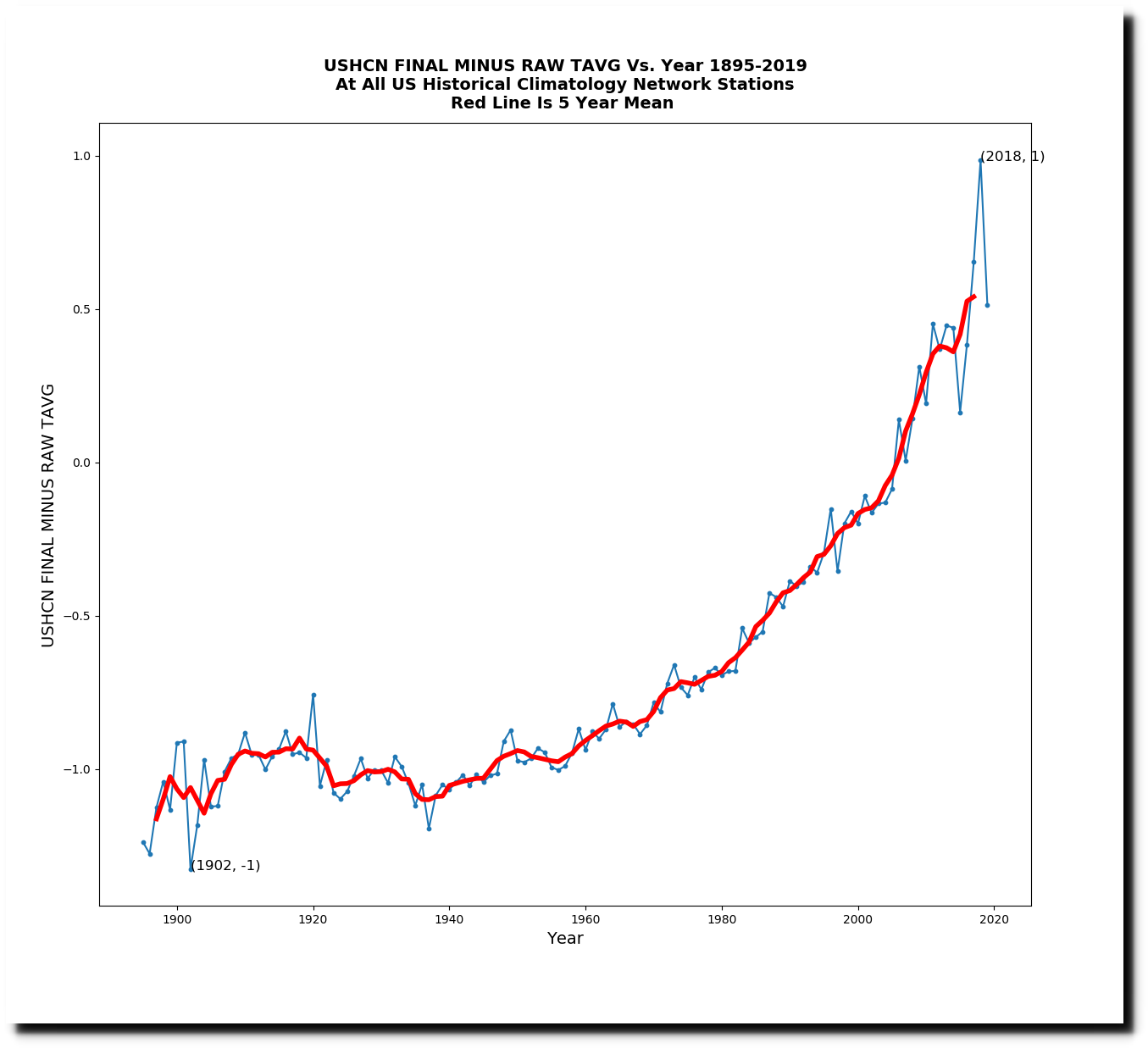
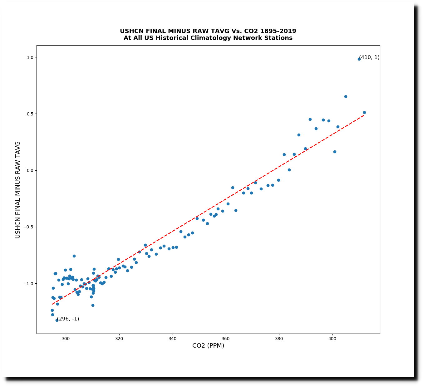
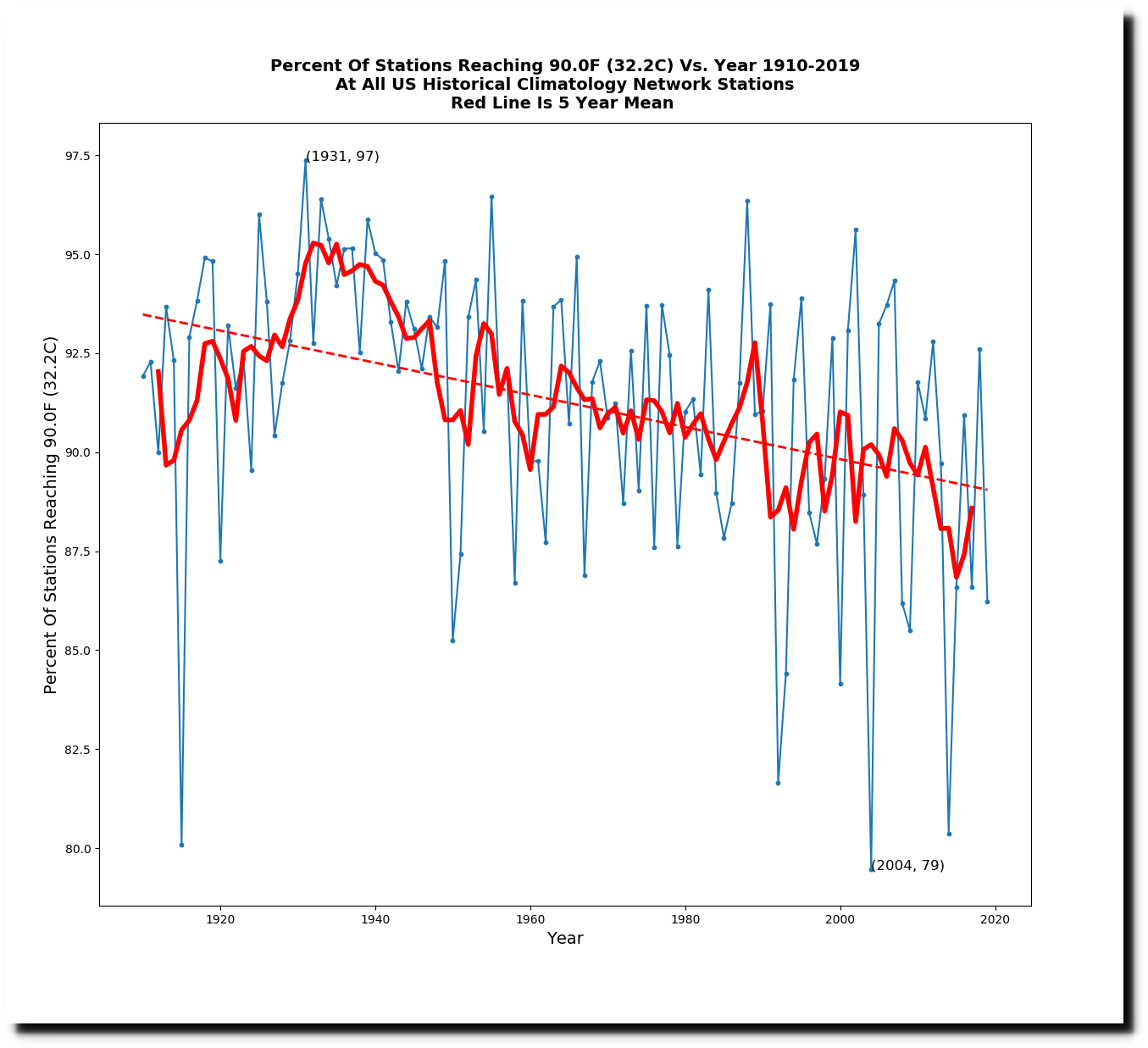
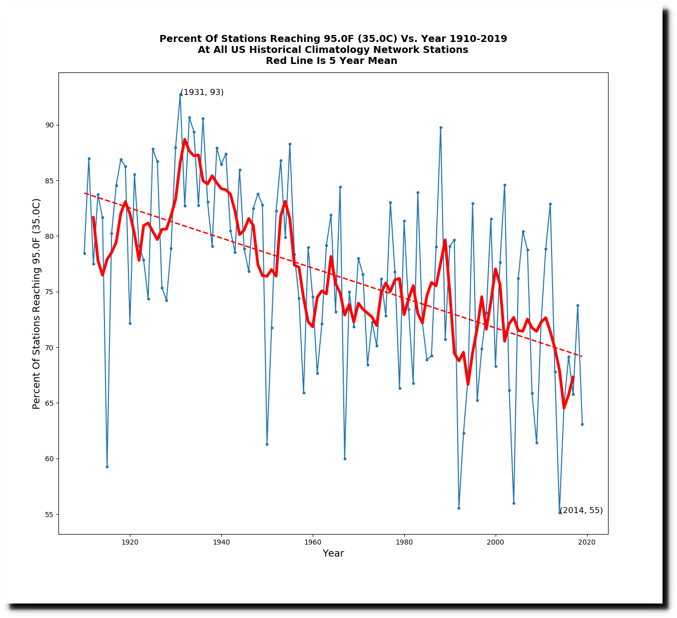
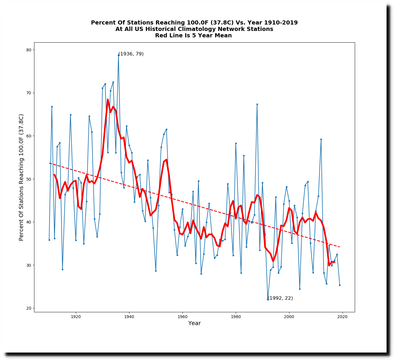
Other data shows the USA wasn’t even close to a record.

By Anthony Watts

In a report generating substantial media attention this month, the National Oceanic and Atmospheric Administration (NOAA) claimed January 2020 was the hottest January on record. In reality, the claim relies on substantial speculation, dubious reporting methods, and a large, very suspicious, extremely warm reported heat patch covering most of Russia.

The January 2020 Climate Assessment Report, released by NOAA’s National Center for Environmental Information (NCEI), was accompanied by a map showing a giant red menace of extraordinary asserted warmth extending from the Russian border with Poland well into Siberia. Yet, the asserted hot spot appears nowhere else.

clip_image002clip_image002

Figure 1: Map of temperature departure provided by NOAA/NCEII. Note the huge red spot over Russia.

Meanwhile, in the United States, Alaska was abnormally cold, and the contiguous United States wasn’t even close to a record.

While the media attempt to spin the NOAA announcement as more “proof” of a climate crisis, there are a few things to consider. First and foremost, January is the coldest month of the year for much of the Northern Hemisphere. You likely won’t find many people complaining that a particular January was warmer than usual. This is especially the case in Russia and Siberia.

January in Moscow is typically the coldest month of the year. Daytime high temperatures average 20°F, with average lows of 9°F. In Siberia, it is even worse. The Siberian city of Oymyakon, Russia, reached 88°F below zero (-66.67°C) in January 2018. The big red Russian “hot spot” in NOAA’s January temperature map simply shows Russia remained very, very cold, but not as excruciatingly cold as usual.

Yet, the Russian temperature data was the primary driver behind the asserted global January temperature record. This begs the question, why would Russia – and Russia alone – have such an unusual, giant red spot of unusual warmth compared to the rest of the world? Is Russia trying to influence and interfere with global climate data along with American elections?

Hardly, and the answer may be very simple and have little to do with climate change. In 2008, I identified a possible source for similarly odd reported warmth during the preceding Russian winter: Russian central-heating steam pipes.

Now before you say, “How could that possibly affect global temperature?” let’s take a closer look.

clip_image004clip_image004

Figure 2: Steam generation plant and steam distribution pipes for central heating in the Russian village of Oymyakon Image credit: Amos Chapple via Radio Free Europe

In most of Russia, and especially in Siberia, a central power plant pipes steam via overhead pipes within towns and villages. The steam goes to radiators in homes to provide warmth during the brutally cold winters. The waste heat from these heating systems is dispersed throughout the town. Official temperatures are also measured in these same towns, meaning that waste heat raises the reported temperature above what it would normally be.

When you have much of the Russian nation using this inefficient central heating scheme, dumping huge amount of waste heat into the local atmosphere, you end up with a nationwide temperature anomaly – which might well explain the great temperature “red spot” over Russia and Siberia that appears almost every winter.

A similar effect happens in Barrow, Alaska, a town that is dependent on heating to survive the winter, just like towns in northern Russia. Science has found that Barrow has become its own Urban Heat Island (UHI) during winter. In a peer-reviewed study published in the International Journal of Climatology, “The Urban Heat Island in Winter at Barrow, Alaska,” researchers found Barrow’s urban heat island to create local temperatures an average of 3.96°F warmer that would otherwise be the case. Notably, this artificial heat signal was largest during the winter, when the indoor heating requirements for the town were greatest to compensate the cold, outside air.

It appears that the “warmest ever” January might simply have been influenced by Russian temperature data warmed up by waste heat. Maybe the U.S. House of Representatives will start an inquiry into Russian collusion to interfere with global temperature data and climate change legislation – but don’t hold your breath.


Anthony Watts (awatts@heartland.org) is a former television meteorologist and Senior Fellow for Environment and Climate for The Heartland Institute. He operates the most viewed website on climate in the world, WattsUpWithThat.com

.

via Watts Up With That?

https://ift.tt/2T9y9A5

February 29, 2020 at 10:07AM

Zombie Climate Science

Daily temperature data from NOAA’s United States Historical Climatology Network shows that US maximum temperatures last year were tied for second coolest on record with 1912. The only cooler year was 1993, which was affected by the eruption of Mt. Pinatubo. The trend is strongly downwards since the 1930s.

But NOAA alters the data to turn cooling into warming, and they changed 2019 from second coolest to 71st coolest, or 54th warmest.

Climate at a Glance | National Centers for Environmental Information (NCEI)

NOAA does not adjust daily temperature data, rather they calculate monthly averages and adjust the monthly data. Their monthly “raw” temperatures are very similar to what I calculate from the daily temperatures. NOAA’s “final” data set is very similar to their published graphs, like the one above.

The adjustments are done in two stages. First is a time of observation adjustment (TOB), and then comes the final adjustment.

Temperatures prior to 1980 are cooled more than a degree, and recent temperatures are warmed nearly one degree. There is a hockey stick after the year 1980.

Time of Observation Bias adjustments are small, and haven’t changed for 20 years. The vast majority of data tampering is done in the final adjustment.

Since the year 1980, final and TOB adjustments are diverging in a hockey stick.’

There has been a sharp decline in the number of reporting stations over the past 30 years.

When NOAA doesn’t have data for a station, they fabricate it. More than 40% of the data is now “estimated” from a computer model.

More than one third (424) of the 1,218 USHCN stations had estimated data for all 12 months in 2019.  These fake (zombie) stations averaged about two degrees warmer than the adjusted measured stations and the raw daily measurements.

It would be easy to jump to the conclusion that zombie stations are the cause of the post-1980 hockey stick, so I tried a different experiment to test that theory.  I used the set of all 672 stations which had daily temperature data for both 1919 and 2019. This group only had 15% fake data in 2019, compared to 42% when using the group of all 1,218 stations.

That group had 8% zombie stations, and shows similar patterns to the group of all 1,218 stations.

Raw temperatures show a downwards trend over the past century,

Time of observation bias adjusted shows a slight warming trend.

Final adjusted shows a strong warming trend since 1980.

Adjustments form a hockey stick after 1980.

The hockey stick appears in the final adjustment.

The average temperature adjustments being made very closely match the increase in CO2 over the past century.

The fake post-1980 hockey stick gets carried over into other data sets, like this one which shows a sharp rise in the area of the US with unusually high summer maximum temperatures since 1980.

Natural Disasters – Our World in Data

This post-1980 rise doesn’t exist. It is not present in the National Climate Assessment.

Temperature Changes in the United States – Climate Science Special Report

The press refuses to talk to me, and instead talks to fraudster John Cook, who tells them there is no data tampering and there are no Urban Heat Island effects. Cook says “independent” data sets from different agencies proves that the data is good.

Climate change: 10 common myths – and what science really says – CBS News

In 1989. Tom Karl and Phil Jones said UHI was huge.

1520-0477(1989)070<0265:UBIAAS>2.0.CO;2

Different government agencies colluded to tamper with data.

di2.nu/foia/1254108338.txt

And when Senator Roberts from Australia queried NASA about obvious fraud in the Icelandic temperature record, Gavin Schmidt responded by blaming it on NOAA and saying it wasn’t his data.

robertsnasags.pdf

A small handful of people are pulling off a massive fraud, and because the press refuses to talk to scientists with accurate information, the public suffers.

Heathrow third runway ruled illegal over climate change | Environment | The Guardian

via Real Climate Science

https://ift.tt/32BXHZX

February 29, 2020 at 10:04AM

NSIDC Cheating Again

NSIDC Cheating Again

DMI shows Arctic sea ice extent increasing over the past three days.

Ocean and Ice Services | Danmarks Meteorologiske Institut

But NSIDC graphs show it declining.

Charctic Interactive Sea Ice Graph | Arctic Sea Ice News and Analysis

However, their maps show sea ice extent increasing.

Index of /DATASETS/NOAA/G02135/north/daily/images/2020/02_Feb/

I caught them cheating in 2012 as sea ice extent approached the mean. That time I got them to admit it.

NSIDCsNatureTrick

NSIDC’s 2012 Nature Trick | Real Science

I’ve also caught them cheating with ice age.

PaintImage160

NSIDC Caught Cheating – Yet Again | Real Climate Science

This entry was posted in

Uncategorized

. Bookmark the

permalink

.

via Real Climate Science

https://ift.tt/396PiQC

February 29, 2020 at 10:04AM

US Leads In Preventing Spread Of COVID-19 …Europe, Other Continents Faring Far Worse!

Lately we’ve been hearing lots from desperate politicians suggesting that the US response to the spread of the COVID-19 virus has not been adequate.

Far worse in Europe

Here in Europe we’ve been hearing a lot about new cases arising on a daily basis, and when I compare the number of U.S.cases (February 29, 2020) to those reported here and in other countries, it’s hard to understand what all the commotion in the US is about. Things are far worse in Europe.

So far the US has reported 66 cases among a population of over 330 million. That translates to about 0.2 cases per million, despite the huge volume of travel between the US and Asia. In France and Germany the rate is 5 times higher (though they are doing a pretty good job fighting the spread). In Italy it’s 75 times greater!

Early travel restriction from China paying precious dividends

What follows is a table showing the top 20 countries reporting COVID-19 cases. They are listed according to the number of cases per one million inhabitants. The list starts with the countries with the lowest rates:

The U.S. and the U.K. lead the pack. The high success rate likely is in large part due to President Trump’s early decision to restrict air travel from China – a move for which he was loudly criticized not long ago. Now that decision has turned to to have been wise and has paid off.

South Korea, Bahrain and Singapore have a real problem along with China, where the virus is said to have originated.

Of course lots of factors are at play, and so the statistics above should be viewed merely as indicators. One local outbreak can change the stats fast.

The next challenge for the U.S. remains containing the pockets of infections that have been arising, some in not very well run places – like California. In these places it would be a wise idea to rapidly cancel public events, close schools and force workplaces to implement strict hygiene practices. I would even consider restricting interstate air travel from California for awhile under they get their house in order.

There’s no reason to panic as the death rate from COVID-19 is nothing like Ebola, SARS, or H5N1.

For those with a greater interest in pandemics, etc, I highly recommend the following book:

The Great Influenza


via NoTricksZone

https://ift.tt/2uLoOp2

February 29, 2020 at 07:27AM