
The map shows that in Canada 8591 deaths have been attributed to Covid19, meaning people who died having tested positive for SARS CV2 virus. This number accumulated over a period of 132 days starting January 31. The daily death rate reached a peak of 177 on May 6, 2020, and is down to 20 as of yesterday. More details on this below, but first the summary picture.
|
Canada Pop |
Ann Deaths |
Daily Deaths |
Risk per
Person |
| 2019 |
37600000 |
330880 |
907 |
0.8800% |
| Covid 2020 |
37600000 |
8591 |
65 |
0.0228% |
Over the epidemic months, the average Covid daily death rate amounted to 7% of the All Causes death rate. During this time a Canadian had an average 1 in 5000 risk of dying with SARS CV2 versus a 1 in 114 chance of dying regardless of that infection. As shown below the risk varied greatly with age, much lower for younger, healthier people.
Background Updated from Previous Post
In reporting on Covid19 pandemic, governments have provided information intended to frighten the public into compliance with orders constraining freedom of movement and activity. For example, the above map of the Canadian experience is all cumulative, and the curve will continue upward as long as cases can be found and deaths attributed. As shown below, we can work around this myopia by calculating the daily differentials, and then averaging newly reported cases and deaths by seven days to smooth out lumps in the data processing by institutions.
A second major deficiency is lack of reporting of recoveries, including people infected and not requiring hospitalization or, in many cases, without professional diagnosis or treatment. The only recoveries presently to be found are limited statistics on patients released from hospital. The only way to get at the scale of recoveries is to subtract deaths from cases, considering survivors to be in recovery or cured. Comparing such numbers involves the delay between infection, symptoms and death. Herein lies another issue of terminology: a positive test for the SARS CV2 virus is reported as a case of the disease COVID19. In fact, an unknown number of people have been infected without symptoms, and many with very mild discomfort.

For this discussion let’s assume that anyone reported as dying from COVD19 tested positive for the virus at some point prior. A recent article by Nic Lewis at Climate Etc. referred to evidence that the average time from infection to symptoms is 5.1 days, and from symptoms to death 18.8 days. A separate issue, of course, is that 95+% of those dying had one or more co-morbidities contributing to the patient’s demise. Setting aside the issue of dying with/from Covid19, it is reasonable to assume that 24 days after testing positive for the virus, survivors can be considered recoveries.

Recoveries are calculated as cases minus deaths with a lag of 24 days. Daily cases and deaths are averages of the seven days ending on the stated date. Recoveries are # of cases from 24 days earlier minus # of daily deaths on the stated date. Since both testing and reports of Covid deaths were sketchy in the beginning, this graph begins with daily deaths as of April 24, 2020 compared to cases reported on May 31, 2020. Another view of the data is shown below.

The scale of testing has increased and is now reached 40,000 a day, while positive tests (cases) are dwindling. The shape of the recovery curve resembles the case curve lagged by 24 days, since death rates are a small portion of cases. The recovery rate has grown from 83% to 98% steady over the last 5 days. This approximation surely understates the number of those infected with SAR CV2 who are healthy afterwards, since antibody studies show infection rates multiples higher than confirmed positive tests. In absolute terms, cases are now down to 320 a day and deaths 20 a day, while estimates of recoveries are 804 a day.
Summary of Canada Covid Epidemic
It took a lot of work, but I was able to produce something akin to the Dutch advice to their citizens.
The media and governmental reports focus on total accumulated numbers which are big enough to scare people to do as they are told. In the absence of contextual comparisons, citizens have difficulty answering the main (perhaps only) question on their minds: What are my chances of catching Covid19 and dying from it? The map shows a lot of cases, and the chart looks like an hockey stick, going upward on a straight line. So why do I say canadians are safer than it looks like from such images?
First let’s look at daily numbers to see where we are in this process. All the statistics come from Canada Public Health Coronavirus disease (COVID-19): Outbreak update.
By showing daily tests, new cases and reported deaths, we can see how the outbreak has built up, peaked and declined over the last 3 months. The green line shows how testing steadily grew up to a daily rate of 40,000 (all numbers are smoothed with 7 day averages ending with the stated date.) Note that the curve is now descending after peaking at 1800 on April 22, now down to 320 new cases per day. This lower rate of infections is despite the highest rate of testing since the outbreak began. Deaths have also peaked at 177 on May 6, down to 20 on June 30. The percentage of people testing positive is down to 3.8%, and deaths are 0.31% of the tests administered.
But it matters greatly where in Canada you live. In the map at the top, Quebec is the dark blue province leading the nation in both cases and deaths. Quebec has always celebrated being a distinct society, but not in this way. Below is the same chart for the Quebec epidemic from the same dataset. The province has about 23% of the national population and does about 26% of the tests. But Quebec contributed 56% of the cases and 64% of the deaths, as of yesterday. Here how the outbreak has gone in La Belle Province.

The Quebec graph is more lumpy showing cases peaking May 1-9, including several days inflated by data catchups. Cases have dropped off recently, from 1100 May 7 down to 82 yesterday. Deaths are also slowing, declining from 110 on May 7 to 11 June 30. The animation below shows the epidemic in Canada with and without Quebec statistics.

But clearly everywhere else in Canada, people are much safer than those living in Quebec. So what is going on?

To enlarge image, open in new tab.
The graph shows that people in Quebec are dying in group homes, the majority in CHSLD (long term medical care facilities) and also in PSR (private seniors’ residences). The huge majority of Quebecers in other, more typical living arrangements have very little chance of dying from this disease. Not even prisoners are much at risk.
Of course the other dimension is years of age, since this disease has punished mostly people suffering from end-of-life frailties. A previous post reported that the Netherlands parliament was provided with the type of guidance everyone wants to see.

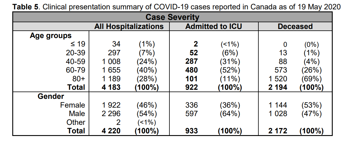
For canadians, the most similar analysis is this one from the Daily Epidemiology Update: :
The table presents only those cases with a full clinical documentation, which included some 2194 deaths compared to the 5842 total reported. The numbers show that under 60 years old, few adults and almost no children have anything to fear.
Update May 20, 2020
It is really quite difficult to find cases and deaths broken down by age groups. For Canadian national statistics, I resorted to a report from Ontario to get the age distributions, since that province provides 69% of the cases outside of Quebec and 87% of the deaths. Applying those proportions across Canada results in this table. For Canada as a whole nation:
| Age |
Risk of Test + |
Risk of Death |
Population
per 1 CV death |
| <20 |
0.05% |
None |
NA |
| 20-39 |
0.20% |
0.000% |
431817 |
| 40-59 |
0.25% |
0.002% |
42273 |
| 60-79 |
0.20% |
0.020% |
4984 |
| 80+ |
0.76% |
0.251% |
398 |
In the worst case, if you are a Canadian aged more than 80 years, you have a 1 in 400 chance of dying from Covid19. If you are 60 to 80 years old, your odds are 1 in 5000. Younger than that, it’s only slightly higher than winning (or in this case, losing the lottery).
As noted above Quebec provides the bulk of cases and deaths in Canada, and also reports age distribution more precisely, The numbers in the table below show risks for Quebecers.
| Age |
Risk of Test + |
Risk of Death |
Population
per 1 CV death |
| 0-9 yrs |
0.13% |
0 |
NA |
| 10-19 yrs |
0.21% |
0 |
NA |
| 20-29 yrs |
0.50% |
0.000% |
289,647 |
| 30-39 |
0.51% |
0.001% |
152,009 |
| 40-49 years |
0.63% |
0.001% |
73,342 |
| 50-59 years |
0.53% |
0.005% |
21,087 |
| 60-69 years |
0.37% |
0.021% |
4,778 |
| 70-79 years |
0.52% |
0.094% |
1,069 |
| 80-89 |
1.78% |
0.469% |
213 |
| 90 + |
5.19% |
1.608% |
62 |
While some of the risk factors are higher in the viral hotspot of Quebec, it is still the case that under 80 years of age, your chances of dying from Covid 19 are better than 1 in 1000, and much better the younger you are.
Mr. Trudeau, Take Down This Wall !

via Science Matters
https://ift.tt/3dPNVaw
July 1, 2020 at 02:22PM




 Iowa Climate Science Education