
Climate alarmism is looking increasingly like organized fraud and deception.
A German YouTube video reveals a number of charts prepared by Tony Heller illustrating how climate alarmists hide data in order to produce an alarming impression of the globe’s climate.
Today we present 4 pairs of charts to show how climate alarmists carefully cherrypick their start points and ignore all the available data in order to create totally phony climate scenarios.
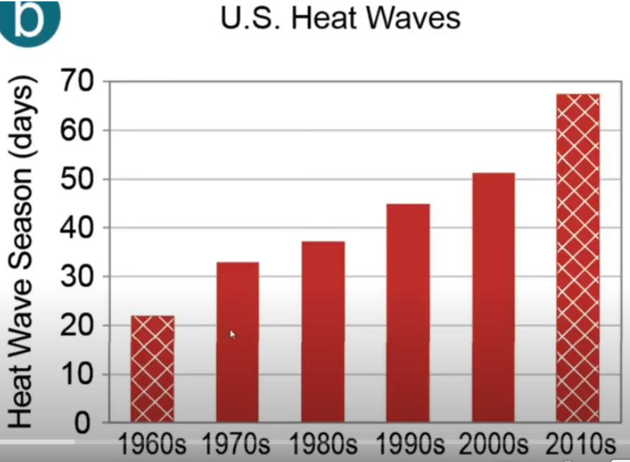
US HEAT WAVES
The first pair looks at US heat waves. The alarmist chart starts at 1960, and so shows what appears to be an alarming trend:
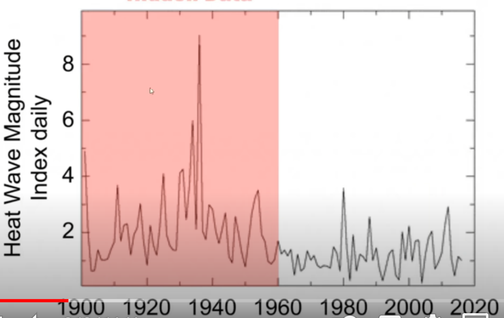
But the data go back much further, and so the heat wave story loses all its alarm:
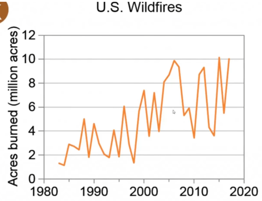
US WILD FIRES
Alarmist deceitful chart:
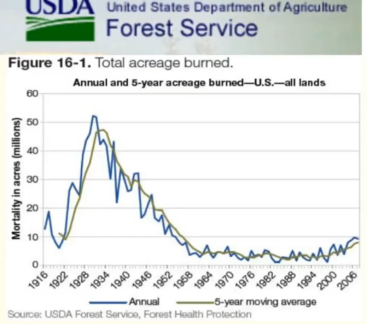
Reality, data go back to 1916:
ARCTIC SEA ICE
Alarmist deception chart:
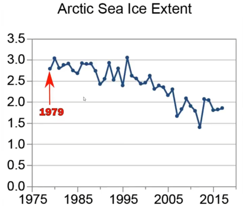
Arctic ice reality:

SEA LEVEL RISE
Alarmist chart:
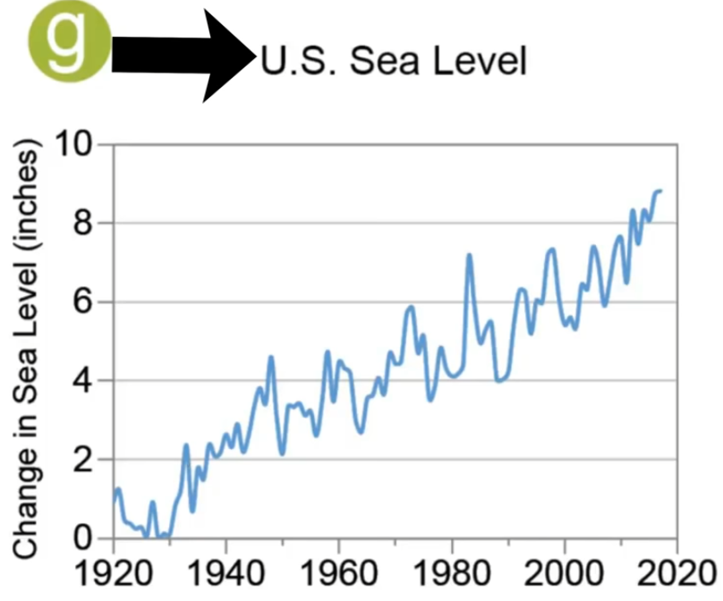
Reality – no sea level rise acceleration:

Donate – choose an amount
via NoTricksZone
July 28, 2021 at 02:26PM
