As I predicted, climate change has been blamed for the recent New England blizzard (e.g. from Bloomberg here). During that storm, Boston tied its 24-hr snowfall record at 23.6 inches.
Yet, as recently as January 6, we were told by USAToday that Boston’s lengthy 316-day streak *without* one inch of snowfall as of January 1st was caused by global warming.
So, which is it? Global warming causes less snow, or more snow?
When science produces contradictory claims, is it really science?
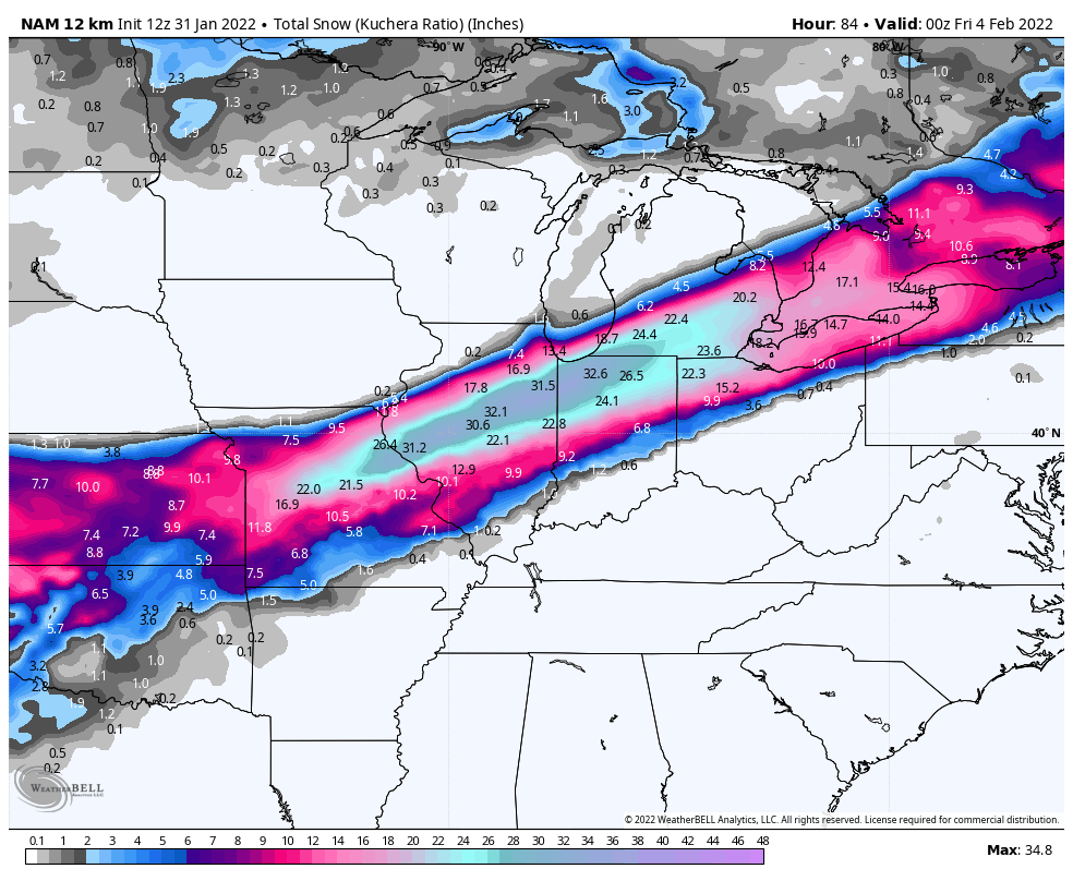
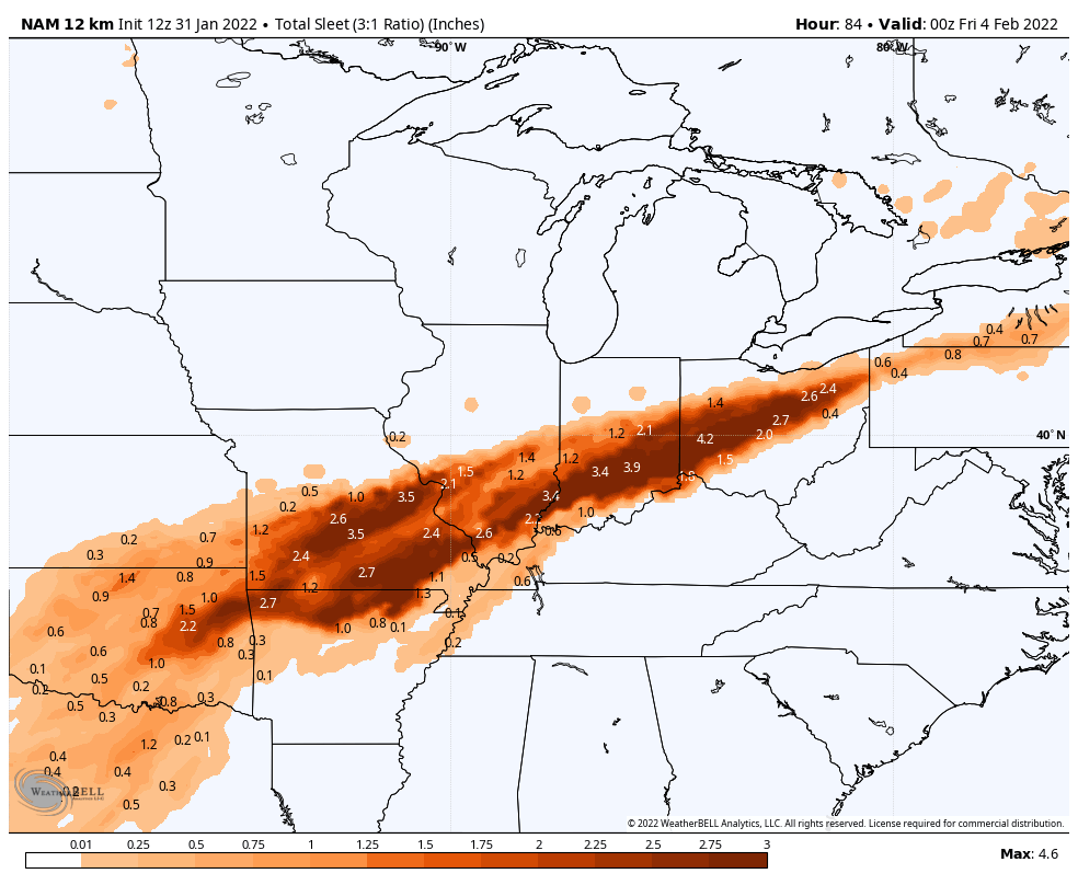
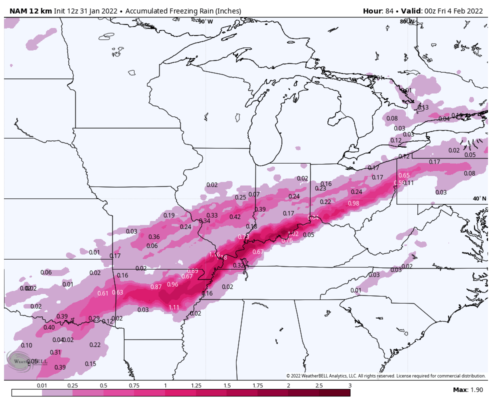
What’s coming up next is a snow and ice storm that will stretch all the way from the southern Rockies to northern New England. Here are NAM model forecast totals of snow, ice pellets, and freezing rain (respectively) from Tuesday evening through Thursday evening. All of the forecast models I follow (ECMWF, GFS, NAM, and Canadian) are in general agreement, with some variation in the north-south positioning:
Not shown is the westward extension of this into NW Texas, Colorado, and New Mexico. Also not shown is the eastward spreading of this mess into northern New England through Friday.
If anything like this forecast verifies, it’s going to cause huge disruptions.
At this current crazy moment, most of the “Western” world (Europe, the U.S., Canada, Australia) is hell bent on achieving a “net zero” energy system. As I understand this concept, it means that, within two or three decades, all electricity production will be converted from the current mostly-fossil-fuel generation mix to almost entirely wind, solar and storage.On top of that, all or nearly all energy consumption that is not currently electricity (e.g., transportation, industry, heat, agriculture) must be converted to electricity, so that the energy for these things can also be supplied solely by the wind, sun, and batteries. Since electricity is currently only about a quarter of final energy consumption, that means that we are soon to have an all-electric energy generation and consumption system producing around four times the output of our current electricity system, all from wind and solar, backed up as necessary only by batteries or other storage.
A reasonable question is, has anybody thought to construct a small-to-moderate scale pilot project to demonstrate that this is feasible? Before embarking on “net zero” for a billion people, how about trying it out in a place with, say, 10,000, or 50,000, or 100,000 people. See if it can actually work, and how much it will cost. Then, if it works at reasonable cost, start expanding it.
As far as I can determine, that has never been done anywhere. However, there is something somewhat close. An island called El Hierro, which is one of the Canary Islands and is part of Spain, embarked more than a decade ago on constructing an electricity system consisting only of wind turbines and a pumped-storage water reservoir. El Hierro has a population of about 11,000. It is a very mountainous volcanic island, so it provided a fortuitous location for construction of a large pumped-storage hydro project, with an upper reservoir in an old volcanic crater right up a near-cliff from a lower reservoir just above sea level. The difference in elevation of the two reservoirs is about 660 meters, or more than 2000 feet. Here is a picture of the upper reservoir, looking down to the ocean, to give you an idea of just how favorable a location for pumped-storage hydro this is:
The El Hierro wind/storage system began operations in 2015. How has it done? I would say that it is at best a huge disappointment, really bordering on disaster. It has never come close to realizing the dream of 100% wind/storage electricity for El Hierro, instead averaging 50% or less when averaged over a full year (although it has had some substantial periods over 50%). Moreover, since only about one-quarter of El HIerro’s final energy consumption is electricity, the project has replaced barely 10% of El Hierro’s fossil fuel consumption.
Over at the website page for production statistics, it’s still more excitement about tons of carbon emissions avoided (15,484 in 2020!) and hours of 100% renewable generation (1293 in 2020!). I think that they’re hoping you don’t know that there are 8784 hours in a 366 day year like 2020.
So why don’t they just build the system a little bigger? After all, if this system can provide around 50% +/- of El Hierro’s electricity, can’t you just double it in size to get to 100%? The answer is, absolutely not. The 50% can be achieved only with those diesel generators always present to provide full backup when needed. Without that, you need massively more storage to get you through what could be weeks of wind drought, let alone through wind seasonality that means that you likely need 30 days’ or more full storage.
Then take a look at the picture and see if you can figure out where or how El Hierro is going to build that 40 times bigger reservoir. Time to look into a few billions of dollars worth of lithium ion batteries — for 11,000 people.
And of course, for those of us here in the rest of the world, we don’t have massive volcanic craters sitting 2000 feet right up a cliff from the sea. For us, it’s batteries or nothing. Or maybe just stick with the fossil fuels for now.
So the closest thing we have to a “demonstration project” of the fully wind/storage electricity has come up woefully short, and really has only proved that the whole concept will necessarily fail on the necessity of far more storage than is remotely practical or affordable. The idea that our political betters plow forward toward “net zero” without any demonstration of feasibility I find completely incomprehensible.
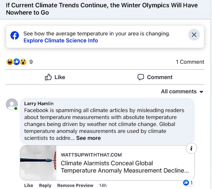
For some time now Facebook has been attaching a note to virtually every posted climate change article telling readers to go to an attached link (Explore Climate Science Info) to see how “average temperature in your area is changing” with the inference being that local average temperatures changes are linked to climate change. An example is shown in one of the Facebook articles below.
I have been commenting on many of these articles with the same comment as shown below which addresses the fact that absolute temperatures are not appropriate for use in addressing climate change issues and that temperature anomaly measurements are used for that purpose.
“Facebook is spamming all climate articles by misleading readers about temperature measurements with absolute temperature changes being driven by weather not climate change. Global temperature anomaly measurements are used by climate scientists to address global temperature climate change issues. There are 5 scientifically accepted global temperature anomaly data measurement systems used by climate scientists worldwide. These systems are NASA, NOAA and UK Met Office surface anomaly measurement systems and satellite anomaly measurement systems RSS and UAH. All 5 of these global temperature anomaly measurement systems have established that global temperature anomaly measured data have declining trends since year 2016 through 2021 with the decline being at a rate averaging -0.16 degrees C per decade (-1.6 degrees C per century). The 2016 global peak measured temperature anomaly was driven by a natural climate El Niño event not climate change. Climate alarmists hyped claim that year 2021 represents a “climate emergency” is unsupported by measured global temperature anomaly data by all 5 global measurement systems with this data declining for the past 6 years. There is no “climate emergency” (as demonstrated by global temperature anomaly measurement declines over the period 2016-2021) and claims otherwise are nothing but scientifically unsupported climate alarmism propaganda that was intended to support the now spectacularly failed COP26 climate confab debacle. See the following for details.”
After commenting the Facebook article would look as shown below.
The circled “i” refers readers to the fact that WUWT is one of those evil “climate change denial blogs that opposes the scientific consensus” with this Facebook claim being the usual climate alarmist propaganda political hype.
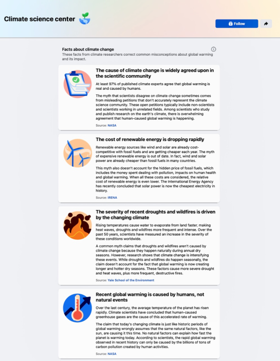
The Facebook “Climate Science Center” provides a listing of about a dozen topics where allegedly climate science information is provided to inform the readers of Facebooks climate alarmism claims. The “Climate science center” is shown (in part) below and a number of these topics are briefly examined in this post regarding the “Facts about climate change” claims.
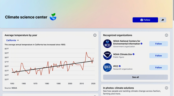
Facebook provides an example in the “Climate science center” of the “See how average temperatures in your area are changing” by providing a graph of NOAA’s California average annual temperature data as shown below which is supposed to represent an increasing temperature trend allegedly caused by man-made climate change.
The Facebook California temperature data displays average annual absolute temperatures instead of providing temperature anomaly data that is utilized by climate scientists to address climate change issues.
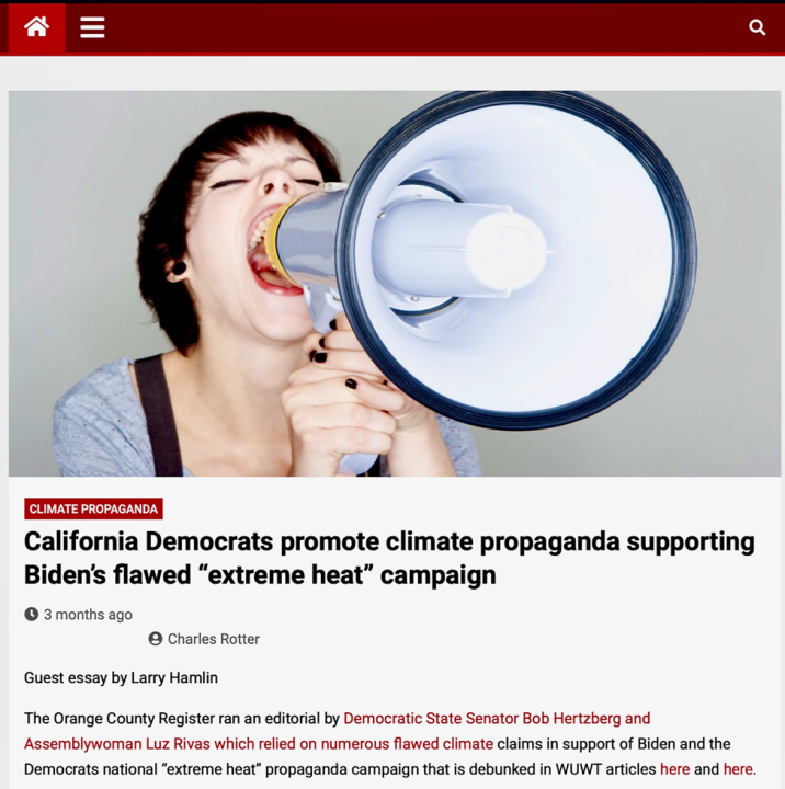
The failure of Facebook to understand the scientific difference between absolute versus temperature anomaly data measurements regarding issues associated with climate change is typical of the scientific ineptness of the climate alarmist propaganda political community as addressed in a prior WUWT article below exposing the climate science incompetence of the California Democratic Party.
This article notes the following regarding the critical scientific distinction between absolute versus temperature anomaly data measurements as follows:
“All anyone needs to do is Google “temperature anomaly” to understand the significant difference between “absolute temperature” versus “temperature anomaly” measurement data that climate scientists rely upon to address climate related temperature changes as noted below.
What do temperature anomalies mean?
Temperature anomalies are useful for deriving average surface temperatures because they tend to be highly correlated over large distances (of the order of 1000 km). In other words, anomalies are representative of temperature changes over large areas and distances.
Why do we use temperature anomalies?
Anomalies more accurately describe climate variability over larger areas than absolute temperatures do, and they give a frame of reference that allows more meaningful comparisons between locations and more accurate calculations of temperature trends.
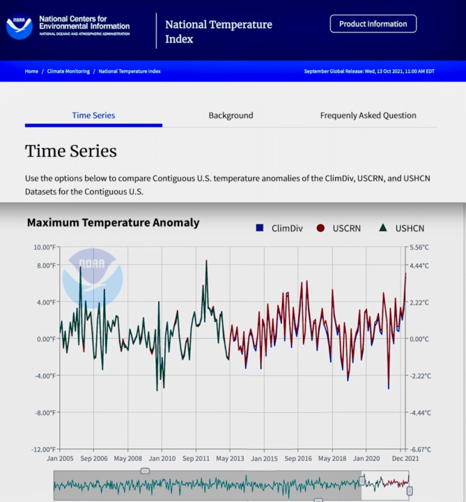
NOAA measurements of temperature anomaly data across the contiguous 48 U. S. States (Parameter: Maximum Temperature Anomaly; Time Scale: 1-Month; Months: All Months) using its most reliable USCRN temperature anomaly measurement data system establishes that the U.S. is not experiencing increasing “extreme heat” as presented and established below using NOAA temperature anomaly data which clearly shows that the nations maximum temperature anomaly measurement data has no increasing trend and in fact has declined since temperature anomaly peaks in years 2006 and 2012.”
“NOAA maximum temperature anomaly data for the 48 contiguous states proves that the U.S. is not experiencing increasing “extreme heat” trends and Democrat claims otherwise are unsupported by scientific data. Democrats are improperly politicalizing the use of localized-weather absolute temperature events to define national, regional and global climate temperature change behavior which is scientifically invalid.”
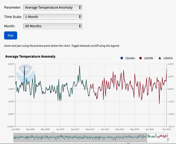
The same lack of increasing trend profile also occurs for NOAA’s average temperature anomaly data for the 48 contiguous states as shown below. NOAA’s temperature anomaly data representing the contiguous U.S. does not support Facebooks climate alarmist claims that man made CO2 emissions are driving increasing U.S. average temperature trends and in addition Facebooks is erroneously using absolute temperatures versus temperature anomaly measurement data.
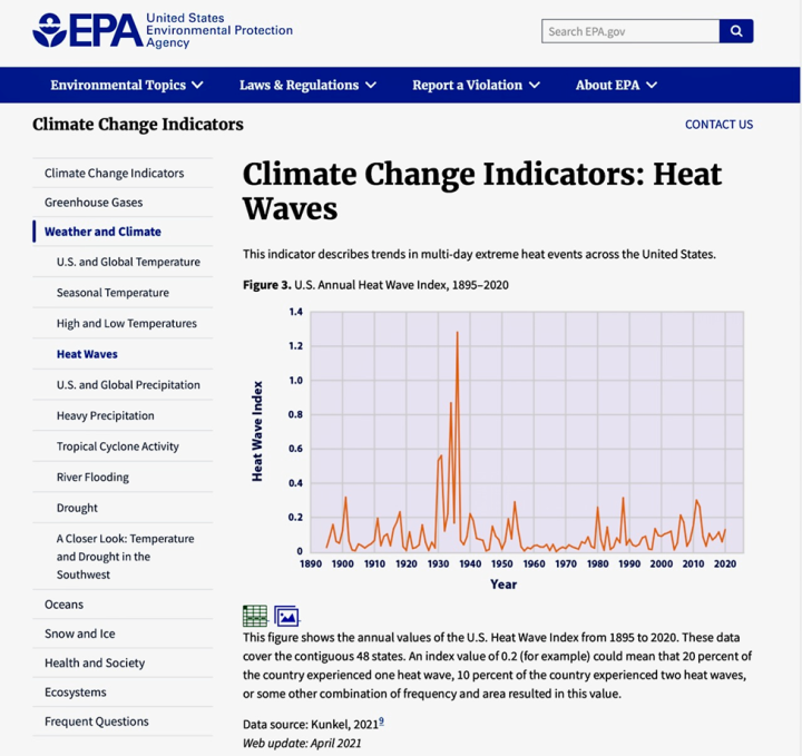
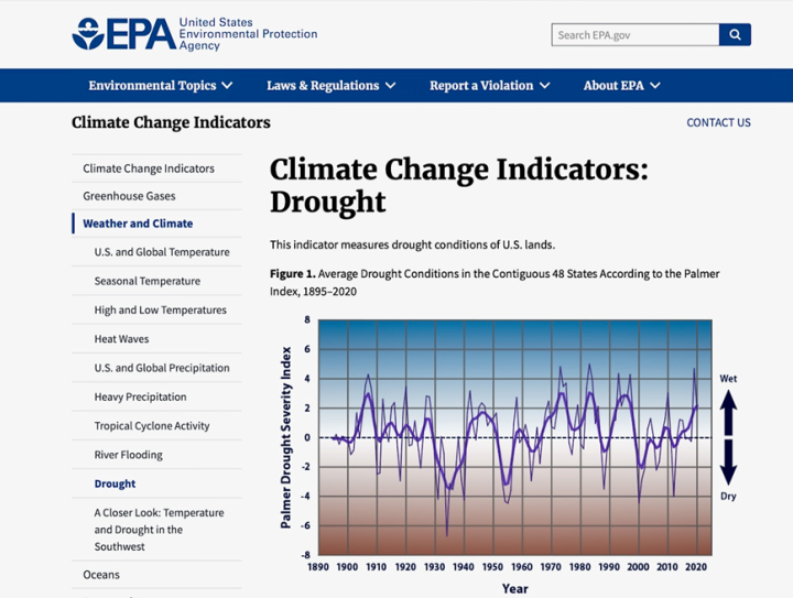
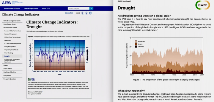
Facebook also fails to present long standing EPA data (perhaps because EPA attempted to conceal this data as addressed in a recent WUWT post) that clearly shows that the U.S. is not experiencing increased heat waves or droughts since the 1950s period with measured data covering the period between 1895 and 2020 demonstrating the greatest occurrences of heat wave and droughts occurred in the period of the 1930s as shown in EPA data presented in the diagrams below.
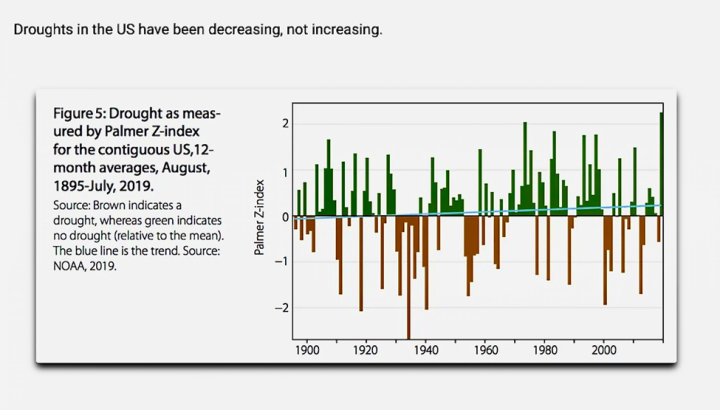
Additionally, NOAA’s Palmer-Z-drought index data also shows U.S. droughts declining as shown below.
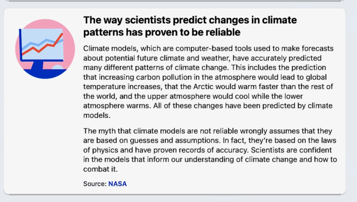
One of the Facebook “Facts about climate change” addresses the use of climate models and their claim that these models have “accurately predicted” climate change impacts as noted in the Facebook Fact item presented below.
Facebook conceals the fact that the UN IPCC in its Third Annual Climate Change Report in 2001 concluded that trying to develop and utilize computer models to address future global climate change impacts will always be problematic.
Specifically in Section 14.2.2.2 (Balancing the need for finer scales and the need for ensembles) of the AR3 report the bottom line concerning the unresolvable shortcomings of global climate model simulations was articulated and clearly presented as:
“In sum, a strategy must recognize what is possible. In climate research and modeling, we should recognize that we are dealing with a coupled non-linear chaotic system, and therefore that the long-term prediction of future climate states is not possible. The most we can expect to achieve is the prediction of the probability distribution of the system’s future possible states by generation of ensembles of modal solutions.”
Furthermore, Facebook also conceals the fact that the UN IPCC acknowledged in its Fifth Annual Climate Report in 2013 that the climate model scenarios utilized to “project” climate outcomes are speculative and specifically qualified as such by noting:
“The scenarios should be considered plausible and illustrative, and do not have probabilities attached to them. (12.3.1; Box 1.1)”
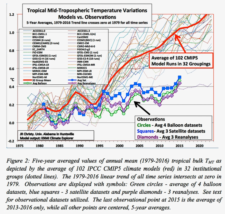
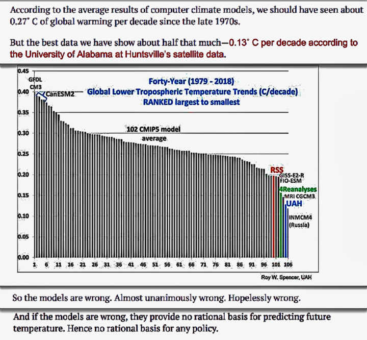
These UN IPCC significant and acknowledged limitations of climate models are clearly illustrated by comparisons of model projections of global climate temperature anomalies versus measured temperature anomalies as presented in the results shown below establishing that climate models grossly overstate global climate temperature anomaly impacts.
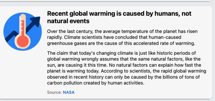
Another Facebook “Facts about climate change” area as shown below claims to establish that only humans can be causing climate change temperature change impacts not natural occurring climate events.
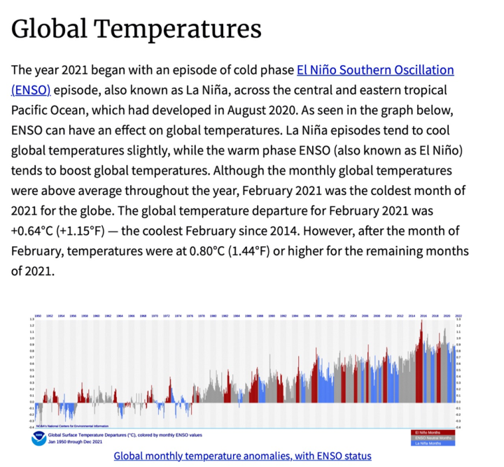
This is a completely ridiculous climate alarmist propaganda claim given that NOAA and other climate science organizations global climate temperature anomaly data clearly establishes that natural climate behavior driven EL Nino events significantly contribute to increasing global climate temperature anomaly changes as clearly presented in NOAA’s global temperature data shown below.
As the NOAA global temperature anomaly data clearly shows the peak global temperature anomaly measurement data in 2016 was directly driven by the result of a strong EL Nino event as has occurred on many other peak temperature anomaly measurement data years over the past 70 years shown in NOAA’s graph.
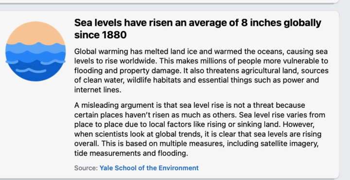
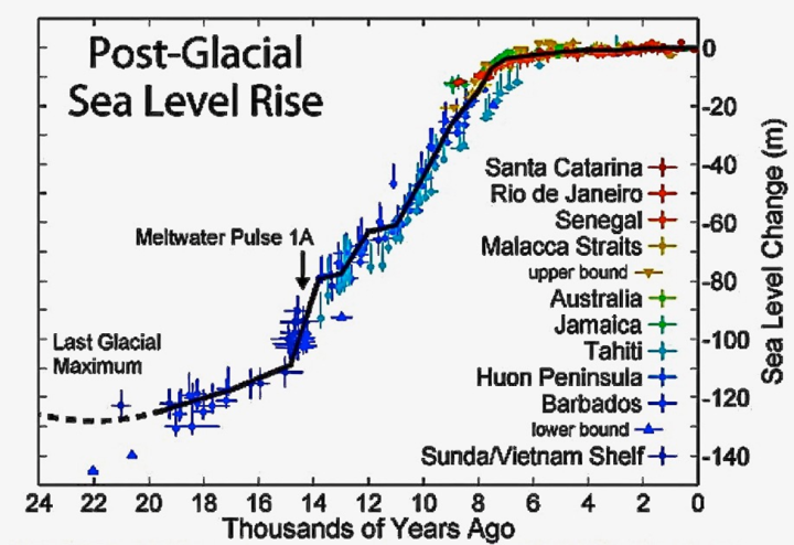
Another Facebook “Facts about climate change” deceptively notes that sea level rise is occurring because of melting ice and warming oceans that represent a global climate threat, but Facebook conceals the fact that sea levels have been rising driven by natural climate behavior occurring since the end of the last ice age.
It is well established climate science that natural climate events have been controlling ocean sea level rise behavior for tens of thousands of years since the end of the last ice age as shown in the analysis presented below.
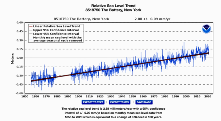
What Facebook fails to address is that coastal sea level rise is not accelerating (rate of sea level rise is not increasing) which climate alarmists have been falsely claiming for decades. NOAA tide gauge coastal sea level rise measurements at hundreds of coastal locations going back for more than a century confirm the lack of coastal sea rise acceleration as shown below from examples for New York (164 years of data measurements, the longest NOAA tide gauge record in the U.S.) and Los Angeles (97 years of data measurements) with stable sea level rise rates of 11.3 and 4.08 inches per century respectively.
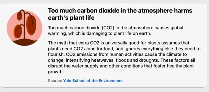
Another Facebook “Facts about climate change” item claims that increasing atmospheric CO2 harms earth’s plant life.
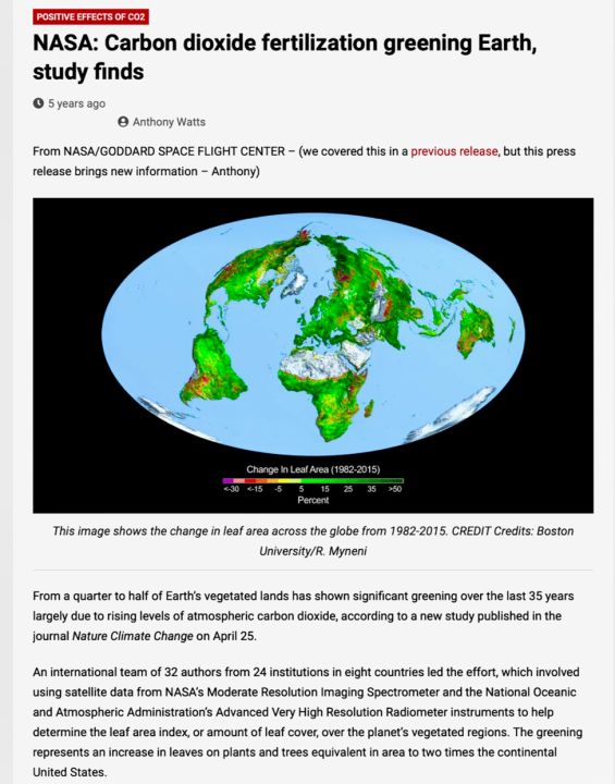
Facebook conceals NASA Earth Observatory satellite data that shows greater global atmospheric CO2 is increasing greening of the earth as shown in their analysis below.
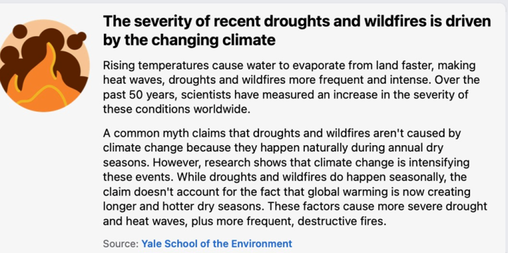
Another Facebook “Facts about climate change” claims that climate change is increasing the severity of droughts and wildfires.
Regional and global data confirm that droughts are not increasing in severity or occurrence frequency at either the regional or global level as shown below from both EPA and UN IPCC drought index data.
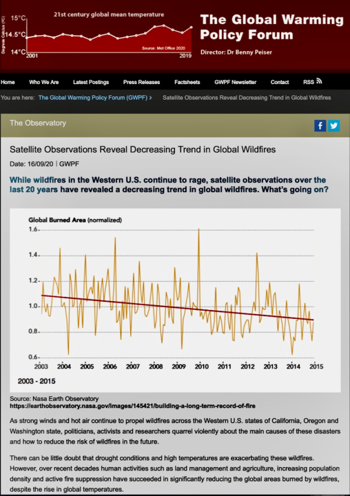
Additionally, data from NASA’s Earth Observatory satellites shows that there is no increasing trend of global wildfires but in fact there is a measured declining wildfire data trend as shown below.
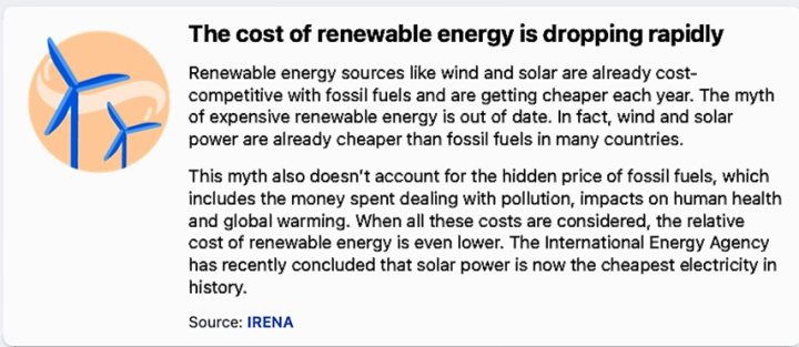
Another Facebook “Facts about climate change” makes the absurd claim that the cost renewable energy is dropping rapidly.
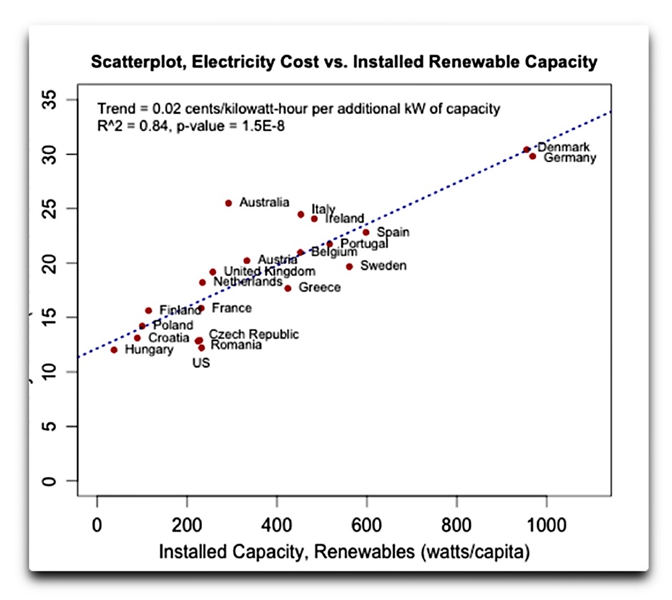
As the energy and reliability debacle of the UK and EU continues to harshly demonstrate excessive reliance on unreliable, nondispatchable and backup power reliant renewable energy increases electric systems costs dramatically and degrades grid reliability as shown in the analysis below.
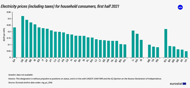
Updated EU electricity price data covering the first half of 2021 shows that Denmark and Germany who have the highest levels of renewable energy of all EU countries have electricity prices about 40% higher than the EU average (shown below) and nearly 3.5 times greater than those of the U.S.
So much for Facebooks phony propaganda claim – “The myth of expensive renewable energy is out of date.”
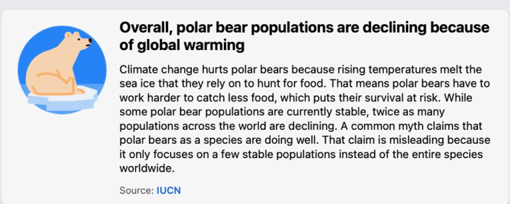
Facebook also has “Facts about climate change” hyping the same old incompetent Al Gore Polar Bear declining population propaganda baloney.
Dr. Susan Crockford has the most up to date survey data regarding Polar Bear populations which directly addresses the Facebook gravely out of date information regarding this subject. A summary of her results are provided below which concludes depending on location these populations are stable and growing despite declining sea ice conditions.
“Crockford, S.J. 2021. The State of the Polar Bear Report 2020. Global Warming Policy Foundation Report 48, London.
London, 27 February: A prominent Canadian zoologist says that Facebook’s information is gravely out of date and 2020 was another good year for polar bears.
In the State of the Polar Bear Report 2020, published by the Global Warming Policy Foundation (GWPF) on International Polar Bear Day, zoologist Dr. Susan Crockford explains that while the climate change narrative insists that polar bear populations are declining due to reduced sea ice, the scientific literature doesn’t support such a conclusion.
Crockford clarifies that the IUCN’s 2015 Red List assessment for polar bears, which Facebook uses as an authority for ‘fact checking’, is seriously out of date. New and compelling evidence shows bears that in regions with profound summer ice loss are doing well.
Included in that evidence are survey results for 8 of the 19 polar bear subpopulations, only two of which showed insignificant declines after very modest ice loss. The rest were either stable or increasing, and some despite major reductions in sea ice. As a result, the global population size is now almost 30,000 – up from about 26,000 in 2015.
Dr. Crockford points out that in 2020, even though summer sea ice declined to the second lowest levels since 1979, there were no reports of widespread starvation of bears, acts of cannibalism, or drowning deaths that might suggest bears were having trouble surviving the ice-free season.”
The Facebook “Climate science center” is nothing but climate alarmist propaganda, speculation and opinion devoid of credible scientifically supported data and analysis and just a continuation of its biased and scientifically incompetent climate alarmist political campaign that led to their falsely and inaccurately “Fact Checking” peer reviewed climate science as noted in a prior WUWT article shown below.
The Facebook organization is completely incapable of contributing credible, accurate or noteworthy assessments of climate science information and its “Climate science center” as demonstrated by this essay is simply pure climate alarmist political propaganda trying to disguise itself as “science.”
The UK could become much more vulnerable to price shocks and geopolitical events unless new offshore fields are approved and developed—and the UK’s gas production could plummet by 75 percent by 2030, the offshore energy industry body OGUK said on Thursday.
Without new investment in new gas fields in the North Sea, the UK will be left more vulnerable to crisis, such as the current one between Russia and Ukraine, the industry association noted.
Additional price shocks would add to the ongoing energy crisis in the UK where gas and power suppliers are going bust, while customers face a cost-of-living crisis when the energy market regulator Ofgem raises the price cap on energy bills as of April 1. The worst is yet to come for consumers in April, when millions of households would be thrown into energy poverty, with many people having to choose between eating and heating.
Domestic production currently meets 47 percent of the UK’s gas demand, 31 percent comes from pipeline imports from Europe, mostly from Norway, and 21 percent from LNG imports. In 2020, Russia supplied 3.4 percent of the UK’s gas, OGUK said.
According to the industry body, new fields are needed in the UK North Sea to stave off a predicted 75-percent plunge in domestic supplies if no new fields are approved. Many fields remain to be tapped, according to geological surveys. Such fields are estimated to contain oil and gas equivalent to 10-20 billion barrels of oil—enough to sustain production for 10-20 years, OGUK said.
“In the longer term, if UK gas production is allowed to fall as predicted, then our energy supplies will become ever more vulnerable to global events over which we have no control – as we now see happening with Russia’s threatened invasion of Ukraine,” OGUK Energy Policy Manager Will Webster said on Thursday.