Guest essay by Eric Worrall
NASA is promoting the Ed Hawkins Climate Spiral, climate propaganda art which uses a cherry picked interval and scaling and some nice bright angry reds to make climate change look scary.
Watch Global Temperatures Spiral Out of Control in New Climate Change Animation
CARLY CASSELLA 16 MARCH 2022
Climate change is spiraling out of control, and that’s never been easier to see.
A winding coil of global temperatures spanning 1880 to 2021 is practically a maelstrom of menace.
The animation is based on data from NASA’s GISS Surface Temperature Analysis and was designed by climate scientist Ed Hawkins, who is known for putting together the original climate stripes.
…
The following is latest Hawkins spiral on Youtube;
WUWT’s critique of the original Hawkins spiral is available here.
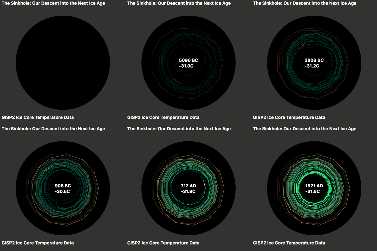
The short time period is the giveaway. If you look at a longer period, like the last 10,000 years or so, the spiral looks very different. I produced this graph in 2016, in response to the original Hawkins spiral.

My GISP2 spiral graph is just as guilty of cherry picked scale and interval as Hawkins’ spiral, and from memory I got my dates slightly wrong. But I think it is funny to show the two spirals next to each other, to demonstrate how easily a visual representation of climate data can be manipulated to create an impression of two completely opposite scenarios.
What can I say – if NASA is dusting off a hoary old propaganda piece like the Ed Hawkins climate spiral, they must really be getting desperate.
via Watts Up With That?
March 19, 2022 at 12:07AM
