
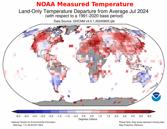
NOAA measured land temperatures in July were a mixture of warm and cold, but NOAA tampered with the data to create a bright red map.


map-percentile-mntp-202407.png (990×765)
The next map masks off the claimed ocean temperatures. NOAA erased the cold in Australia, Africa. South America, Alaska and Siberia, and they created imaginary heat in Greenland, Africa, Antarctica, and many other places.

About Tony Heller
Just having fun
This entry was posted in Uncategorized. Bookmark the permalink.
via Real Climate Science
August 17, 2024 at 04:01PM
