
So says the Institute and Faculty of Actuaries.
Every year.
Every year – at least for the last three, I haven’t looked further back – they produce a report that is a glossy, broad-brush, almost unreadable, partisan, hysterical fantasy tale of present and future climate-related risks.
This year: Planetary Solvency – finding our balance with nature
Thesis: The risk of Planetary Insolvency looms unless we act decisively. Without immediate policy action to change course, catastrophic or extreme impacts are eminently plausible, which could threaten future prosperity.
Last year: Climate Scorpion – the sting is in the tail
Thesis: The actuarial approach can be used for climate change. It begins by outlining how actuaries deal with extreme, ruinous risks, what this means for climate change, what we do and don’t know about the physical impacts, tipping points and social knock-on effects of climate change, and what actions we can take to manage the risk.
2023: The Emperor’s New Climate Scenarios
Thesis: Climate tipping points are a growing threat, and the solution to climate change has to be equally discontinuous. We need to “operationalise” positive tipping points.
All three are a fricassee of pretty diagrams and alarmist nonsense. You might expect actuarial science to be as dry as old bones, for numbers to be crunched unemotionally, rigorously, for data to tell all, and fantasy to tell nothing. Well, the things they put in their shop window show otherwise.
Take this comment from “Planetary Insolvency”:
For example, in The Emperor’s New Climate Scenarios a methodology based on a technique known as reverse stress testing suggests to ‘expect 50% GDP destruction – somewhere between 2070 and 2090’.
Does anybody seriously expect >50% GDP destruction? It is a ludicrous suggestion.
The source they refer to, their own Emperor’s New Climate Scenarios, says:
Put another way, at what point do we expect 50% GDP destruction – somewhere between 2070 and 2090 depending on how you parameterise the distribution.
Parameterise? Distribution?
This is the relevant figure from Emperor’s:

Where do these lines come from you ask? Here is their explanation:
A relatively simple log damage function could be used that assumes 100% GDP loss at a certain level of warming, say 6˚C, 5˚C, or 4˚C, although some may argue that even 3˚C would be extremely challenging to adapt to, and certainly sensitivities should be undertaken at all of these. Figure 9 above, adapted from analysis undertaken by Carbon Tracker, illustrates this, as well as comparing the output with the current quadratic damage function used by economists.
So the answer is: you create a logistic function that hits 100% at 4C, and then use that to show that in 2070 the world should expect a 50% GDP destruction. The curve itself has no basis in anything: it is a line plucked unceremoniously from an unmentionable orifice.
Why logistic? Why not exponential? I fear our actuarial alarmists are missing a trick here. Why should the damage slope start to level off after it reaches 50%?
Yes, Jit, I hear you say in your most soothing voice, desperately trying to gently calm the agitated patient. But this is just an illustration. It’s a scenario, just put there to facilitate discussion. It’s not an actual attempt to model anything. No-one really believes it.
Except the Institute and Faculty of Actuaries do, as they made clear in the press release accompanying this year’s dose of claptrap:
The global economy could face a 50% loss in GDP between 2070 and 2090, unless immediate policy action on risks posed by the climate crisis is taken.
I’m not going to dwell on these reports – I don’t think they deserve it. But I will pull out a few things from the most recent. Ya know, things that caught my eye as I skimmed down the page, waiting for it to get better.
Word of the report: “polycrisis,” which has four uses, apparently none of them ironic.
Their Figure 9 shows that under a tipping point of AMOC collapse and 2.5C of warming, the Antarctic Peninsula will be suitable for growing wheat:
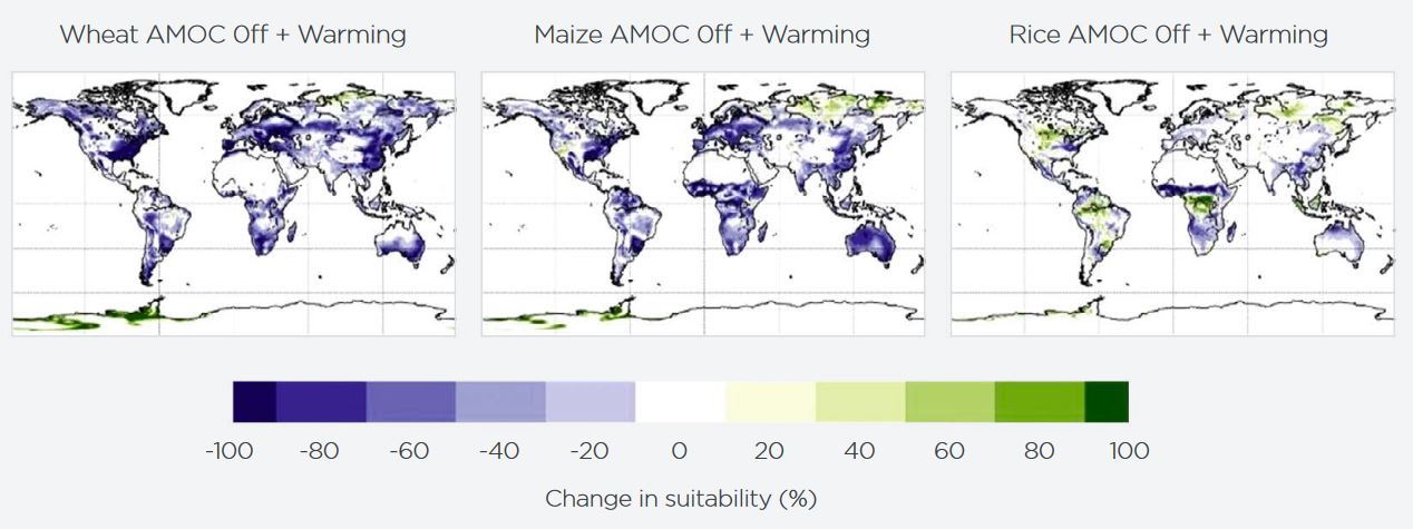
However, it looks as if nowhere else in the world will be. The magic of tipping points! Crank up that alarm, go on. Ah, but it’s just a scenario. Just an illustration. No-one really believes it might happen. But they do, as the report makes clear:
Some scientists estimate there is a 45% chance of a collapse in key ocean current circulations, possibly as early as 2040, which is ‘unignorably high’. Impacts would include significant reductions in the northern hemisphere in staple crop-growing capability.
For Climate, the risk matrix they provide gives a “highly likely” chance of “limited” to “severe” impacts in 2025 – i.e., now.

Highly likely means >90% chance; as to the impacts themselves, see their risk matrix:
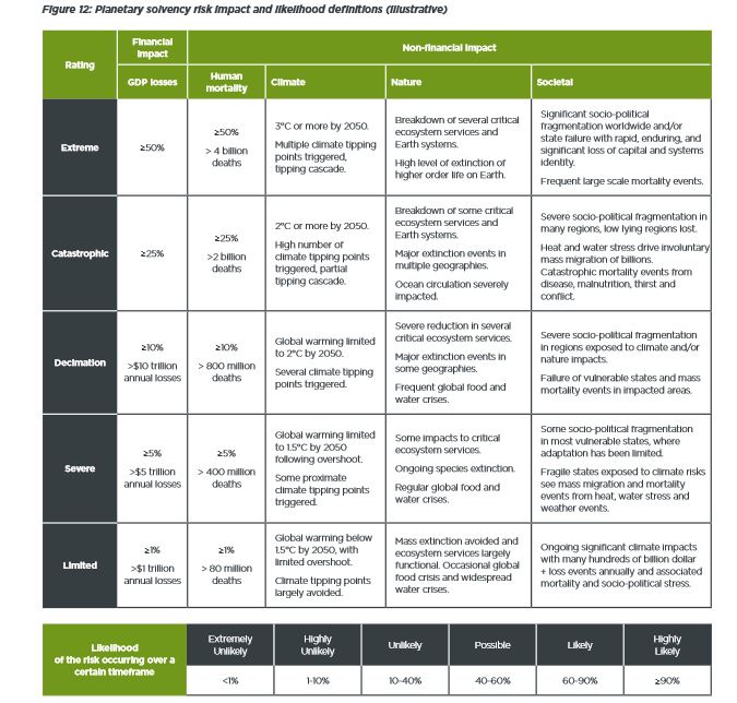
So, it’s terrible now. But by 2050, we’re into >50% mortality fantasy apocalypse land. I know! I exaggerated in the title. We’re not all doomed. Only half of us are.
And finally, especially for our resident Black Swan aficionado John R, I present a figure (from 2024’s “Scorpion”) that seems to imply that the tails of a parametric distribution are Black Swans.

Featured image: the webcam at Longyearbyen Harbour this morning. The BBC were today telling us how worried they were that Svalbard has been so unseasonably warm this early February. [In a story about record-low sea ice extent globally.]
via Climate Scepticism
February 15, 2025 at 11:16AM
