Big Battery prices on fire in Australia last quarter
The Renewable Crash Test Dummy suffers yet another nasty price surprise. We have more batteries than last year but the average price per megawatt hour has doubled.
In June there were a few hellfire price spikes where the prices on the National Energy Market launched up to an obscene $10,000 a megawatt-hour and then levitated there for hour after hour. These spikes had a width like we rarely see. Now, with the latest AEMO Quarterly Report we know that the spikes were due to the batteries.
On the left, the price spike of June 26th. On the right, the timing of the battery discharging…
And just so everyone can see how much energy the batteries provided — note the patch marked “Battery” below in the daily load curve of June 26th. The black line across the top is “total demand”. Most of the area under that curve was provided by the evil, but reliable, fossil fuels. Batteries contributed just 0.7% of total NEM generation.
Anero.id
These spikes were so bad they moved the quarterly average costs
In this post we will examine the idea that ocean and atmospheric oscillations are random internal variability, except for volcanic eruptions and human emissions, at climatic time scales. This is a claim made by the IPCC when they renamed the Atlantic Multidecadal Oscillation (AMO) to the Atlantic Multidecadal Variability (AMV) and the PDO to PDV, and so on. AR6 (IPCC, 2021) explicitly states that the AMO (or AMV) and PDO (or PDV) are “unpredictable on time scales longer than a few years” (IPCC, 2021, p. 197). Their main reason for stating this and concluding that these oscillations are not influenced by external “forcings,” other than a small influence from humans and volcanic eruptions, is that they cannot model these oscillations, with the possible exceptions of the NAM and SAM (IPCC, 2021, pp. 113-115). This is, of course, a circular argument since the IPCC models have never been validated by predicting future climate accurately, and they also make some fundamental assumptions that simply aren’t true.
They also state that the variance over the observational records in the Pacific and Atlantic exhibit no significant changes (IPCC, 2021, p. 114). This is disputed in the peer-reviewed literature (Ghil, et al., 2002), (Scafetta, 2010), (Mantua, et al., 1997), and (Gray, et al., 2004). All the listed sources, and many others, found the AMO, PDO, ENSO, or the global mean surface temperature (GMST) oscillations to be statistically significant at the 95% level or higher, usually by comparing them to red or white noise.
While AR6 WGI (page 196) believes that the statistical significance of a change in climate (a signal to noise ratio greater than one) can be estimated with either observations or models, I believe only observations should be used. For the purposes of this post, a trend in observations will be tested versus a mean state with no definable time period, like white noise. That is, it covers all frequencies equally. We will also refer to “red noise,” which is like white noise, but has a higher content of lower frequencies and provides a stricter test than white noise (Ghil, et al., 2002).
At the other extreme is a perfect cycle that never varies in frequency. None of the oscillations are perfect cycles, the periods do vary. So, what we want is to measure how close the oscillation is to a perfect cycle and how far away it is from white or red noise. The statistical significance of observed oscillations varies considerably.
Finally, oscillations are inconsistent with anthropogenic greenhouse gas emissions as a dominant forcing of climate change. Greenhouse gas emissions do not oscillate; recently they have only increased with time. So, we will examine the relationship between solar and orbital cycles and the climate oscillations. As Scafetta and Bianchini (2022) have noted, there are some very interesting correlations between solar activity and planetary orbits, and climate changes on Earth.
Correlations with solar and planetary forces
Nicola Scafetta has identified strong climate oscillation frequencies with periods of ~9, ~20, and ~60 years that closely correspond to the orbital periods of the Moon, the rather complex movement of the Sun around the barycenter of the solar system, and the orbits of Jupiter, and Saturn (Scafetta, 2010). Frank Stefani has written about how the beat between the 22.14-year Hale solar cycle and the complex 19.86-year path of the Sun around the solar system barycenter can explain the ~193-year Suess-de Vries and two Gleissberg-type cycles close to 90 and 60 years. The computed periods turned out to be in amazing agreement with those derived from climate-related sediment data from Lake Lisan (see Figure 9 in Stefani et al., 2024) and may also explain the pacing of the Little Ice Age solar grand minima. The grand minima are plotted in figure 2 or the featured image of this post, also see (Stefani, et al., 2024).
The astronomical periods mentioned above all correlate, in phase, with observed climate oscillations on Earth. However, it is very unlikely that they are the only external influences affecting climate, probably volcanic eruptions, greenhouse gases, and true internal variability play a role as well. Further, our inability to measure climate change accurately plays a role in determining how Earth’s climate state changes with time. As we have seen in this series, the global mean surface temperature or GMST is a poor measure of the state of global or regional climate.
While internal variability may play a role in our observed oscillations, it is possible that gravitational forces and changes in solar output provide the pacing of the oscillations. Since all climate oscillations clearly influence the others through a mechanism named “teleconnections,” if the pacing of a few of the oscillations is driven by gravity, tides, and solar variability, then the pacing can be transmitted to all of them.
Major teleconnection patterns are large scale Rossby waves that can last for months and sometimes persist around the entire planet. They define the “waviness” of the jet streams and thus the weather in the mid-latitudes, especially in winter. They vary on all time scales, daily, monthly, annually, and decadally. The illustration in figure 1, from climate.gov, shows a Rossby planetary wave. If you’ve read the previous Climate Oscillation posts (see the full list at the bottom of this post) you will recognize how closely related Rossby waves are to the oscillation patterns I have been writing about.
Figure 1. An illustration of a Rossby wave from climate.gov. The waves create alternating high and low pressure regions. These regions can move over long periods of time and the movement can be seen in many climate oscillations.
Rossby waves can create a sort of domino effect through all major hemispheric oscillations as described by Marcia Wyatt’s “stadium wave” hypothesis (Wyatt, et al., 2012a) and (Wyatt & Curry, 2014). Unfortunately, the fact that multiple extraterrestrial forces are contributing to affect our climate patterns and Rossby waves are not static, and they vary in sometimes unpredictable ways, the resulting climate oscillations vary in period and strength as we have seen in the earlier posts of this series.
If we define “global climate change” as the observed changes in HadCRUT5 or BEST global mean surface temperature (GMST) as the IPCC does, then the oscillations that correlate best are the AMO and the global mean sea surface temperature (SST) as shown in figure 2. None of the other oscillations correlate well with GMST.
Figure 2. Detrended HadCRUT5 compared to the detrended world ocean mean SST and the AMO.
In figure 2, the gray curve is a 64-year cosine function. It fits the 20th century data but departs significantly around 2005 and before 1878. The early departure could be due to poor data, the 19th century temperature data is very bad, see figure 11 in (Kennedy, et al., 2011b & 2011). Data quality problems still exist today, but are much less of a factor and the departure after 2005 is likely real and could be caused by any combination of the of the two following factors:
Human-emitted greenhouse gases.
The full AMO/world SST/GMST period is longer and/or more complex than we can see with only 170 years of data.
It is probably a combination of the two. As discussed by Scafetta and Stefani, climate, orbital, and solar cycles are known to exist that are longer than 170 years. The fact that I had to detrend all the records shown in figure 2 testifies to that. It is also noteworthy that the ENSO ONI trend since 2005 is trending down; as shown in the last post. So is the current PDO trend. All the notable oscillations are not synchronized, teleconnections or not, climate change is not simple. The trends in figure 2 result from complex combinations of gravitational forces and teleconnections (Scafetta, 2010), (Ghil, et al., 2002), and (Stefani, et al., 2021).
60-70-year oscillations
In the twentieth century the AMO appears to have a period of about ~64 years, ±5 years (Wyatt, et al., 2012). The same ~64-year period fits HadCRUT5 and the global average SST record as shown in figure 2. Scafetta illustrates a similar ~61-year oscillation in GMST and highlights its match to the Sun’s speed around the center of mass of the solar system (SCMSS), as shown in figure 10 in Scafetta (2010). Of the oscillations studied in this series, the AMO, global SST mean, and HadCRUT5 are unique in that they do not have a strong frequency content in the 5–25-year bands (Gray, et al., 2004).
Marcia Wyatt’s “stadium wave” hypothesis shows that a suite of global and regional climate indicators vary over roughly the same 64-year period (Wyatt, 2020), (Wyatt, et al., 2012a), and (Wyatt & Curry, 2014). Although the climate indicators have about the same period, they are offset from one another in time. Using data from the 20th century, the AMO, global SST, and HadCRUT5 have lows in 1904-1911 and 1972-1976.
Figure 3. Frequency analysis of the HadCRUT3 GMST record from 1850-2009. Source: (Scafetta, 2010).
Nicola Scafetta did the frequency analysis of the HadCRUT3 global mean surface temperature shown in figure 3. It shows that the roughly ~60-year periodicity in GMST is present in the record with a confidence of 99% when compared to red noise.
As we can see in figure 2, the ~64-year period does seem to have broken down over the past 20 years. Scafetta provides a good summary of the evidence for a ~60-year global climate oscillation and establishes that this period is significant at the 99% level. What we might be seeing at the end of the record in figure 2 is the influence of CO2, the strong 2016 El Niño, the Hunga Tonga volcanic eruption, and a smaller natural temperature maximum that follows the 60-year maximum by ~20 years (ie. 2020-25) that was predicted in Scafetta (2010) in his figure 10.
As Scafetta and Bianchini note, the ~60-year cycle has been known since antiquity, Johannes Kepler mentioned it in his writings in 1606. Scafetta also provides a list of several climate and environmental series that have a strong ~60-year period component, including G. Bulloides abundance in the Caribbean Sea since 1650, berylium-10 and carbon-14 records, as well as in Earth’s angular velocity and magnetic field (Scafetta, 2010). The ~60-year cycle may be related to the orbits of Jupiter and Saturn (Scafetta & Bianchini, 2022).
The specific mechanism behind the ~60- or ~64-year oscillation is unknown. However, Scafetta (2021) has proposed a reason the modern oscillation is 64 years, whereas the historical cycle is closer to 60 years. Using data from the CMIP5 models, he removed the anthropogenic greenhouse gas (using an ECS of 1.5°C/2xCO2) and volcanic forcings and the oscillation moved from 64 years to 60. He concluded that the natural oscillation is about 60 years. His analysis shows that the CMIP climate models are missing an important natural climate change forcing. That is, the changes in insolation due to changes in the Sun, which, in turn, are due to planetary orbital patterns. Once the solar changes are incorporated into the model the computed ECS is cut in half to about 1.5°C/2xCO2, which fits the ECS values computed from observations.
20-30-year oscillations
Nathan Mantua and colleagues (Mantua, et al., 1997) identified 20th century “climate shifts” in the PDO in 1925, 1947, and 1977, which results in a major multidecadal climate oscillation of 22 to 30 years. We identified two additional possible PDO shifts in 1898 and 1997 in post 8 of this series. The average difference is around 25 years. A 25-year period is shown with a 5-year-smoothed PDO in figure 4.
Figure 4. ERSST v5 PDO, the recognized Pacific climate shifts are noted on the plot as well as the more speculative 1898 and 1997 possible shifts.
Solar and orbital oscillations of ~20- and ~30-years, that correlate with climate oscillations like the PDO, have been observed (Scafetta, 2014). These solar cycles are near the PDO oscillation shown in figure 4.
The 2-, 5-, 9-, and 11-year oscillations
Frank Stefani and colleagues and Nicola Scafetta and Antonio Bianchini (2022) make convincing cases that the Schwabe 11.07-year solar cycle is built from Jupiter and Saturn (9.93 years), Jupiter alone (11.86 years), and/or the periodic linear alignment of Earth, Venus, and Jupiter. According to Nicola Scafetta, the fact that the 11-year Schwabe solar cycle is related to the “influences of Venus, Earth, Jupiter and Saturn,” was proposed by Johann Rudolph Wolf as early as 1859 (Scafetta & Bianchini, 2022).
There is a statistically strong period of 9 to 9.2 years in most temperature records, and this periodicity matches half the lunar-solar orbital cycle, thus the periodicity matches the pattern of strong lunar tides on Earth and the periodicity is evident in ocean records (Scafetta, 2010). Besides lunar tides, evidence that a Jupiter-type planet can induce a 9-year activity cycle in any star has been known for some time (Scafetta, 2014).
The two dominant periods in the ENSO SOI (similar to the ONI discussed in post 11) are 2.4 and 5.5 years. Both periods are significant at the 99% level (Ghil, et al., 2002). GMST also shows a significant period of about 5.5 years. The speed of the sun around the center of mass of the solar system also has a significant period of 5.5 years (Scafetta, 2010).
The QBO (the Quasi-Biennial Oscillation) has an average period of 28 months or 2.3 years. This is a stratospheric wind that circles the globe in the tropics. It changes direction from easterly to westerly about every 28 months and this periodic change is called the QBO. The QBO is important for seasonal weather forecasting, it exerts a considerable effect on stratospheric ozone, and it influences how the sun affects Earth’s climate (see the discussion here). Exactly how solar activity affects the QBO is unknown. Interestingly, though, Frank Stefani explains the solar pendant of the QBO in terms of the 1.723-year beat period of the two-planet tidal forcings from Venus, Earth, and Jupiter. This number agrees strikingly with the observed period of sporadic relativistic solar particles detected at the Earth’s surface by cosmic ray detectors. These solar particle events (called “Ground Level Enhancement” events) occur preferentially in the positive phase of the QBO and have a beat period of 1.73-year (Herrera, et al., 2018) or 1.724 years (Stefani, et al., 2025).
Discussion
The causes of climate change are a complex mixture of many natural cycles, perhaps some human activities, and natural variability. This is far more sensible than “CO2 done it,” which is still what many believe today. Exactly how climate change works is still unknown, but fortunately much more research into natural causes is being done today than in the past. This series was meant to bring my readers up to date on the quest. One thing is for sure; climate is a regional long-term trend, it is not global mean surface temperature!
The oscillations described in this series are not internal variability with a little push here and there from manmade greenhouse gas emissions or volcanic eruptions, as proposed by Michael Mann (2021). They are too regular, and many can be traced back thousands of years through proxies. They also correlate extremely well with environmental changes that can be traced into the past (Ebbesmeyer, et al., 1990) and (Scafetta, 2010). Finally, they affect one another through teleconnections that themselves have statistically significant decadal to multidecadal oscillations.
The strong climate oscillations correlate quite well with planetary motions that have major periods of about 11, 12, 15, 20-22, 30, and 61 years. These cycles are related to the orbital patterns of Jupiter, Saturn, and Earth (Scafetta, 2010). The 11- and 22-year periods are also the well-known Schwabe and Hale cycles. The common 9.1-year cycle is related to the long-term orbital motion of the Moon.
The roughly 60-year oscillation that is so prominent in many records is likely the most powerful, it can be seen in the length-of-day (see post 4), auroral records (Scafetta, 2012c), berylium-10 and carbon-14 records, as well as global climate oscillations and in the stadium wave. The exact mechanism of how it affects climate is unknown. The second most powerful oscillation is the 20-22-year oscillation probably powered by the previously mentioned solar path around the solar system barycenter and the 22-year Hale solar cycle. Besides the shorter solar/climate oscillations mentioned in this post, there are longer oscillations or cycles that can be seen in climate proxies. Some of the most important are discussed here.
As mentioned previously in this series, the observed climate oscillations are not reproduced well in the CMIP climate models. Scafetta provides a good analysis of the model problems in (Scafetta, 2012c).
The climate oscillations described in this series are real and they do correlate with planetary movements and known solar cycles. It is reasonable to assume that the planetary orbits and solar cycles are helping to pace the oscillations and/or cause them. Proxies have shown that most of the oscillations can be traced back in time hundreds or thousands of years with some confidence, thus the inability of the CMIP climate models to reproduce them destroys the models’ credibility. The attempts by the IPCC, and others, to claim the oscillations are “natural variability” and not forced or paced by the Sun and planetary orbits, makes no sense.
Climate change and climate itself is a complex, poorly understood, dance of regional oscillations around the world. The dance is choreographed by teleconnections that themselves vary decadally. Each oscillation and teleconnection influences the others to some degree as alluded to in Marcia Wyatt’s papers. On a global scale, they dance their way through a roughly 64-year global oscillation. This is the way the world has worked for millions of years, and we will never be able to understand how humans influence climate until we understand exactly how these natural oscillations work. Proclaiming that we control the climate without first understanding how nature works is a fool’s errand.
This post has been reviewed by Nicola Scafetta and Frank Stefani who suggested some very useful corrections and additions. I am indebted to them, but any remaining errors are mine alone.
The post below updates the UAH record of air temperatures over land and ocean. Each month and year exposes again the growing disconnect between the real world and the Zero Carbon zealots. It is as though the anti-hydrocarbon band wagon hopes to drown out the data contradicting their justification for the Great Energy Transition. Yes, there was warming from an El Nino buildup coincidental with North Atlantic warming, but no basis to blame it on CO2.
As an overview consider how recent rapid cooling completely overcame the warming from the last 3 El Ninos (1998, 2010 and 2016). The UAH record shows that the effects of the last one were gone as of April 2021, again in November 2021, and in February and June 2022 At year end 2022 and continuing into 2023 global temp anomaly matched or went lower than average since 1995, an ENSO neutral year. (UAH baseline is now 1991-2020). Then there was an usual El Nino warming spike of uncertain cause, unrelated to steadily rising CO2, and now dropping steadily back toward normal values.
For reference I added an overlay of CO2 annual concentrations as measured at Mauna Loa. While temperatures fluctuated up and down ending flat, CO2 went up steadily by ~65 ppm, an 18% increase.
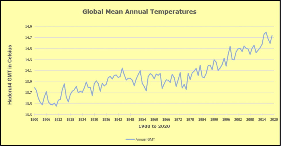
Furthermore, going back to previous warmings prior to the satellite record shows that the entire rise of 0.8C since 1947 is due to oceanic, not human activity.
The animation is an update of a previous analysis from Dr. Murry Salby. These graphs use Hadcrut4 and include the 2016 El Nino warming event. The exhibit shows since 1947 GMT warmed by 0.8 C, from 13.9 to 14.7, as estimated by Hadcrut4. This resulted from three natural warming events involving ocean cycles. The most recent rise 2013-16 lifted temperatures by 0.2C. Previously the 1997-98 El Nino produced a plateau increase of 0.4C. Before that, a rise from 1977-81 added 0.2C to start the warming since 1947.
Importantly, the theory of human-caused global warming asserts that increasing CO2 in the atmosphere changes the baseline and causes systemic warming in our climate. On the contrary, all of the warming since 1947 was episodic, coming from three brief events associated with oceanic cycles. And in 2024 we saw an amazing episode with a temperature spike driven by ocean air warming in all regions, along with rising NH land temperatures, now dropping below its peak.
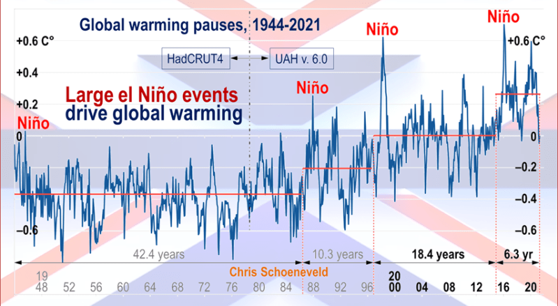
Chris Schoeneveld has produced a similar graph to the animation above, with a temperature series combining HadCRUT4 and UAH6. H/T WUWT
With apologies to Paul Revere, this post is on the lookout for cooler weather with an eye on both the Land and the Sea. While you heard a lot about 2020-21 temperatures matching 2016 as the highest ever, that spin ignores how fast the cooling set in. The UAH data analyzed below shows that warming from the last El Nino had fully dissipated with chilly temperatures in all regions. After a warming blip in 2022, land and ocean temps dropped again with 2023 starting below the mean since 1995. Spring and Summer 2023 saw a series of warmings, continuing into 2024 peaking in April, then cooling off to the present.
UAH has updated their TLT (temperatures in lower troposphere) dataset for July 2025. Due to one satellite drifting more than can be corrected, the dataset has been recalibrated and retitled as version 6.1 Graphs here contain this updated 6.1 data. Posts on their reading of ocean air temps this month are behind the update from HadSST4. I posted recently on SSTs June 2025 Ocean SSTs: NH Warms, SH Cools.These posts have a separate graph of land air temps because the comparisons and contrasts are interesting as we contemplate possible cooling in coming months and years.
Sometimes air temps over land diverge from ocean air changes. In July 2024 all oceans were unchanged except for Tropical warming, while all land regions rose slightly. In August we saw a warming leap in SH land, slight Land cooling elsewhere, a dip in Tropical Ocean temp and slightly elsewhere. September showed a dramatic drop in SH land, overcome by a greater NH land increase. 2025 has shown a sharp contrast between land and sea, first with ocean air temps falling in January recovering in February. Then land air temps, especially NH, dropped in February and recovered in March. Now in July SH ocean dropped markedly, pulling down the Global ocean anomaly despite a rise in the Tropics. SH land also cooled by half, driving Global land temps down despite Tropics land warming.
Note: UAH has shifted their baseline from 1981-2010 to 1991-2020 beginning with January 2021. v6.1 data was recalibrated also starting with 2021. In the charts below, the trends and fluctuations remain the same but the anomaly values changed with the baseline reference shift.
Presently sea surface temperatures (SST) are the best available indicator of heat content gained or lost from earth’s climate system. Enthalpy is the thermodynamic term for total heat content in a system, and humidity differences in air parcels affect enthalpy. Measuring water temperature directly avoids distorted impressions from air measurements. In addition, ocean covers 71% of the planet surface and thus dominates surface temperature estimates. Eventually we will likely have reliable means of recording water temperatures at depth.
Recently, Dr. Ole Humlum reported from his research that air temperatures lag 2-3 months behind changes in SST. Thus cooling oceans portend cooling land air temperatures to follow. He also observed that changes in CO2 atmospheric concentrations lag behind SST by 11-12 months. This latter point is addressed in a previous post Who to Blame for Rising CO2?
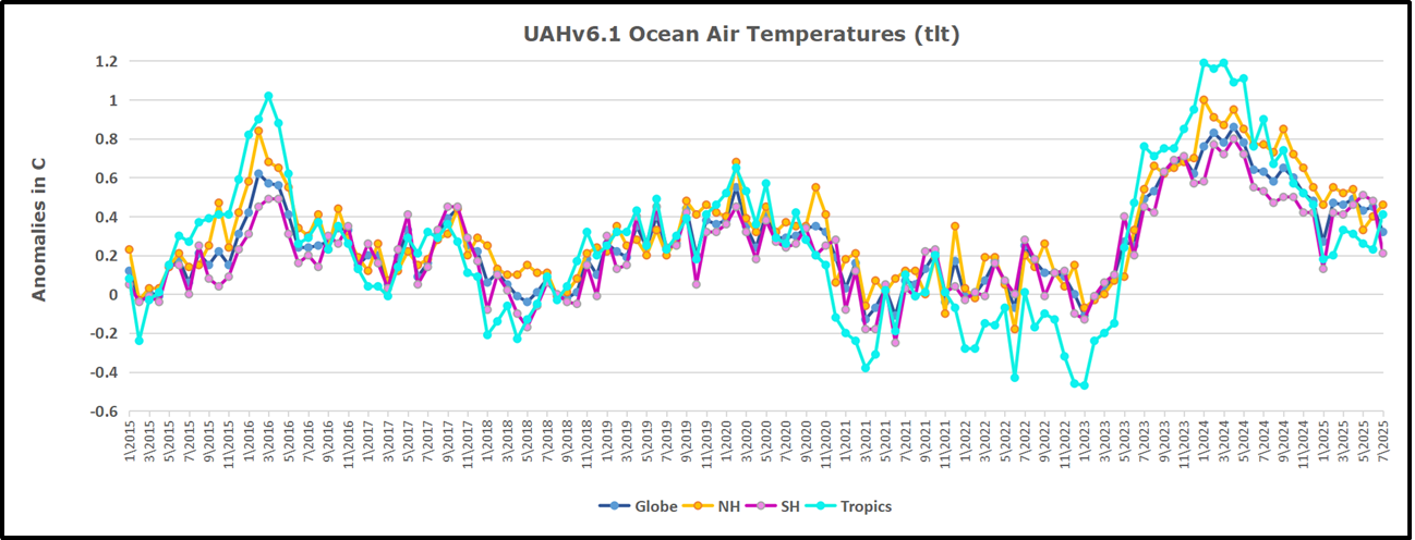
After a change in priorities, updates are now exclusive to HadSST4. For comparison we can also look at lower troposphere temperatures (TLT) from UAHv6.1 which are now posted for July 2025. The temperature record is derived from microwave sounding units (MSU) on board satellites like the one pictured above. Recently there was a change in UAH processing of satellite drift corrections, including dropping one platform which can no longer be corrected. The graphs below are taken from the revised and current dataset.
The UAH dataset includes temperature results for air above the oceans, and thus should be most comparable to the SSTs. There is the additional feature that ocean air temps avoid Urban Heat Islands (UHI). The graph below shows monthly anomalies for ocean air temps since January 2015.
In 2021-22, SH and NH showed spikes up and down while the Tropics cooled dramatically, with some ups and downs, but hitting a new low in January 2023. At that point all regions were more or less in negative territory.
After sharp cooling everywhere in January 2023, there was a remarkable spiking of Tropical ocean temps from -0.5C up to + 1.2C in January 2024. The rise was matched by other regions in 2024, such that the Global anomaly peaked at 0.86C in April. Since then all regions have cooled down sharply to a low of 0.27C in January. In February 2025, SH rose from 0.1C to 0.4C pulling the Global ocean air anomaly up to 0.47C, where it stayed in March and April. In May drops in NH and Tropics pulled the air temps over oceans down despite an uptick in SH. At 0.43C, ocean air temps were similar to May 2020, albeit with higher SH anomalies. Now in July Global temps are down to 0.32C due to SH dropping from 0.48C to 0.21C.
Land Air Temperatures Tracking in Seesaw Pattern
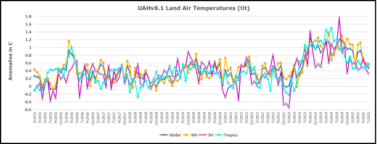
We sometimes overlook that in climate temperature records, while the oceans are measured directly with SSTs, land temps are measured only indirectly. The land temperature records at surface stations sample air temps at 2 meters above ground. UAH gives tlt anomalies for air over land separately from ocean air temps. The graph updated for July is below.
Here we have fresh evidence of the greater volatility of the Land temperatures, along with extraordinary departures by SH land. The seesaw pattern in Land temps is similar to ocean temps 2021-22, except that SH is the outlier, hitting bottom in January 2023. Then exceptionally SH goes from -0.6C up to 1.4C in September 2023 and 1.8C in August 2024, with a large drop in between. In November, SH and the Tropics pulled the Global Land anomaly further down despite a bump in NH land temps. February showed a sharp drop in NH land air temps from 1.07C down to 0.56C, pulling the Global land anomaly downward from 0.9C to 0.6C. In March that drop reversed with both NH and Global land back to January values, holding there in April. In May sharp drops in NH and Tropics land air temps pulled the Global land air temps back down close to February value. In July SH land dropped sharply, down from 0.47C to 0.23C, and NH land also cooled by 0.08C pulling Global land air down as well.
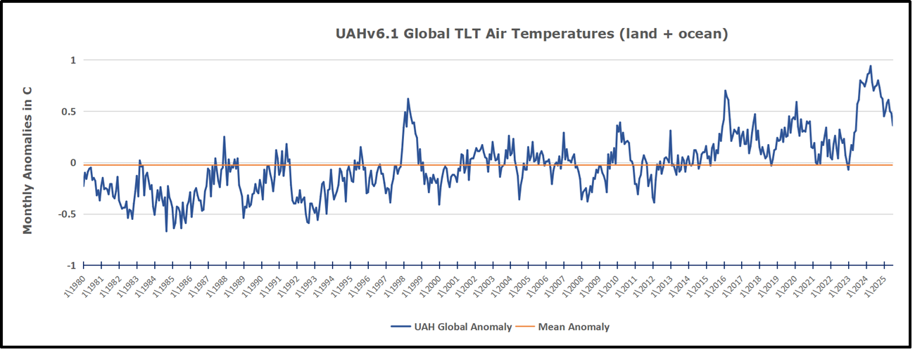
The Bigger Picture UAH Global Since 1980
The chart shows monthly Global Land and Ocean anomalies starting 01/1980 to present. The average monthly anomaly is -0.03, for this period of more than four decades. The graph shows the 1998 El Nino after which the mean resumed, and again after the smaller 2010 event. The 2016 El Nino matched 1998 peak and in addition NH after effects lasted longer, followed by the NH warming 2019-20. An upward bump in 2021 was reversed with temps having returned close to the mean as of 2/2022. March and April brought warmer Global temps, later reversed
With the sharp drops in Nov., Dec. and January 2023 temps, there was no increase over 1980. Then in 2023 the buildup to the October/November peak exceeded the sharp April peak of the El Nino 1998 event. It also surpassed the February peak in 2016. In 2024 March and April took the Global anomaly to a new peak of 0.94C. The cool down started with May dropping to 0.9C, and in June a further decline to 0.8C. October went down to 0.7C, November and December dropped to 0.6C. Now in July Global Land and Ocean is down to 0.36C
The graph reminds of another chart showing the abrupt ejection of humid air from Hunga Tonga eruption.
TLTs include mixing above the oceans and probably some influence from nearby more volatile land temps. Clearly NH and Global land temps have been dropping in a seesaw pattern, nearly 1C lower than the 2016 peak. Since the ocean has 1000 times the heat capacity as the atmosphere, that cooling is a significant driving force. TLT measures started the recent cooling later than SSTs from HadSST4, but are now showing the same pattern. Despite the three El Ninos, their warming had not persisted prior to 2023, and without them it would probably have cooled since 1995. Of course, the future has not yet been written.
One of the most reliable tells in the climate shell game is a government program with a name that promises “carbon” and delivers something suspiciously less concrete. Enter the OCO satellites—Orbiting Carbon Observatories, which, right off the bat, don’t actually measure “carbon.” They measure CO₂. It’s like opening a box labeled “Mystery Steak” and finding tofu.
If you want a tale of cosmic hubris stitched to pure bureaucratic ambition, look no further than NASA’s Orbiting Carbon Observatory satellites—OCO by name, not by actual carbon content. These polished tin cans were launched to spy on atmospheric CO₂ from space, the latest chapter in humanity’s endless fantasy that, if we just measure nature sharply enough, we might finally drag the carbon cycle kicking and screaming under bureaucratic control.
The original OCO was a flame-out before the party started—launched in 2009, it belly-flopped into the Southern Ocean. NASA called this a “launch vehicle anomaly”—which is bureaucratese for “the thing blew up.”
Then, like every Hollywood flop, we got the sequel: OCO-2, plucky and determined, rising phoenix-like in July 2014. Imagine NASA muttering “this time for sure” and clutching its high-resolution spectrometer like a blackjack player eyeing his last stack of chips.
What does OCO-2 do? It chases reflected sunlight—zeroing in on those precise, CO₂-hungry wavelengths the gas loves to slurp up. With this, OCO-2 pulls the ultimate global neighborhood watch: polar sun-synchronous orbit, meaning it goes pole to pole, day after day, circling the globe every sixteen spins of the Earth. The result? Near-global selfies of the planet’s every atmospheric sigh, with precision down to less than one part per million. Yes, it picks out the smallest seasonal burp in CO₂ from the leafy lungs of the world; yes, climate modelers treat its graphs like sacred runes; no, it won’t find your missing car keys.
And then came OCO-3—the inevitable space family photo. Shuttled up to the International Space Station in 2019, this cousin gets to peek sideways, take “action shots” in new viewing geometries, and basically try angles even OCO-2 didn’t dare. Think of it as the satellite version of a go-pro on a skateboard: more, more, always more coverage.
So the OCO saga rolls on—a dazzling dance of technical triumphs, fizzled launches, and a hope bordering on superstition: if we can just catalog the ghostly flux of carbon well enough, maybe we’ll wrestle the climate into submission. It’s noble, in a way. Or maybe it’s just expensive performance art for an audience allergic to low budgets and short stories. Either way, it’s one hell of a ride—assuming you’re not footing the bill.
Now, with the Trump Administration threatening to pull the plug on OCO, the usual suspects are sounding the klaxons—“Catastrophe! The data! The lost science!” Yet, I did what apparently nobody at NASA, NOAA, or CNN ever attempts: I actually looked at what the satellites have coughed up, and whether anyone—any actual person, business, or government—has found these cosmic spreadsheets useful outside of tenure applications and conference circuit PowerPoints.
First, let’s take the case most likely to give the climate alarmists the vapors: a real, honest-to-god, peer-reviewed study that used OCO data to figure out how much more corn, soy, and wheat the Midwest is pumping out thanks to the CO₂ “fertilization effect.” The math, by Taylor and Schlenker, goes like this: for every 1 ppm rise in CO₂ measured from space, corn yields go up 0.5%, soybeans 0.6%, wheat 0.8%. Over the last decade, thanks in part to 20 ppm worth of bonus CO₂, global farmers collected an extra $71.7 billion worth of food, including $4 billion a year for U.S. corn alone. If you’re a wheat farmer, this is the part where you lift your hat and say “Thanks to fossil fuels for all the carbon dioxide!”
But here’s the rub. These dollars aren’t landing in anyone’s account because of OCO. They’re landing because… well, CO₂ went up. The OCO satellites simply told us, after the fact, how green the grass grew. Their role is “observer,” not “rainmaker.” If you’re waiting for a case where a power utility, a city, a trader on the CBOT, or even a budget-stressed county extension officer flipped through OCO’s gigabytes and made a buck, I hope you packed a lunch and a good book.
The supposed “applications” for OCO-2 data beyond academic joyrides? They’re a gospel of indirectness. “National carbon accounting.” “Large-scale scientific assessments.” “Paris Agreement verification.” “Model input.” If you boil this all down, what you get is more paperwork, higher-resolution graphs, and the chance for government ministries to add another decimal point to emission numbers with satellite snapshots. The impact on your life, the price of your groceries, or the peril to your electrical grid? Round off to zero.
Best I can tell, not a single primary source—not NASA, not peer-reviewed journals, not the Paris Agreement’s own secretariat—documents any organization, utility, or corporation making a real-world, real-money decision using OCO data. Every “benefit” is hypothetical, every “application” is a footnote for a climate negotiation PowerPoint, and every stakeholder story ends a step before anything actually happens.
So when the media lights up with righteous indignation about the imminent unplugging of the OCO satellites, it’s not because the world stands to lose operations, dollars, or even actionable knowledge. It’s because a lot of institutional, academic, and consulting interests stand to lose a reliable grant generator—a justification parade for more “urgent” research, more staff, more servers buzzing away in the service of an endless, mostly circular, pursuit of “climate verification.”
Could I have missed a secret billion-dollar industry quietly built on real-time OCO data? Well, sure. And if those unicorns take up day-trading next week, I’ll issue an apology.
Until then, the obvious answer is: if a satellite’s only measurable benefit is keeping research staff busy and PowerPoint decks vivid, it’s better to let the thing burn up, let the lights go out at OCO HQ, and see if maybe, just maybe, someone finds a direct use for satellite data that isn’t another exercise in scientific navel-gazing. Otherwise, call it what it is:
A very fancy, very expensive cosmic spectator sport.
My very best regards to all of you on a lovely summer morning,
w.
My Usual Request: When you comment, please quote the exact words that you are referring to. It avoids endless misunderstandings.
Discover more from Watts Up With That?
Subscribe to get the latest posts sent to your email.