Professor Mike Hulme: “… There’s going to be a lot of work done to reconstruct a narrative …”
Was the world’s most influential climate target doomed from the start?
As the world passes 1.5 degrees C of warming, a Cambridge scholar argues that putting a deadline on climate action was the wrong way to frame it.
…
A pair ofnew studies in the journal Nature Climate Change looked at historical data and came to the conclusion that the record heat last year — the first year to surpass 1.5 degrees C — wasn’t a temporary fluke, but a sign that the world is now soaring past this influential climate target over the long term. The new year continued that upward trajectory. Even as a natural cooling pattern called La Niña took hold recently, January managed to be hotter than ever, clocking in at a record 1.75 degrees C warmer than the preindustrial average.
…
… So is the world now at the edge of disaster?
Mike Hulme, a professor of human geography at the University of Cambridge, asserts that it isn’t. “There’s no ‘cliff edge’ that emerges from any of the scientific analyses that have been done about these thresholds,” he said. “They are, in many senses, just arbitrary numbers plucked because they are either integers or half of an integer.”
…
Of course, the thing that’s going to happen is, “Well, if 1.5 is now in the back mirror, what’s in the front mirror now?” There’s going to be a lot of work done to reconstruct a narrative for those people who think that 1.5 was the be-all and the end-all. There’s now going to have to be very significant work in reeducating and reframing what the future actually holds, if 1.5 is no longer the benchmark.
The Grist article is long, so it covers a lot of ground not mentioned in the quotes above.
But the fortuitously early arrival of 1.5C warming, and the lack of any accompanying climate disasters, will likely hasten the demise of the climate movement.
Because unlike the 1970s global cooling scare, the internet age has abundant digital records of how alarmists tried to frighten people with “arbitrary numbers” like 1.5C global warming.
I look forward to enriching attempts to “rebuild the narrative” by replaying lots of ridiculous 1.5C scare campaign material.
Discover more from Watts Up With That?
Subscribe to get the latest posts sent to your email.
Every year – at least for the last three, I haven’t looked further back – they produce a report that is a glossy, broad-brush, almost unreadable, partisan, hysterical fantasy tale of present and future climate-related risks.
Thesis: The risk of Planetary Insolvency looms unless we act decisively. Without immediate policy action to change course, catastrophic or extreme impacts are eminently plausible, which could threaten future prosperity.
Thesis: The actuarial approach can be used for climate change. It begins by outlining how actuaries deal with extreme, ruinous risks, what this means for climate change, what we do and don’t know about the physical impacts, tipping points and social knock-on effects of climate change, and what actions we can take to manage the risk.
Thesis: Climate tipping points are a growing threat, and the solution to climate change has to be equally discontinuous. We need to “operationalise” positive tipping points.
All three are a fricassee of pretty diagrams and alarmist nonsense. You might expect actuarial science to be as dry as old bones, for numbers to be crunched unemotionally, rigorously, for data to tell all, and fantasy to tell nothing. Well, the things they put in their shop window show otherwise.
Take this comment from “Planetary Insolvency”:
For example, in The Emperor’s New Climate Scenarios a methodology based on a technique known as reverse stress testing suggests to ‘expect 50% GDP destruction – somewhere between 2070 and 2090’.
Does anybody seriously expect >50% GDP destruction? It is a ludicrous suggestion.
The source they refer to, their own Emperor’s New Climate Scenarios, says:
Put another way, at what point do we expect 50% GDP destruction – somewhere between 2070 and 2090 depending on how you parameterise the distribution.
Parameterise? Distribution?
This is the relevant figure from Emperor’s:
Not, in fact, used by permission.
Where do these lines come from you ask? Here is their explanation:
A relatively simple log damage function could be used that assumes 100% GDP loss at a certain level of warming, say 6˚C, 5˚C, or 4˚C, although some may argue that even 3˚C would be extremely challenging to adapt to, and certainly sensitivities should be undertaken at all of these. Figure 9 above, adapted from analysis undertaken by Carbon Tracker, illustrates this, as well as comparing the output with the current quadratic damage function used by economists.
So the answer is: you create a logistic function that hits 100% at 4C, and then use that to show that in 2070 the world should expect a 50% GDP destruction. The curve itself has no basis in anything: it is a line plucked unceremoniously from an unmentionable orifice.
Why logistic? Why not exponential? I fear our actuarial alarmists are missing a trick here. Why should the damage slope start to level off after it reaches 50%?
Yes, Jit, I hear you say in your most soothing voice, desperately trying to gently calm the agitated patient. But this is just an illustration. It’s a scenario, just put there to facilitate discussion. It’s not an actual attempt to model anything. No-one really believes it.
Except the Institute and Faculty of Actuaries do, as they made clear in the press release accompanying this year’s dose of claptrap:
The global economy could face a 50% loss in GDP between 2070 and 2090, unless immediate policy action on risks posed by the climate crisis is taken.
I’m not going to dwell on these reports – I don’t think they deserve it. But I will pull out a few things from the most recent. Ya know, things that caught my eye as I skimmed down the page, waiting for it to get better.
Word of the report: “polycrisis,” which has four uses, apparently none of them ironic.
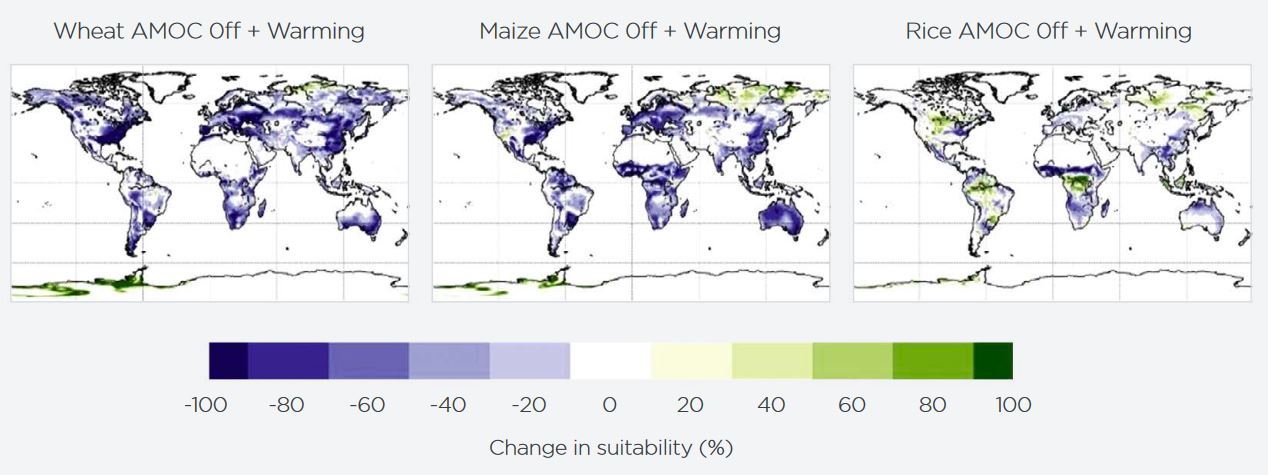
Their Figure 9 shows that under a tipping point of AMOC collapse and 2.5C of warming, the Antarctic Peninsula will be suitable for growing wheat:
However, it looks as if nowhere else in the world will be. The magic of tipping points! Crank up that alarm, go on. Ah, but it’s just a scenario. Just an illustration. No-one really believes it might happen. But they do, as the report makes clear:
Some scientists estimate there is a 45% chance of a collapse in key ocean current circulations, possibly as early as 2040, which is ‘unignorably high’. Impacts would include significant reductions in the northern hemisphere in staple crop-growing capability.
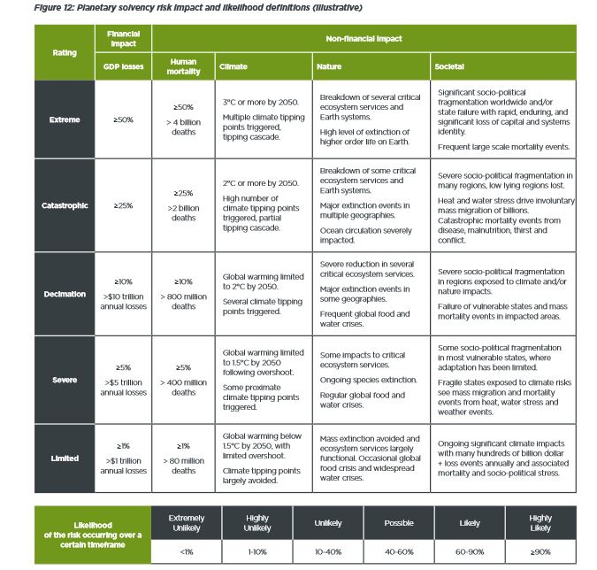
For Climate, the risk matrix they provide gives a “highly likely” chance of “limited” to “severe” impacts in 2025 – i.e., now.
Highly likely means >90% chance; as to the impacts themselves, see their risk matrix:
So, it’s terrible now. But by 2050, we’re into >50% mortality fantasy apocalypse land. I know! I exaggerated in the title. We’re not all doomed. Only half of us are.
And finally, especially for our resident Black Swan aficionado John R, I present a figure (from 2024’s “Scorpion”) that seems to imply that the tails of a parametric distribution are Black Swans.
Featured image: the webcam at Longyearbyen Harbour this morning. The BBC were today telling us how worried they were that Svalbard has been so unseasonably warm this early February. [In a story about record-low sea ice extent globally.]
During President Trump’s inauguration speech, he promised to unlock the “liquid gold” beneath Americans’ feet and ramp up fossil fuel production. Doing so, he suggested, would lower gas prices and lead to cascading American wealth. In his executive order declaring a “national energy emergency,” he directed the Department of Energy to resume processing LNG export authorizations and prioritizing the development of LNG in Alaska.
There is no actual “energy emergency”—at least not in the sense Trump means. Under former president Joe Biden, the United States was already pumping out record amounts of oil and gas. And growing evidence suggests that Trump’s plan to maximize LNG exports will actually achieve the oppositeof his stated goal: Two January reports show that increased US LNG exports will drive updomestic gas prices, with most of those LNG profits winding up overseas in the coffers of foreign investment firms, with particular advantages for China.
Money from LNG goes to foreign investors
The first report, from the Private Equity Stakeholder Project, found that a startling proportion of US LNG profits go to foreign investment firms. Researchers found that 14 investment firms, from eight foreign countries, have financed 11.5 billion cubic feet per day in US LNG export capacity—about 78 percent of peak US LNG export capacity in 2023.
Note to Ms. Nolan: That’s how private equity works. I don’t have the time or inclination to verify exactly who financed the construction of the seven currently operational LNG export facilities or the five that are currently under construction. However, whoever financed the construction usually reaps much of the profits until the financing note is paid off. Irrespective of the Bravo Sierra Club’s misinformed opinions, North American LNG export capacity will more than double during President Trump’s second term in office.
The vast majority of this export capacity will be along the US Gulf Coast and will be exporting natural gas produced from oil & gas fields located in the United States and Gulf of America. If LNG exports drove up prices, it would have already done so.
From 1997-2012, the US consumed more natural gas than we produced and the average price was $4.76 per thousand cubic feet (mcf). Since 2013, we’ve produced more natural gas than we consumed and the priced $3.35/mcf. If we take out the anomalously high prices in 2022, it would have averaged about $3.00/mcf.
The US can afford to be a net exporter of natural gas because we produce more than we consume. This works to keep prices lower. If LNG exports were restricted or prohibited, it would temporarily crash natural gas prices. Drilling would be curtailed, production would decline and prices would rise again.
What makes natural gas prices go up? It’s not increased production or consumption.
Imported natural gas drives up prices – Because we are a net importer when we produce less than we consume.
But we’ll use up all our reserves!
The average prices of both crude oil and natural gas in the United States were the highest since 2008. Proved reserves of crude oil and natural gas hit record highs for the United States in 2022.
U.S. Crude Oil and Natural Gas Proved Reserves, Year-end 2022
With Data for 2022 | Release Date: April 29, 2024 | Next Release Date: April 2025
Oil highlights
U.S. crude oil and lease condensate proved reserves increased 9% from 44.4 billion barrels to 48.3 billion barrels at year-end 2022 (Table 1).
U.S. crude oil and lease condensate production increased 6% in 2022.
In Texas, which has more proved reserves of crude oil and lease condensate than any other state, proved reserves increased 9% in 2022 (1.7 billion barrels), the largest net increase in any state (Table 6).
In New Mexico, crude oil and lease condensate proved reserves increased 26%, the second-largest net increase (1.3 billion barrels). In North Dakota proved reserves increased 14%, the third-largest increase (0.6 billion barrels).
The largest net decrease, 13%, in proved reserves of crude oil and lease condensate in 2022 was in California (225 million barrels) (Table 6).
The 12-month, first-day-of-the-month average spot price for West Texas Intermediate (WTI) crude oil at Cushing, Oklahoma, increased by 43%, from $66.26 per barrel in 2021 to $94.54 per barrel in 2022.
Natural gas highlights
Proved reserves of U.S. natural gas increased 10%, from 625.4 Tcf at year-end 2021 to 691.0 Tcf at year-end 2022, establishing a new record for natural gas proved reserves in the United States for a second consecutive year (Table 8).
Natural gas proved reserves in Alaska increased 25% in 2022, raising that state’s total from 99.8 Tcf to 125.2 Tcf—the largest increase of all states in 2022.
Texas had the second-largest increase in proved reserves of natural gas in 2022 (21.2 Tcf, or 14%), and New Mexico had the third-largest increase (9.9 Tcf, or 27%).
The 12-month, first day-of-the-month average spot price for natural gas at the Louisiana Henry Hub increased by 71% in 2022, from $3.67 per million British thermal units (MMBtu) in 2021 to $6.29/MMBtu in 2022, which was the highest annual average price since 2008.
Operators in Pennsylvania reported the largest net decrease in proved reserves of natural gas in 2022 (652 billion cubic feet, or 0.6%).
In 2022, U.S. natural gas exports were 6.9 Tcf, the highest volume on record.
Proved reserves are estimated volumes of hydrocarbon resources that analysis of geologic and engineering data demonstrates with reasonable certainty are recoverable under existing economic and operating conditions. Reserves estimates change from year to year because of:
Price and cost changes
New discoveries
Thorough appraisals of existing fields
Existing reserves production
New and improved techniques and technologies
To prepare this report, we collect independently developed estimates of proved reserves with Form EIA-23L from a sample of U.S. operators of oil and natural gas fields. We use this sample to further estimate the portion of proved reserves from operators who do not report. This year, we received responses from 397 of 404 sampled operators, which provided coverage of about 90% of proved reserves of oil and 93% of proved reserves of natural gas at the national level. We develop estimates for reserves located in the United States, each state individually, and some state subdivisions. States and regions with subdivisions are: