Month: January 2023

February Fantasy Versus Reality

Guest Post by Willis Eschenbach

Yesterday, Eric Worrall posted an interesting article entitled “Forbes: Global Warming is Causing Colder Februaries“. The title says it all. The Forbes article states:

Thanks To Climate Change, February Is Now The Cruelest Month

Jeff McMahon
Senior Contributor
Jan 29, 2023,12:14am EST

Those unusual frozen Februaries in Texas may not be so unusual anymore.

Early winter has been warming across North America, but late winter is another story. Scientists have documented a cooling trend over more than 40 Februaries, marked by dangerous and increasingly common intrusions of Arctic air deep into the United States.

The underlying article in Science says:

Cold weather disruptions

Despite the rapid warming that is the cardinal signature of global climate change, especially in the Arctic, where temperatures are rising much more than elsewhere in the world, the United States and other regions of the Northern Hemisphere have experienced a conspicuous and increasingly frequent number of episodes of extremely cold winter weather over the past four decades. Cohen et al. combined observations and models to demonstrate that Arctic change is likely an important cause of a chain of processes involving what they call a stratospheric polar vortex disruption, which ultimately results in periods of extreme cold in northern midlatitudes (see the Perspective by Coumou).

Abstract

The Arctic is warming at a rate twice the global average and severe winter weather is reported to be increasing across many heavily populated mid-latitude regions, but there is no agreement on whether a physical link exists between the two phenomena. We use observational analysis to show that a lesser-known stratospheric polar vortex (SPV) disruption that involves wave reflection and stretching of the SPV is linked with extreme cold across parts of Asia and North America, including the recent February 2021 Texas cold wave, and has been increasing over the satellite era. We then use numerical modeling experiments forced with trends in autumn snow cover and Arctic sea ice to establish a physical link between Arctic change and SPV stretching and related surface impacts.

Hmmm …

Now, I’m a data guy. So I went and got the US February temperatures from four different datasets—Berkeley Earth, CERES, NOAA ClimDiv, and the UAH MSU lower troposphere data. All but the CERES dataset cover the 1979—2021 period covered by the study.

Here are the US February trends from the four datasets:

Figure 1. February Continental US Temperature Anomalies, four datasets.

In all four datasets, February has been getting warmer, not colder … go figure.

So … how did they get their results? Well, they didn’t look at observational data.

Instead, they used a climate model fed with the results of a climate reanalysis model plus snow cover data plus arctic sea ice data … and in addition, they used K-means clustering of the 100 hPa reanalysis geopotential heights, multiple linear regression, a simplified Betts-Miller convection scheme, an idealized boundary layer scheme based on Monin-Obukhov similarity theory, a slab ocean, the Rapid Radiative Transfer Model (RRTMG) radiation scheme, and lots of other good juju.

What it seems they didn’t do was … actually look at real-world data instead of using the Bette-Midler convection scheme.

Gotta say, the dying throes of the climate insanity are kind of amusing to watch … or they would be if climate alarmism weren’t so dangerous, particularly to the poor. This kind of madness is driving energy prices through the roof, and that’s the cruelest tax of all.

My very best to everyone,

w.

via Watts Up With That?

https://ift.tt/rBVspQf

January 30, 2023 at 12:37PM

Emperor penguin ESA listing in 2022 used Antarctic sea ice models known to be flawed

While Arctic sea ice has declined remarkably since 1979, Antarctic ice has been unexpectedly stable. Experts acknowledge that existing climate models–which assume that CO2 emissions drive global sea ice loss–had predicted Antarctic sea ice would have declined over the last several decades–and would decline even more in the future. They’ve finally admitted they were wrong.

John Turner (British Antarctic Survey) and Josifino Comiso (NASA) in a NATURE paper in 2017:

“Current climate models struggle to simulate the seasonal and regional variability seen in Antarctic sea ice.“

A new model released earlier this year suggests the virtually stable Antarctic sea ice cover that has existed over the last four decades can now be expected to continue for almost another three decades, until at least 2050, and decline only slowly after that (Rackow et al. 2022).

However, emperor penguin researchers used the old flawed models to get the species listed as ‘threatened’ in the US just a few months ago due to predicted sea ice loss (Jenouvrier et al. 2009; Jenouvrier et al. 2020; Trathan et al 2020; USFWS 2022).

In other words, it’s not just that penguin researchers picked the most pessimistic and totally implausible ‘worst case’ scenario to make their case, as polar bear specialist so love to do (Crockford 2019; Hausfather and Peters 2020): sea ice experts now say those old sea ice models are quite useless for predicting future sea ice conditions and have known this for more than a decade (Blanchard-Wrigglesworth et al. 2021, 2022; Comiso et al. 2017; Turner and Comiso 2017; Turner and Overland 2009; Turner et al. 2013).

Sea ice experts knew the models were wrong about Antarctic sea ice and CO2–and wrote about their concerns in the scientific literature–yet penguin biologists ignored that evidence and continued to insist that penguins are doomed to near-extinction by future sea ice loss in the Southern Ocean. See graphic below, from Jenouvrier et al. 2020:

ESA protection for emperors was granted by US Fish & Wildlife on 25 October 2022, even though a new Antarctic sea ice model was published more than eight months earlier, on 2 February 2022. This means both the petitioners for the ESA listing and the USFWS ignored years of evidence provided by trusted experts that Antarctic sea ice models were not fit for purpose plus a more plausible option offered, then called it all “best available science.”

The new model may also be crap but that doesn’t warrant ignoring solid evidence that the old one was seriously flawed.

The graph below is from the Turner and Comiso paper and shows the discrepancy of concern: summer Arctic ice vs. Antarctic winter ice (September for both) from 1979-2017, with max for Antarctic ice hitting 20.11mkm2 in 2014 (when Arctic ice was its 6th lowest at 5.02mkm2):

That graph ends in 2017, now five years ago. Below was the extent at 19 September 2022, near the maximum for that year, eventually reaching 18.19 mkm2. Plenty of ice for emperor penguins, who uniquely lay their eggs and raise hatchlings over the winter/spring, primarily on land-fast ice:

As an aside, I couldn’t help but notice that emperor penguin researchers working in the Antarctic focus on winter sea ice with regard to future health and survival while polar bear specialists and other Arctic biologists are most concerned about summer sea ice loss. In both cases, the ice-dependent species of concern require sea ice in the winter/spring for reproducing and/or feeding. The difference is that summer sea ice in the Antarctic has always virtually disappeared over the summer (down to 15% or less than winter extent) and no one pretends that any Antarctic animal requires summer sea ice for survival. Odd, that.

References

BirdLife International. 2020. Aptenodytes forsteri. The IUCN Red List of Threatened Species 2019: e.T22697752A132600320. Downloaded on 26 October 2022. https://www.iucnredlist.org/species/22697752/157658053

Blanchard-Wrigglesworth, E., I. Eisenman, S. Zhang, et al. 2022. New perspectives on the enigma of expanding Antarctic sea ice, Eos 103. https://doi.org/10.1029/2022EO220076.

Blanchard-Wrigglesworth, E., Roach, L.A., Donohoe, A. and Ding, Q. 2021. Impact of winds and Southern Ocean SSTs on Antarctic sea ice trends and variability. Journal of Climate 34(3):949–965. https://doi.org/10.1175/JCLI-D-20-0386.1.

Hausfather, Z. and Peters, G.P. 2020. Emissions – the ‘business as usual’ story is misleading [“Stop using the worst-case scenario for climate warming as the most likely outcome — more-realistic baselines make for better policy”]. Nature 577: 618-620

Jenouvrier, S., Caswell, H., Barbraud, C., Holland, M., Stroeve, J. and Weimerskirch, H. 2009. Demographic models and IPCC climate projections predict the decline of an emperor penguin population. Proceedings of the National Academy of Science USA 106: 1844-1847. Available here: https://www.researchgate.net/publication/23951047_Demographic_models_and_IPCC_climate_projections_predict_the_decline_of_an_Emperor_penguin_population

Jenouvrier, S. et al. 2020. The Paris Agreement objectives will likely halt future declines of emperor penguins. Global Change Biology 26(3): 1170-1184. [paywalled] https://onlinelibrary.wiley.com/doi/abs/10.1111/gcb.14864

Rackow, T., Danilov, S., Goessling, H.F. et al. 2022. Delayed Antarctic sea-ice decline in high-resolution climate change simulations. Nature Communications 13:637. https://www.nature.com/articles/s41467-022-28259-y

Trathan, P.N. et al. 2020. The emperor penguin – Vulnerable to projected rates of warming and sea ice loss. Biological Conservation 241:108216. [open access] https://doi.org/10.1016/j.biocon.2019.108216

Turner, J. and Comiso, J. 2017. Solve Antarctica’s sea-ice puzzle. Nature 547:275-277. https://www.nature.com/articles/547275a

Turner, J. and Overland, J. 2009. Contrasting climate change in the two polar regions. Polar Research 28(2):146-164. https://doi.org/10.3402/polar.v28i2.6120

Turner, J., Bracegirdle, T.J., Phillips, T. et al. 2013. An initial assessment of Antarctic sea ice extent in the CMIP5 models. Journal of Climate 26(5):1473-1484.

USFWS 2022. ‘Endangered and Threatened Wildlife and Plants; Threatened Species Status for Emperor Penguin With Section 4(d) Rule.’ Federal Register 87(206):64700-64720.

via polarbearscience

https://ift.tt/qSA2K9i

January 30, 2023 at 11:52AM

5 charts explain gas & power price slump into 2023

By Paul Homewood

More from Timera on softening gas prices:

5 charts explain gas & power price slump into 2023

Europe entered winter confronting the threat of gas & power supply cuts and price spikes. Policy makers scrambled to protect consumers. Energy companies did their best to protect portfolios.

Across the 4 weeks from mid Dec 2022 to mid Jan 2023 Europe’s energy crisis delivered its latest twist. Instead of spiking, gas & power prices slumped.  Benchmark TTF forward gas prices for delivery across 2023-24 were cut in half, falling 40-60%.

The knock-on impact of this rapid decline was a textbook case study in why the European gas market is so important to broader energy market pricing. European power prices saw an associated decline as the variable cost of marginal gas generators fell. Pacific & Atlantic basin LNG prices also followed TTF south given Europe’s key role in anchoring global LNG prices.

What the …. happened? Let’s explore using 5 charts.

    1. Record European LNG imports

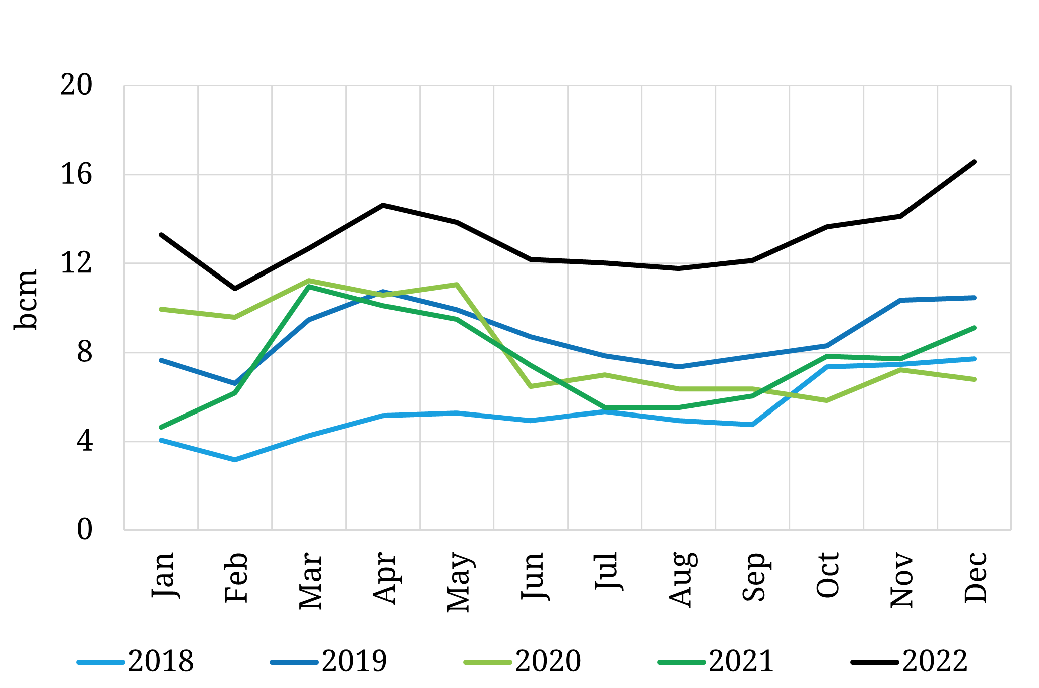
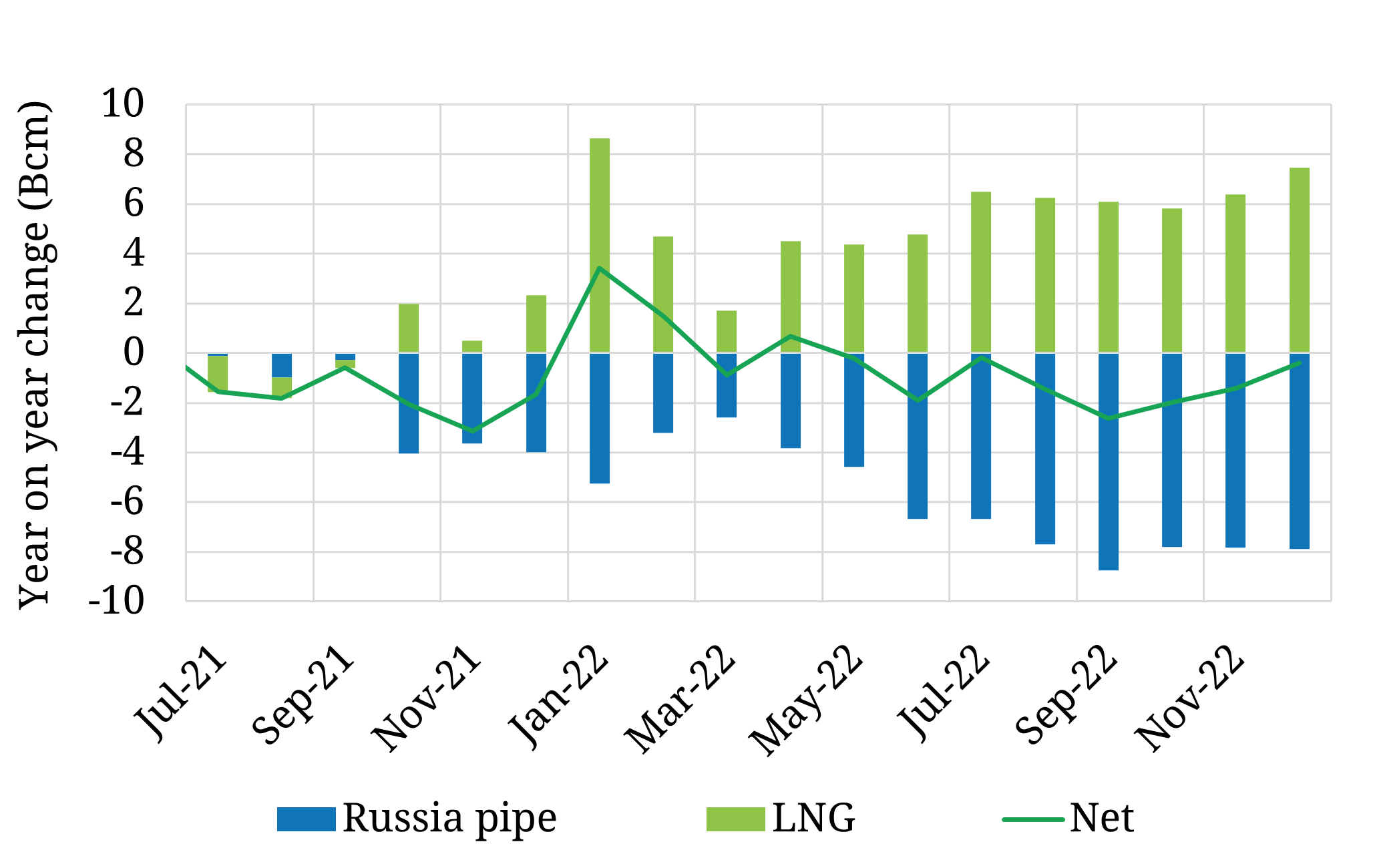
Europe is absorbing LNG like a sponge. LNG imports were up 74% in 2022 vs 2021, a huge increase as shown in the top panel of Chart 1. This went a long way to making up for the 2022 drop off in Russian pipeline supply volumes (excluding Turkstream) as shown in the bottom panel of Chart 1.

Chart 1: European LNG imports surge (top panel) vs Russian pipe flow declines (bottom panel)

European LNG imports

Source: Timera Energy, LNG Unlimited

Russia vs LNG supply to Europe

Source: Timera Energy, ENTSOG, LNG Unlimited

Incremental LNG imports saved Europe in 2022. But Europe likely faces an additional 40-50 bcm reduction of Russian flows in 2023 vs 2022. That is a material hole to fill!

    2. Weak Asian LNG demand

Europe’s surging LNG imports were supported by a substantial reduction in Asian LNG demand in 2022. Asian LNG imports declined 8% in 2022 vs 2021, as shown in Chart 2. This was the major factor allowing incremental LNG volumes to flow to Europe.

Chart 2: Asian LNG demand year-on-year change vs JKM price

Y-o-Y change in Asian LNG imports vs JKM

Source: Timera Energy, CME, LNG Unlimited

This decline was driven by Asian demand response to soaring LNG prices, as shown by the JKM price in Chart 2 (green line). But lower demand was also helped by a mild winter and a weaker 2022 macroeconomic backdrop in China.

Two factors represent headwinds to further weak demand in Asia in 2023: (i) China’s post-Covid lockdown re-opening & policy stimulus is set to spur economic growth (ii) the recent price decline supporting incremental LNG demand.

New LNG supply volumes are also set to be relatively weak in 2023 (given low volumes of project FIDs in 2018). It is not until 2025 that the LNG market is set to see a material increase in new supply.

    3. Low European gas & power demand

European gas demand declined more than 10% in 2022 vs 2021, with the biggest declines focused in Q4. A mild winter definitely helped. But there has also been evidence of:

  • genuine demand destruction given high prices (e.g. industrial production cuts)
  • shifts in consumer behavioural patterns driving energy efficiency (e.g. turning down thermostats)
  • fuel switching (e.g. oil for gas and refinery optimisation).

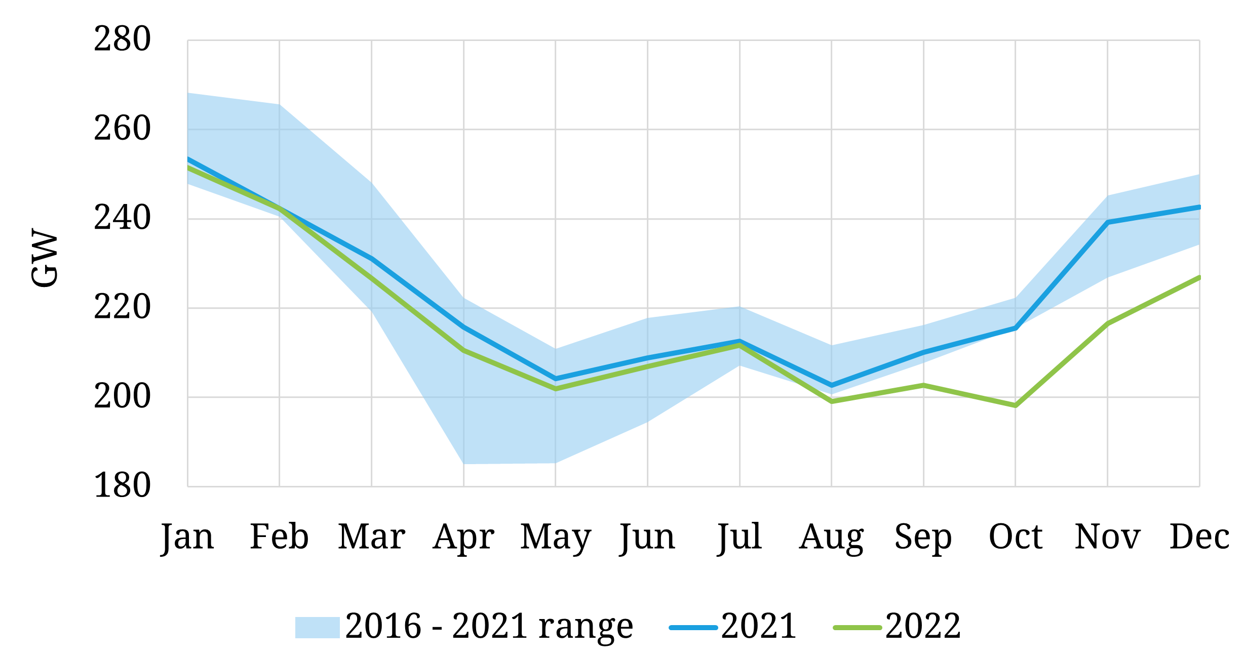
Power demand has also fallen significantly which has helped to ease gas demand from gas-fired generators. The scale of gas & power demand declines since Sep 2022 has been a big surprise and a major contributing factor to declining gas & power prices. Chart 3 shows the pronounced fall in power demand across 7 key markets vs previous years.

Chart 3: Power demand across 7 key European markets

EU7 power demand

Source: Timera Energy, ENTSO-E

If this structural decline in gas & power demand continues in 2023 then Europe may weather the crisis better than most expected. The reductions in residential & commercial demand since Q4 are encouraging, but we only have several months of data across an unusually warm winter.

Demand reductions are a key factor to watch in 2023!

    4. High European storage inventories

Storage inventories across the EU sat at over 83% full entering the new year, helped by government storage mandates and mild weather. Europe has also seen historically low withdrawal volumes winter-to-date.  The pan-European storage position is summarised in Chart 4.

Chart 4: EU underground gas stock levels

EU underground gas stock levels

Source: Timera Energy, GIE

There is currently little incentive for storage withdrawals given (i) a TTF price curve in contango (ii) continuation of relatively mild winter. We published a snapshot article last week with more detail on current European gas storage dynamics.

High storage inventories weigh on the market because they reduce summer demand for injections (by ~15 bcm) and provide an insurance buffer into next winter. Whether this buffer will be sufficient depends on the factors above (i.e. European LNG imports, Asian LNG demand and European power & gas demand).

    5. Falling gas & power prices

The 4 factors set out above have combined to push European gas & power prices lower into 2023. Chart 5 shows the TTF forward curve (i) in Aug 2022 at the peak of the crisis (ii) at the start of Dec 2022 (iii) at the end of last week.

Prices have fallen substantially since last summer’s peak but remain elevated versus pre-crisis levels.

Chart 5: TTF prices

TTF price formation

Source: Timera Energy, ICE

The substantial premium of TTF over JKM has now diminished (but not disappeared). The fact that European prices remain at or above JKM levels reflects the fact that both the European and LNG markets remain in a tight regime despite recent price declines.

The DES NWE price discount to TTF has also declined (back to a 1-2 $/mmbtu range) as new regas capacity is coming online to ease import bottlenecks and some of the acute market stress of 2022 has eased.

Not yet out of the danger zone

There has been widespread reporting that European gas prices are now ‘below pre-invasion levels’. Sounds comforting right, the crisis must be largely over? No.

While it is factually correct that front month TTF prices are now below pre-invasion levels this says little about the tightness of the European gas market across the next two years. 2023-25 forward TTF prices are substantially higher than pre-Russian invasion levels.

Both the LNG market and European gas market remain in a very tight regime of inelastic supply and demand curves. In this environment small changes in volumes drive big changes in price, both up and down.

The factors we set out in this article are the key drivers that will determine market dynamics across 2023. It is dangerous to assume we have seen the last twist in this crisis.

https://timera-energy.com/5-charts-explain-gas-power-price-slump-into-2023/


Most of this is straight forwsrd supply and demand stuff. High gas prices have triggered more LNG supply, lower consumption and switching to other fuels, such as coal and oil.

Perhaps the most surprising graphec is the sharp decline in power demand, which is a strong sign of economic and industrial slowdown.

via NOT A LOT OF PEOPLE KNOW THAT

https://ift.tt/EqzTdia

January 30, 2023 at 11:40AM

Global Warming Outbreak

We haven’t been above 0F (-18C) for several days here in Cheyenne, Wyoming. And the press says we are having the worst drought in 1,200 years.

via Real Climate Science

https://ift.tt/sKBUDk4

January 30, 2023 at 09:09AM