
By Paul Homewood
More disinformation from the BBC:

https://www.bbc.co.uk/news/science-environment-64553915
Amidst the backslapping about how wonderful solar power is, the BBC present this graph:
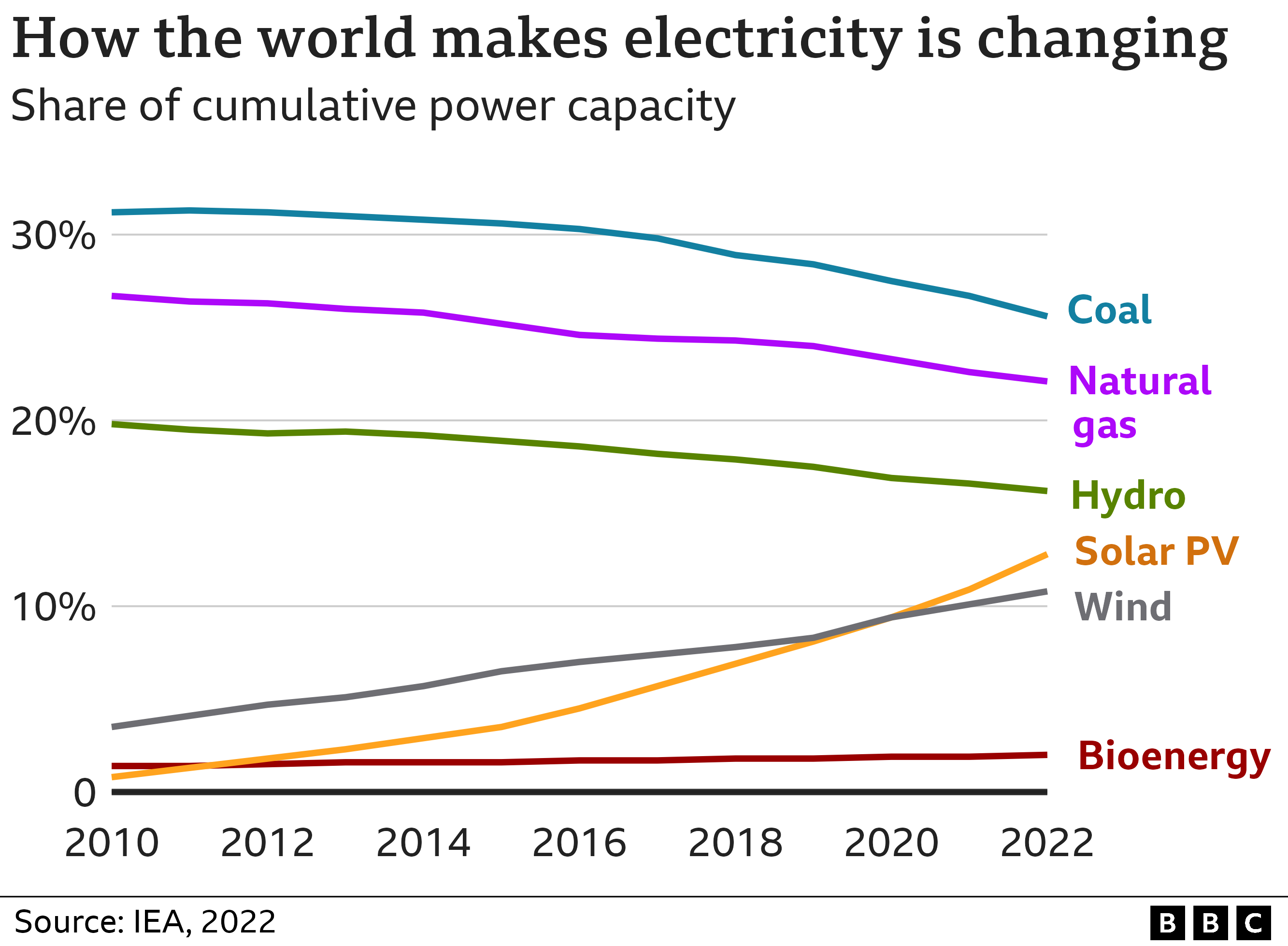
WOW!! Most people reading this would believe that electricity from fossil fuels is declining rapidly, while solar and wind power now claim a share well over 20%.
Most of those same readers would be unaware what the BBC mean by “capacity”, or that “capacity” and “generation” are two totally separate and different things.
And when we look at generation, we can see how badly misled those readers have been:

BP Energy Review
Far from being major players, wind and solar together only supply 10% of the world’s electricity. And since 2010, the increase in fossil fuel generation has exceeded that of wind and solar.
A rather different picture to the one the BBC would like you believe, I think you might agree!
via NOT A LOT OF PEOPLE KNOW THAT
February 10, 2023 at 12:07PM
