
via Real Climate Science
September 15, 2023 at 11:40PM
via Real Climate Science
September 15, 2023 at 11:40PM
By James Taylor
This morning, the MSN news feed that displays for millions of people when they open a new Internet tab prominently displayed an article titled, “The climate crisis is here, the ecosystem is starting to collapse.” Embedded in the usual debunked claims of worsening extreme weather were claims that climate change is devastating crop production around the world. In particular, the article singled out rice, sugar, and tomato production as particularly ravaged by climate change. The objective facts, however, show just the opposite.
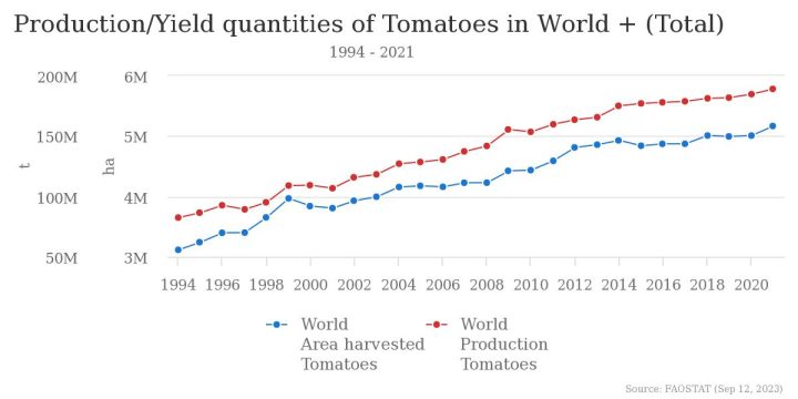
Fake claims of tomato shortages. According to the article, “India’s Burger King has taken tomatoes off their burgers after this year’s crop failed and the cost of tomatoes has become prohibitively expensive.”
An anecdotal claim that Burger King is taking tomatoes off its hamburgers in some locations does not prove that climate change is destroying tomato crops. Instead, according to the United Nations Food and Agriculture Organization (UNFAO), global tomato production is faring quite well. In fact, the UNFAO reports that global tomato production has set new records an amazing 10 years in a row.
Sugar data is record sweet, not sour. The article continued, “The world’s largest sugar trader expects the coming season to see a deficit for the sixth consecutive year as unfavourable crop forecasts in India will reduce global stocks of the sweetener. ‘The world will be as close to running out of sugar as it can be,’ said Mauro Virgino, trading intelligence lead at Alvean, a trading house controlled by Brazilian producer Copersucar SA, in a recent interview.”
Claims by a trading professional who has a financial stake in leading people to expect higher sugar prices are neither evidence of declining sugar production nor evidence of any climate change impact. Fortunately, the UNFAO keeps meticulous data for world sugar production, also. According to the UNFAO, 2019 saw the largest global sugar crop in history. All 10 of the largest sugar crops in history occurred during the past 10 years. During the past 15 years, global sugar production has increased by more than 33 percent.
Rice crops continue to set records. Also, claimed the article, “Most seriously of all, rice yields across southeast Asia have fallen sending prices up across the board. A rapidly escalating rice crisis is unfolding in Asia that has put hundreds of millions of people at food security risk. … The poor rice yields are going to get worse in the coming months as due to the record high sea waters, this year’s El Niño effect is expected to be especially strong that will cause rice yields to fall further. The food issue and soaring prices in Yangon in Myanmar has already become so bad that residents are turning to charity run food banks for help as they are unable to feed themselves.”
The UNFAO, however, reports an entirely different story. According to the UNFAO, global rice production set a new record in 2021, the latest year for which data is available. All three of the three largest crop years occurred during the past three years. All five of the five largest crop years occurred during the past five years. All 10 of the 10 largest crop years occurred during the past 10 years.
The article focuses special attention on rice yields in India, China, and Myanmar. However, the growth in India’s rice production is even more impressive than the growth in global rice production. India has absolutely smashed its rice production records six years in a row. In China, 2021 was the second-highest rice crop in history. All six of China’s highest-ever rice crops were produced in the past six years. Myanmar rice production is declining – an aberration compared to the global trend – but that is because of Myanmar’s horrible domestic political situation, not climate change. As reported by Human Rights Watch, “Since staging a coup on February 1, 2021, the Myanmar military has carried out a brutal nationwide crackdown on millions of people opposed to its rule. The junta security forces have carried out mass killings, arbitrary arrests, torture, sexual violence, and other abuses that amount to crimes against humanity.” Blaming climate change for Myanmar’s declining crop production is giving a pass to political brutality and human rights abuses.
The overall global crop picture is amazing. It is not surprising that MSN, when cherry-picking its worst-possible scenarios to claim a global crop crisis created by climate change, cannot even find one or two outliers to support its misinformation. The objective fact, as shown definitively by United Nations crop data, is that crop production of nearly all kinds throughout virtually the entire world is setting is setting impressive and live-providing new records nearly every year. This is happening in concurrence with more atmospheric carbon dioxide and modestly warming temperatures.
James Taylor is the President of the Heartland Institute. Taylor is also director of Heartland’s Arthur B. Robinson Center for Climate and Environmental Policy. Taylor is the former managing editor (2001-2014) of Environment & Climate News, a national monthly publication devoted to sound science and free-market environmentalism.
via Watts Up With That?
September 15, 2023 at 08:06PM

The best context for understanding decadal temperature changes comes from the world’s sea surface temperatures (SST), for several reasons:
HadSST is generally regarded as the best of the global SST data sets, and so the temperature story here comes from that source. Previously I used HadSST3 for these reports, but Hadley Centre has made HadSST4 the priority, and v.3 will no longer be updated. HadSST4 is the same as v.3, except that the older data from ship water intake was re-estimated to be generally lower temperatures than shown in v.3. The effect is that v.4 has lower average anomalies for the baseline period 1961-1990, thereby showing higher current anomalies than v.3. This analysis concerns more recent time periods and depends on very similar differentials as those from v.3 despite higher absolute anomaly values in v.4. More on what distinguishes HadSST3 and 4 from other SST products at the end. The user guide for HadSST4 is here.
The chart below shows SST monthly anomalies as reported in HadSST4 starting in 2015 through August 2023. A global cooling pattern is seen clearly in the Tropics since its peak in 2016, joined by NH and SH cycling downward since 2016.

Note that in 2015-2016 the Tropics and SH peaked in between two summer NH spikes. That pattern repeated in 2019-2020 with a lesser Tropics peak and SH bump, but with higher NH spikes. By end of 2020, cooler SSTs in all regions took the Global anomaly well below the mean for this period. In 2021 the summer NH summer spike was joined by warming in the Tropics but offset by a drop in SH SSTs, which raised the Global anomaly slightly over the mean.
Then in 2022, another strong NH summer spike peaked in August, but this time both the Tropic and SH were countervailing, resulting in only slight Global warming, later receding to the mean. Oct./Nov. temps dropped in NH and the Tropics took the Global anomaly below the average for this period. After an uptick in December, temps in January 2023 dropped everywhere, strongest in NH, with the Global anomaly further below the mean since 2015.
Now comes El Nino as shown by the upward spike in the Tropics since January, the anomaly nearly tripling from 0.38C to 1.06C. Now in August 2023, all regions rose, especially NH up from 0.70C to now 1.37C, pulling up the global anomaly to a new high for this period.
The climatists have seized on this unusual warming as proof of their Zero Carbon agenda, without addressing how impossible it would be for CO2 warming the air to raise ocean temperatures. It is the ocean that warms the air, not the other way around. Recently Steven Koonin had this to say about the phonomenon confirmed in the graph above:
El Nino is a phenomenon in the climate system that happens once every four or five years. Heat builds up in the equatorial Pacific to the west of Indonesia and so on. Then when enough of it builds up it surges across the Pacific and changes the currents and the winds. As it surges toward South America it was discovered and named in the 19th century It is well understood at this point that the phenomenon has nothing to do with CO2.
Now people talk about changes in that phenomena as a result of CO2 but it’s there in the climate system already and when it happens it influences weather all over the world. We feel it when it gets rainier in Southern California for example. So for the last 3 years we have been in the opposite of an El Nino, a La Nina, part of the reason people think the West Coast has been in drought.
It has now shifted in the last months to an El Nino condition that warms the globe and is thought to contribute to this Spike we have seen. But there are other contributions as well. One of the most surprising ones is that back in January of 2022 an enormous underwater volcano went off in Tonga and it put up a lot of water vapor into the upper atmosphere. It increased the upper atmosphere of water vapor by about 10 percent, and that’s a warming effect, and it may be that is contributing to why the spike is so high.
A longer view of SSTs

Open image in new tab to enlarge.
The graph above is noisy, but the density is needed to see the seasonal patterns in the oceanic fluctuations. Previous posts focused on the rise and fall of the last El Nino starting in 2015. This post adds a longer view, encompassing the significant 1998 El Nino and since. The color schemes are retained for Global, Tropics, NH and SH anomalies. Despite the longer time frame, I have kept the monthly data (rather than yearly averages) because of interesting shifts between January and July.1995 is a reasonable (ENSO neutral) starting point prior to the first El Nino.
The sharp Tropical rise peaking in 1998 is dominant in the record, starting Jan. ’97 to pull up SSTs uniformly before returning to the same level Jan. ’99. There were strong cool periods before and after the 1998 El Nino event. Then SSTs in all regions returned to the mean in 2001-2.
SSTS fluctuate around the mean until 2007, when another, smaller ENSO event occurs. There is cooling 2007-8, a lower peak warming in 2009-10, following by cooling in 2011-12. Again SSTs are average 2013-14.
Now a different pattern appears. The Tropics cooled sharply to Jan 11, then rise steadily for 4 years to Jan 15, at which point the most recent major El Nino takes off. But this time in contrast to ’97-’99, the Northern Hemisphere produces peaks every summer pulling up the Global average. In fact, these NH peaks appear every July starting in 2003, growing stronger to produce 3 massive highs in 2014, 15 and 16. NH July 2017 was only slightly lower, and a fifth NH peak still lower in Sept. 2018.
The highest summer NH peaks came in 2019 and 2020, only this time the Tropics and SH were offsetting rather adding to the warming. (Note: these are high anomalies on top of the highest absolute temps in the NH.) Since 2014 SH has played a moderating role, offsetting the NH warming pulses. After September 2020 temps dropped off down until February 2021. In 2021-22 there were again summer NH spikes, but in 2022 moderated first by cooling Tropics and SH SSTs, then in October to January 2023 by deeper cooling in NH and Tropics.
Now in 2023 the Tropics flipped from below to well above average, while NH has produced a summer peak with August higher than any previous year. In fact, the summer warming peaks in NH have occurred in August or September, so this number is likely the crest.
What to make of all this? The patterns suggest that in addition to El Ninos in the Pacific driving the Tropic SSTs, something else is going on in the NH. The obvious culprit is the North Atlantic, since I have seen this sort of pulsing before. After reading some papers by David Dilley, I confirmed his observation of Atlantic pulses into the Arctic every 8 to 10 years.
Through January 2023 I depended on the Kaplan AMO Index (not smoothed, not detrended) for N. Atlantic observations. But it is no longer being updated, and NOAA says they don’t know its future. So I find that ERSSTv5 AMO dataset has data through August. It differs from Kaplan, which reported average absolute temps measured in N. Atlantic. “ERSST5 AMO follows Trenberth and Shea (2006) proposal to use the NA region EQ-60°N, 0°-80°W and subtract the global rise of SST 60°S-60°N to obtain a measure of the internal variability, arguing that the effect of external forcing on the North Atlantic should be similar to the effect on the other oceans.” So the values represent sst anomaly differences between the N. Atlantic and the Global ocean.

The chart above confirms what Kaplan also showed. As August is the hottest month for the N. Atlantic, its varibility, high and low, drives the annual results for this basin. Note also the peaks in 2010, lows after 2014, and a rise in 2021. Now in 2023 the peak is nearly 1.4C. An annual chart below is informative:

Note the difference between blue/green years, beige/brown, and purple/red years. 2010, 2021, 2022 all peaked strongly in August or September. 1998 and 2007 were mildly warm. 2016 and 2018 were matching or cooler than the global average. 2023 started out slightly warm, then in May and June spiked to match 2010. Now there are highs in August and the peak in July.
The pattern suggests the ocean may be demonstrating a stairstep pattern like that we have also seen in HadCRUT4.
 The purple line is the average anomaly 1980-1996 inclusive, value 0.18. The orange line the average 1980-202306, value 0.38, also for the period 1997-2012. The red line is 2013-202306, value 0.64. As noted above, these rising stages are driven by the combined warming in the Tropics and NH, including both Pacific and Atlantic basins.
The news about our current solar cycle 25 is that the solar activity is hitting peak numbers now and higher than 1-2 years in the future. As livescience put it: Solar maximum could hit us harder and sooner than we thought. How dangerous will the sun’s chaotic peak be? Some charts from spaceweatherlive look familar to these sea surface temperature charts.


Summary
The oceans are driving the warming this century. SSTs took a step up with the 1998 El Nino and have stayed there with help from the North Atlantic, and more recently the Pacific northern “Blob.” The ocean surfaces are releasing a lot of energy, warming the air, but eventually will have a cooling effect. The decline after 1937 was rapid by comparison, so one wonders: How long can the oceans keep this up? And is the sun adding forcing to this process?
Footnote: Why Rely on HadSST4
HadSST is distinguished from other SST products because HadCRU (Hadley Climatic Research Unit) does not engage in SST interpolation, i.e. infilling estimated anomalies into grid cells lacking sufficient sampling in a given month. From reading the documentation and from queries to Met Office, this is their procedure.
HadSST4 imports data from gridcells containing ocean, excluding land cells. From past records, they have calculated daily and monthly average readings for each grid cell for the period 1961 to 1990. Those temperatures form the baseline from which anomalies are calculated.
In a given month, each gridcell with sufficient sampling is averaged for the month and then the baseline value for that cell and that month is subtracted, resulting in the monthly anomaly for that cell. All cells with monthly anomalies are averaged to produce global, hemispheric and tropical anomalies for the month, based on the cells in those locations. For example, Tropics averages include ocean grid cells lying between latitudes 20N and 20S.
Gridcells lacking sufficient sampling that month are left out of the averaging, and the uncertainty from such missing data is estimated. IMO that is more reasonable than inventing data to infill. And it seems that the Global Drifter Array displayed in the top image is providing more uniform coverage of the oceans than in the past.

USS Pearl Harbor deploys Global Drifter Buoys in Pacific Ocean
via Science Matters
September 15, 2023 at 04:21PM
Essay by Eric Worrall
Dr. Willie Soon emailed me the curious case of an editor of the journal Climate apparently being investigated by NASA GISS director Gavin Schmidt, for publishing Soon’s study.
The trigger for this request may have been recent studies covered by WUWT, which highlights the possibility much reported global warming may be urban heat island effect.
There have been some rather intense exchanges of ideas since the papers were published. Dr. Gavin Schmidt wrote a critique on real climate, in which Gavin accused Dr. Willie Soon of being a “crowd pleaser”, and of using outdated Solar data.
Soon responded to this critique, by accusing Schmidt of raising straw man objections, and suggested Schmidt is taking too narrow and simplistic a view of solar TSI reconstructions.
In the midst of this rather heated debate, Schmidt launched a FOIA action to research whether any employees of the Federal Government used government time or resources to correspond with Dr. Willie Soon, and other authors of the controversial studies. It is notable that Dr. Schmidt used his university account, and sent the FOIA request on Sunday – “Federal employees may not use government time or equipment when requesting information under the FOIA.”. Schmidt may have learned from last time his hat juggling, switching between acting as a powerful government official and a private person, got a little messy.
The last line of Schmidt’s FOIA request is an eye opener:
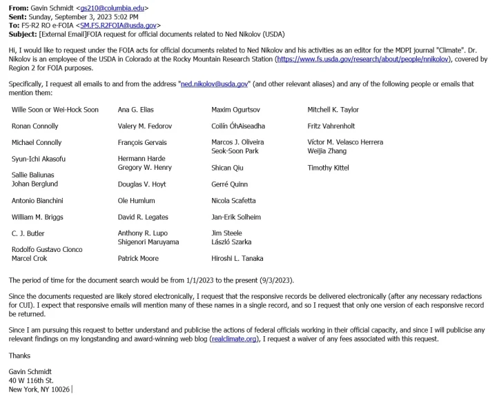
“Since I am pursuing this request to better understand and publicise the actions of federal officials working in their official capacity, and since I will publicise any relevant findings on my longstanding and award-winning web blog (realclimate.org), I request a waiver of any fees associated with this request.”
It would be a tragedy if this FOIA request, and the stated intention to “publicise the actions of federal officials” signals that Dr. Gavin Schmidt is following the footsteps of the worst alleged abusers in the Climategate emails, by putting pressure on journal editors and federal employees who cooperate with the production of studies he doesn’t like.
I’m not saying this is what is happening, but I think given the ugly history of alleged bullying in the field of climate science which was revealed by Climategate, a complete explanation of Dr Gavin Schmidt’s intentions is in order.
via Watts Up With That?
September 15, 2023 at 04:04PM
