A pane of glass just got more protection than human lives. This is madness.
Judge Hehir just sent Anna and Phoebe to prison for a combined total of just under 4 years, for throwing tomato soup at at Van Gogh’s Sunflowers, protected by glass, back in 2022. Since then, the UK Government has approved over 80 new oil and gas projects – a crime against humanity. Those pushing for oil and gas remain at large, raking in cash and bankrolling politicians. Where’s the justice?
…
Prison for ‘conspiracy’. For standing up to the state. For fucking soup. Barely escaping the cell for marching down the road. The courts continue to throw the book at nonviolent direct action, with over 30 of our supporters jailed this year. So we will make them a site of civil resistance. But we need your help.
This is the text of a talk I gave at an American Institute for Economic Research Bastiat Society of Houston Meeting on September 26, 2024.
The IPCC, or the Intergovernmental Panel on Climate Change, AR6 report and the so-called “climate consensus” cabal hide and suppress many inconvenient truths that run counter to their hypothesis that man-made climate change is dangerous. I will list and discuss some examples in this post, more are explained in our recent book, The Frozen Climate Views of the IPCC: An Analysis of AR6.
But first, some personal examples of the suppression of non-consensus ideas.
Two papers rejected for political reasons
Figure 1. Two of my invited papers that passed review and were later rejected by higher authorities.
Both of the papers illustrated in figure 1 were invited, both passed peer-review and/or editorial review, but they were ultimately rejected by people higher in the respective organizations, just before the scheduled publication date, and with no valid reason given. I took this as a clear sign that both rejections were purely political. After all, any technical reasons for rejection should have been voiced during the review process.
The PETM paper was invited by the Rocky Mountain Association of Geologists or RMAG. They intended to publish the paper in their online publication called The Outcrop. Articles for The Outcrop are reviewed by the staff and editors, but not in a formal way as academic journal articles are.
The paper’s rejection was not for technical reasons but was blatantly political and after months of work by the editor, another RMAG staffer, and by me. The rejection was a board decision, done at the at the last minute, and without explanation or justification, except to point out that I am not a “trained climatologist” and I’m a “blogger.” Thus, it was pretty clear that the paper was rejected not because of any problems with it, but because of who I was.
When I complained, the board sent the paper to yet another reviewer; after the paper had already been reviewed and accepted. The additional reviewer was sent an early draft and not the final version. In a conference call he pointed out several flaws that I knew were not in in the final version causing much confusion, until I realized he had the wrong version of the paper.
Thus, the board either did not see the final version when reversing the decision of the editor and the peer-reviewers or sent, either deliberately or by accident, their extra reviewer the wrong version. I explained all this, but it was rejected anyway without reconsideration or even a look at the final draft. Thus, it was clearly a political decision based on the conclusions of the paper, the fact that I am not a trained climatologist, and I’m a blogger. The paper now appears on my blog and has been one of my most popular posts.
The second invited, but ultimately rejected, paper was written for the Creative Society at their request. They specifically wanted me to write a paper on climate shifts, such as those that occurred about 1925, 1947, 1976, and 1997. They asked me to present it in an online interview on October 10th, 2022. The interview was recorded and when I asked when it would be posted online, they said they would have to get back to me. They never did, so I posted the paper on my blog. I was never given a reason why it was not posted online by the Creative Society.
The discussion on climate shifts was interesting, since they believed that they might be related to periodic changes in Earth’s mantle.
A Paper that caused an editor to resign
Figure 2. A very reasonable paper by Roy Spencer and William Braswell that caused the editor who published it to resign.
Wolfgang Wagner, then editor-in-chief of the journal Remote Sensing, resigned over a perfectly reasonable, but counter to the “consensus” paper, by Roy Spencer and William Braswell in 2011. Spencer and Braswell presented solid observations and facts, and their critics presented only model results.
The debate between the two sides is complex, and mostly over the sign and magnitude of feedbacks to greenhouse gas (mainly CO2) warming. This is how science is supposed to work. When an editor proclaims from on high that one well supported opinion is wrong and the other is correct, without proper discussion and debate, it is politics not science.
Two papers that caused the editors to be fired
Figure 3. Two of Prof. Richard Lindzen’s papers that caused the editors that accepted them to be fired. The paper on the right is Lindzen’s landmark first paper on the Iris Effect.
Willie Soon and Dick Lindzen report that two editors were fired for publishing two of Lindzen’s papers. The first, published in 1990, lays out Lindzen’s objections to the idea that a man-made enhanced greenhouse effect could be the dominant reason behind current warming, the paper is quite reasonable and certainly not a reason to fire anyone. The paper warns that more definitive evidence of the potential dangers of man-made global warming must be found before drastic actions, like eliminating fossil fuels, are taken. He reminds us that climate model results are not evidence, they are conjectures. Lindzen’s paper is still viable today since definitive evidence and examples of man-made climate change dangers have not been found, even 34 years later. This is well illustrated in Table 12.12 of AR6 WGI on page 1856, shown a little later in this post.
The second is Lindzen’s landmark first paper on the Iris Effect on the right side of figure 3. Now, more than 23 years later, the Iris Effect is widely accepted and when incorporated into climate models it moves model results closer to observations. Certainly, accepting such a landmark paper is no reason to fire anyone.
One must remember that Albert Einstein’s first PhD thesis was rejected. Years later, he submitted a series of papers to Max Planck at the Annalen der Physik journal, and one of them was accepted as his thesis and he finally got his PhD. Planck published Einstein’s new thesis and several other papers, without formal peer-review and Einstein’s reputation was made. Max Planck said that publishing risky papers is important, it is far worse to reject a possibly groundbreaking work. The peer-review process can, and often does, suppress truly innovative work. Papers are sometimes rejected simply because they are novel and opposed to the “consensus” opinion.
Today the Iris Effect is discussed in detail in the IPCC reports, although often without mentioning Lindzen’s name, and a search using Google Scholar shows seven published papers since the original paper was published in 2001. Five of them were published after 2015, and the most recent in 2022. This major discovery was reported in a journal that fired the editor for publishing it, and now the discovery is well established science. I could find no evidence that the professors who rejected Einstein’s thesis were fired.
The Retraction of the Alimonti paper
Figure 4. An excellent paper that is supported by Chapter 12 in AR6 was retracted by SpringerNature without any reason except “concerns were raised…”
In what Roger Pielke Jr. calls the most egregious failure of modern scientific publishing this perfectly fine paper by Gianluca Alimonti and his colleagues was retracted due to pressure from the “consensus” and the mainstream media. Pielke Jr. believes that the retraction was based solely on the following sentence from the paper:
“In conclusion on the basis of observational data, the climate crisis that, according to many sources, we are experiencing today, is not evident yet.”
Which is simply the same thing that AR6 WGI says in their Table 12.12 shown in figure 5. The SpringerNature retraction notice contained no substantive issues with the paper, it just says “concerns were raised…” For more details see here.
AR6 and Extreme Weather
Figure 5. Table 12.12 in AR6 WGI. The colored boxes show the climate changes that have emerged from climate noise to date. Only a few very benign climate changes have been observed. Most, including flooding, sea level rise, drought, and cyclones, have not.
Here we see part of the previously mentioned Table 12.12, from AR6, Chapter 12, page 1856. The right-hand column of the table shows detected “climate change impact drivers” that can be seen today or in Earth’s recent history, that is since ~1750 or later. The IPCC defines climate change impact drivers or “CIDs” as physical climate system conditions that affect an element of society or ecosystems. Human caused CIDs can be detrimental, beneficial, neutral, or a mixture of each across regions of the Earth.
That is, a particular change in climate can be beneficial in one part of the world and detrimental in another. This is obvious, but often ignored by the climate establishment which tends to only consider the negative impacts of climate change. A climate change impact driver is defined as a change that has exceeded a signal to noise ratio of one. It occurs above a defined level of random change, the so-called “Noise level.” Thus, the definition of climate change is statistical. It takes time to tell whether a particular change is real on climate time scales. Roger Pielke Jr. and his colleagues found that even if a particular change occurred, we could not be sure it was real climate change for over 100 years. It would take that long just to gather the necessary data to show the change had emerged from the noise.
As the legend shows, orange means a decrease and blue means an increase, a white box means no change is detected above the noise level. The tropical cyclone box is white, likewise the boxes for wind speed, drought, flooding, precipitation, wildfires, landslides, ocean acidity, and sea level rise are white, meaning no significant change is detected.
An increase in incidents of extreme heat is detected, but the footnote limits this to some tropical and mid-latitude regions, so even an increase in extreme heat events is not apparent globally. There is a decrease in cold spells and an increase in mean air temperature in most regions. Likewise, there is a decrease in permafrost, in lake and river ice, and an increase in mean ocean temperature. So, if the scientists only found these obvious changes, that are largely benign, why do the politicians act like the world is coming to an end? This is what we must ask ourselves. I guess they didn’t expect anyone to read all the way to page 1856.
Cyclones and Extreme Weather
From AR6 WGI, Chapter 11, (written by scientists), on page 1583-1585.
“… there is low confidence in observed long-term (40 years or more) trends in TC [tropical cyclone] intensity, frequency, and duration, and any observed trends in phenomena such as tornadoes and hail; … it is likely that the global frequency of TCs will either decrease or remain essentially unchanged, … there is low confidence in projections of small-scale phenomena such as tornadoes and hail storms; and there is medium confidence that there will be a reduced frequency and a poleward shift of mid-latitude cyclones due to future anthropogenic climate change.”
From the AR6 WGI Summary for Policymakers (written by politicians), on page 8
“Human-induced climate change is already affecting many weather and climate extremes in every region across the globe. Evidence of observed changes in extremes such as heatwaves, heavy precipitation, droughts, and tropical cyclones, and, in particular, their attribution to human influence, has strengthened since AR5.”
Ideas that go against the consensus can get editors fired. They can also be suppressed by mindless bureaucrats who haven’t read them, even after the peer-reviewers have approved them. Sometimes, politicians can change what the scientists have written to achieve political ends. This happens in every IPCC report. Each report has a political section up front called the Summary for Policymakers. This summary is written by politicians for politicians, it is distinct from the rest of the report which is written by the scientists who did the work and does not say the same thing.
The top quote above describes the scientific findings. They have low confidence that any trend exists in tropical cyclone intensity, frequency, or duration over the past 40 years. They also expect the global frequency of cyclones to decrease or remain the same in the future, although they believe the most intense storms will increase in some places, but not globally. They have medium confidence that there will be a reduced frequency of mid-latitude cyclones due to anthropogenic climate change.
How is this presented in the Summary for Policymakers, written by politicians? They say evidence of observed changes in extreme weather, and the attribution of these changes to human influence, has strengthened since AR5. Who do you believe? The scientists or the politicians? You can’t believe both.
Storminess
The IPCC and Al Gore like to tell us that higher temperatures will lead to stormier weather. Research by many climate scientists, including Zhongwei Yan, Phil Jones, Anders Moberg, Susana Costas, Philippe Sorrel, and many others dispute this idea. As the planet warms the equator-to-pole temperature gradient decreases since tropical temperatures barely change. A smaller equator-to-pole temperature gradient provides less power for storms.
Earth’s atmosphere is like a heat engine. It is powered from below and as the heat moves through the atmosphere it does work just as the steam moving through a locomotive does work on its way to the smokestack. The work it does is our weather. When the gradient is steep, as in the Little Ice Age, it does more work, and the world is stormier.
Leon Barry tells us that most heat is moved from the tropics to the poles by mid-latitude storms, if there is less heat to move, there are fewer and less severe storms. Zhongwei Yan tells us that extreme weather has decreased since the 19th century, especially in the winter months. Work by Roger Pielke Jr. and Bjorn Lomborg confirm this trend. On longer time scales, we see that storminess has greatly decreased since the Little Ice Age, which is labeled “LIA” in the figure in the slide.
What about Sea Level Rise?
Figure 7. Various global sea level reconstructions and their rate of rise since 1900. See here for references.
We are constantly told that the rate of global mean sea level or GMSL rise is accelerating. Is it? How definitive is the evidence? If it is accelerating, why? Is the acceleration dangerous?
We will remember from a previous slide that AR6 concludes that any recent change in the rate of sea level rise is not above the noise in the measurements. In fact, a change in the rate of sea level rise is not expected to be detected globally before the end of the 21st century, except possibly using the extreme, and unlikely, RCP 8.5 scenario (paywalled, try here or here to get the full text).
The usual assumption is that it is rising mostly because of man-made global warming and the resulting melting of glaciers and the polar icecaps. Is this true? Maybe not.
Dangendorf, et al. (the green sea level record in the graph) find a persistent acceleration in GMSL since the 1960s and demonstrate that this is ~76% associated with sea-level changes in the Indo-Pacific and South Atlantic. They also show that the initiation of this recent acceleration in sea level rise is tightly linked to changes in Southern Hemispheric westerly winds. Thus, much of the change in the rate of sea level rise in the 1960s is linked to changes in regional atmospheric circulation, not melting glaciers.
In absolute elevation, sea level is not the same in every ocean basin, this is due to the shape of the ocean basins, the individual ocean basin temperature, and in the strength and direction of the prevailing winds over the basin. Thus, the acceleration of sea level change in each ocean basin is different, the global mean sea level is a combination of all the changes in each basin and just reporting (or discussing) global changes in sea level masks a lot of complexity.
Global sea level is not global at all, it is largely a rise in sea level in specific regions. It is interesting that no acceleration is detected in the eastern Pacific or in the Arctic Ocean, and deceleration is detected in the Southern Ocean. Thus, the regions that should be most affected by melting ice, the Arctic and the Southern Ocean, show no acceleration in the rate of rise since 1960.
You will notice that there is a cyclical acceleration and deceleration in these records with a period of about 65 years. It is most easily seen in the blue Jevrejeva record and in the green Dangendorf record. We are now in the upswing of the rate of sea level rise that began between 1970 and 1990. We are currently about halfway through a cycle (near the peak) that is expected to end around 2050.
The AR6 model of warming since the Little Ice Age
Figure 8. The AR6 WGI illustration of the impact of various forces on the warming since the Little Ice Age.
This is a graphic showing the IPCC modeled components of global warming since 1750, just after the end of the worst part of the Little Ice Age. Their models say that the Sun’s variability had essentially no impact on global warming, or perhaps a very small negative impact. They claim volcanoes have a slightly larger negative impact on global warming, so all the warming is due to human activities in their model. This might be correct, but who knows? The alternative idea that nature caused some of the warming is still entirely possible and should be investigated, not ignored.
Recent Solar Activity
Figure 9. Plot of several solar cycle proxies since the worst time in the Little Ice Age. Number of sunspot groups from Hoyt and Schatten (black line), Usoskin (red), and Svalgaard and Schatten (blue). After Usoskin, 2017, A History of Solar Activity, Living Reviews in Solar Physics.
This graph compares various solar activity reconstructions from sunspot observations. Sunspots are considered a good proxy for solar output, with high sunspot counts equating to higher solar radiation output. Grand solar minima, such as the identified Maunder and Dalton Minimums are readily recognized, since the amplitude of the Schwabe 11-year solar cycle is very reduced in these times. Grand Solar Maxima, such as the Modern Solar Maximum from about 1930 to around 2010 are harder to see. These are periods when the smoothed sunspot number remains above 50 for two solar cycles or longer. The Modern Solar Maximum lasted about 80 years and was centered in 1970 according to Ilya Usoskin. This is the longest Solar Maximum since 1,200BC, 3,200 years ago, according to solar proxies. Solar Maxima do not have an instantaneous effect since the change in solar output is small and they work by accumulating excess thermal energy in the climate system, especially in the oceans. Very little energy escapes directly to space from the oceans, it must first be transferred to the atmosphere and carried to a location and altitude where it can escape to space.
Modern Solar Maximum
Figure 10. A comparison of the sunspot records to the HadCRUT4 global average surface temperature record.
Here we compare the same sunspot records to the HadCRUT4 surface temperature anomaly. We notice the late 19th century temperature decline as solar activity decreases to a minimum around 1910. Then they begin to rise rapidly until the 1940s, and ultimately fall until about 1976 as solar activity drops a bit during the 1960s and early 1970s. Then temperatures begin to rise again in the 1980s and 1990s, only to stall in the 2000s, prior to the 2016 super El Niño. The Modern Solar Maximum is now over, so some reduced rate of warming or even cooling in the next few decades is to be expected if solar variations make a difference.
Discussion
Censorship is an ugly thing. It has happened to presidential candidates and to scientists. It has happened to me. Censorship for any reason, other than to protect children from age-inappropriate images and text, is both unscientific and wrong. The main job of any scientist is to challenge accepted ideas with data and analysis, science is incompatible with censorship.
We constantly hear from the news media that human-caused climate change is dangerous now or that we are seeing signs that serious climate change disasters are imminent. Yet, the only observed so-called dangers are that the world is a little warmer and CO2 has increased in the atmosphere. These obvious changes have simply made the world a greener and better place. All the supposed “dangers” are projected into the future by climate models, and the climate models have been shown to be inaccurate.
Warming occurs mostly in the higher latitudes, temperatures in the tropics barely change and are limited to about 30°C by evaporation and the resulting deep convection of warm humid air that forms clouds. The transport of heat from the tropics to the poles acts as a heat engine that produces our weather, the more heat transported, the stormier it is. Thus, as the higher latitudes warm, aka “global warming,” less heat is transported to the poles, and fewer and less severe storms form in the mid-latitudes. All the data collected in the 20th century suggest that storminess is decreasing as the world warms, not increasing.
Sea level rise since 1900 is about 96% linear using all the common sea level rise records. The apparent acceleration seen since 1990 coincides with an upturn in the AMO and other ocean oscillations and is probably natural. Blaming it on human activities is premature, we won’t know for another 30 years, after the ocean oscillation turns negative.
The Sun is far more variable in its effect on climate than assumed by the IPCC and the climate consensus. Further these known variations in the Sun correlate very well with historical climate changes.
The bias in the U.N. climate change reports is mostly selection bias. They only choose papers that support their thesis that humans control the climate and ignore the abundant literature that shows nature, through cloud cover, ocean oscillations, and the Sun has a large effect, probably the dominant effect on our long-term climate. This censorship, by omission, radically misinforms the public.
Science is the well-established process for one person or one small group to show the world that their cherished beliefs are wrong. It only works in an open world with free speech and a free press. Censorship, suppression of speech, and consensus thinking are the enemies of science and truth.
Censorship and the suppression of free speech destroy innovation and human progress. In a world where the consensus rules and new ideas are suppressed, would a personal computer in every pocket and purse or a SpaceX Starlink exist? No, these were the vision of a few individuals under the leadership of Steven Jobs and Elon Musk respectively. Others would think the ideas were crazy, like Einstein’s thesis or Richard Lindzen’s Iris Effect hypothesis. The so-called “consensus” is the enemy of innovation and truth.
Self-censoring is a real thing – that I refuse to engage in. Over the last year there has been a dramatic reduction in live hard coral cover at many reefs at the Great Barrier Reef, but this has not been documented in official statistics or in the official reporting that prefers the narrative of gradual and linear decline – whereas recent loss was dramatic at some reefs due to cyclones and at others due to bleaching.
Across the bay from where I live, at the coral reef fringing Wreck Beach, Great Keppel Island, for example, there is a lot of dead coral – so much. The coral is dead from the very dramatic bleaching last summer.
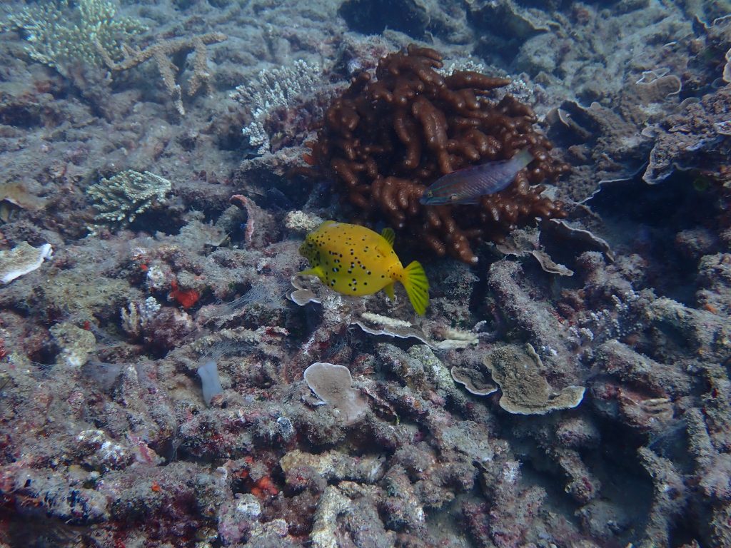
The patches of dead coral are almost exclusively Acropora spp., and of both plate and branching forms. The Porites spp. and other corals, if they bleached, they have most recovered and completely. And the fish – there are still so many, and they are so colourful.
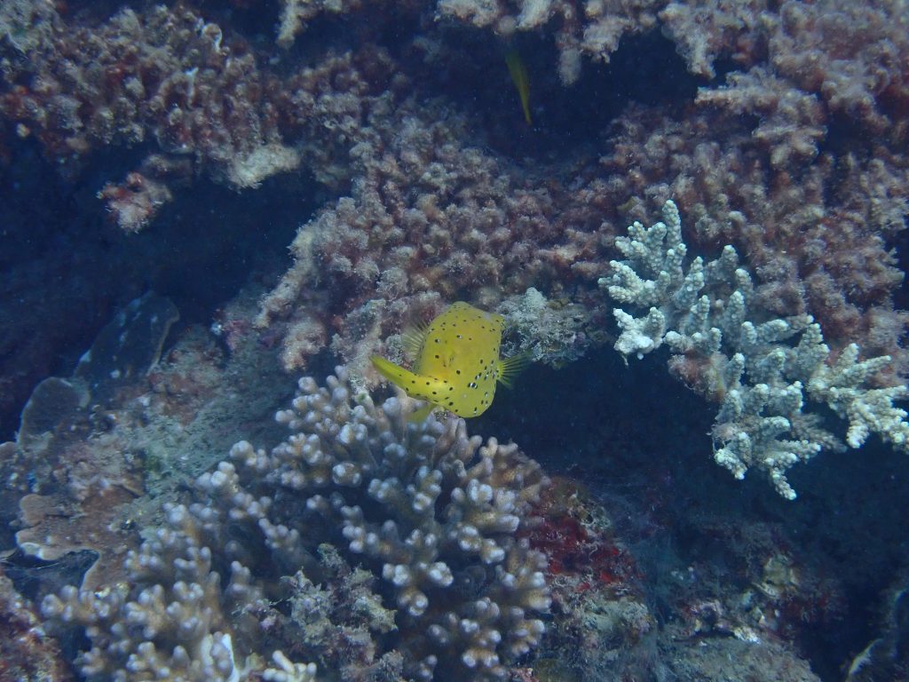
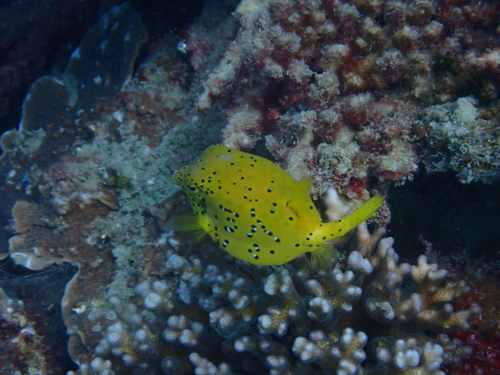
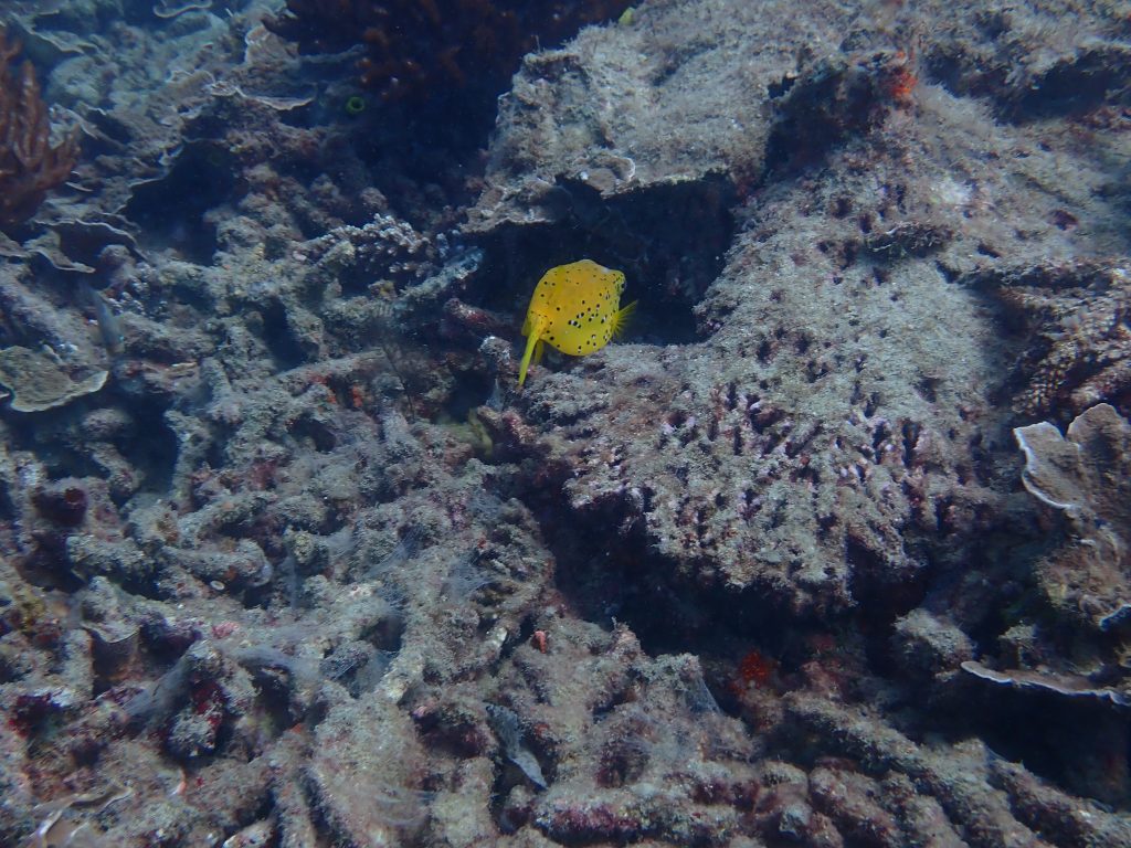
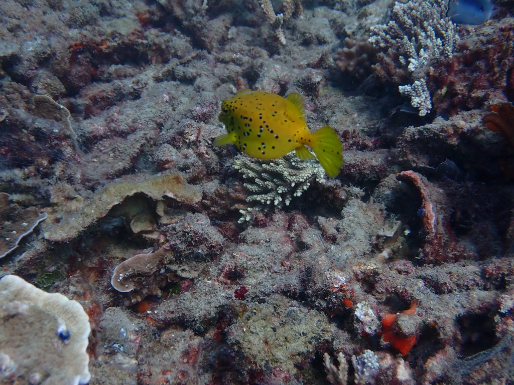
I did take several photographs of a juvenile yellow boxfish (Ostracion cubicus) as it swam across dead coral now infested with dying algae. It is the case that after the corals went white, they became infested with green algae and after that, well the algae are now brown and everything quite dead. But there are still so many fish, and many of the fish are so colourful and seemingly obvious to the dead Acropora spp..
It will be interesting to see what happens next, whether there is recruitment – tiny new corals finding a foothold on the now dead plates – after the coral spawning that will be soon, usually just a few days after the full moon in November.
It is the case that nature tends to follow cycles and to know them we need to acknowledge death when it happens and look to see if new life follows.
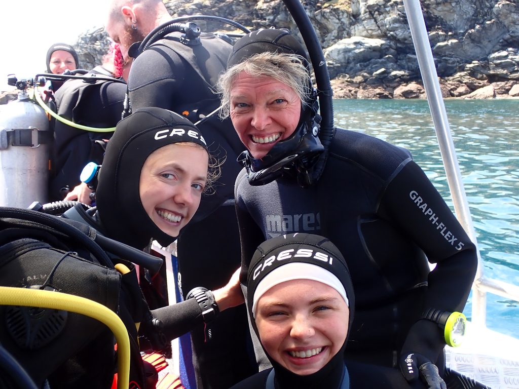
Far back left is Jenn Mayes, and in foreground Jenn Marohasy, Marika and Ewa. Thanks for seeing the corals with me — dead and alive. And I will write about all the nudibranchs we found and photographed in a next blog post.
Some of my previous scribbles on last summer’s coral bleaching:
The best context for understanding decadal temperature changes comes from the world’s sea surface temperatures (SST), for several reasons:
The ocean covers 71% of the globe and drives average temperatures;
SSTs have a constant water content, (unlike air temperatures), so give a better reading of heat content variations;
Major El Ninos have been the dominant climate feature in recent years.
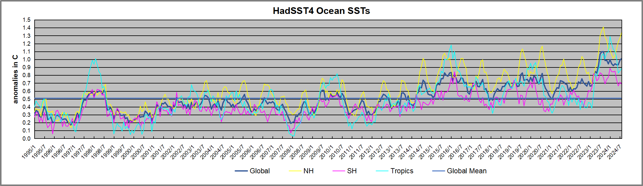
HadSST is generally regarded as the best of the global SST data sets, and so the temperature story here comes from that source. Previously I used HadSST3 for these reports, but Hadley Centre has made HadSST4 the priority, and v.3 will no longer be updated. HadSST4 is the same as v.3, except that the older data from ship water intake was re-estimated to be generally lower temperatures than shown in v.3. The effect is that v.4 has lower average anomalies for the baseline period 1961-1990, thereby showing higher current anomalies than v.3. This analysis concerns more recent time periods and depends on very similar differentials as those from v.3 despite higher absolute anomaly values in v.4. More on what distinguishes HadSST3 and 4 from other SST products at the end. The user guide for HadSST4 is here.
The Current Context
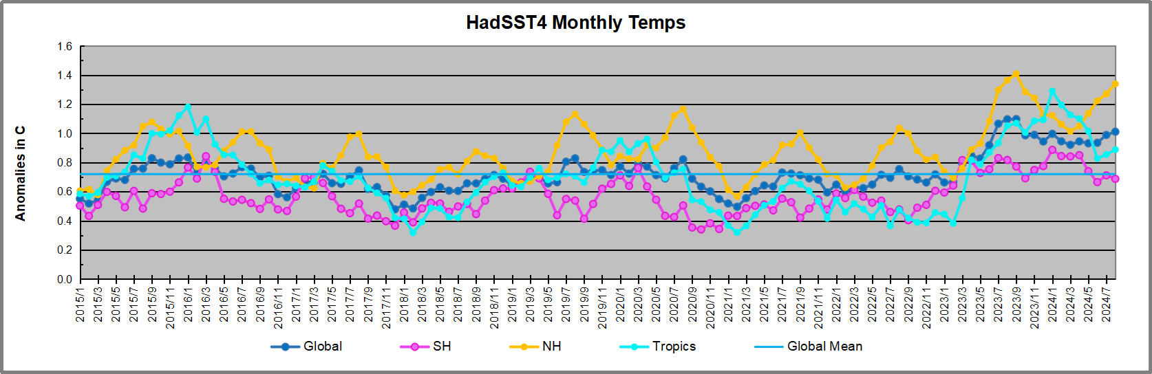
The chart below shows SST monthly anomalies as reported in HadSST4 starting in 2015 through August 2024. A global cooling pattern is seen clearly in the Tropics since its peak in 2016, joined by NH and SH cycling downward since 2016, followed by rising temperatures in 2023 and 2024.
Note that in 2015-2016 the Tropics and SH peaked in between two summer NH spikes. That pattern repeated in 2019-2020 with a lesser Tropics peak and SH bump, but with higher NH spikes. By end of 2020, cooler SSTs in all regions took the Global anomaly well below the mean for this period.
Then in 2022, another strong NH summer spike peaked in August, but this time both the Tropic and SH were countervailing, resulting in only slight Global warming, later receding to the mean. Oct./Nov. temps dropped in NH and the Tropics took the Global anomaly below the average for this period. After an uptick in December, temps in January 2023 dropped everywhere, strongest in NH, with the Global anomaly further below the mean since 2015.
Then came El Nino as shown by the upward spike in the Tropics since January 2023, the anomaly nearly tripling from 0.38C to 1.09C. In September 2023, all regions rose, especially NH up from 0.70C to 1.41C, pulling up the global anomaly to a new high for this period. By December, NH cooled to 1.1C and the Global anomaly down to 0.94C from its peak of 1.10C, despite slight warming in SH and Tropics.
In January 2024 both Tropics and SH rose, resulting in Global Anomaly going higher. Since then Tropics have cooled from a peak of 1.29C down to 0.84C. SH also dropped down from 0.89C to 0.65C. NH lost ~0.4C as of March 2024, but has risen 0.2C over April to June. Despite that upward NH bump, the Global SST anomaly cooled further.
In July there was a warming uptick in all regions, and now in August a new high in NH, along with the Tropics, bringing the global anomaly up to almost match August 2023. We have now three distinct warmings: the El Nino driven peak in 2025-16, the lesser peak in 2019-20 and now a stronger warming event in 2023-24.
Comment:
The climatists have seized on this unusual warming as proof their Zero Carbon agenda is needed, without addressing how impossible it would be for CO2 warming the air to raise ocean temperatures. It is the ocean that warms the air, not the other way around. Recently Steven Koonin had this to say about the phonomenon confirmed in the graph above:
El Nino is a phenomenon in the climate system that happens once every four or five years. Heat builds up in the equatorial Pacific to the west of Indonesia and so on. Then when enough of it builds up it surges across the Pacific and changes the currents and the winds. As it surges toward South America it was discovered and named in the 19th century It iswell understood at this point that the phenomenon has nothing to do with CO2.
Now people talk about changes in that phenomena as a result of CO2 but it’s there in the climate system already and when it happens it influences weather all over the world. We feel it when it gets rainier in Southern California for example. So for the last 3 years we have been in the opposite of an El Nino, a La Nina, part of the reason people think the West Coast has been in drought.
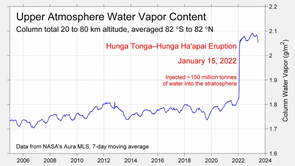
It has now shifted in the last months to an El Nino condition that warms the globe and is thought to contribute to this Spike we have seen. But there are other contributions as well. One of the most surprising ones is that back in January of 2022 an enormous underwater volcano went off in Tonga and it put up a lot of water vapor into the upper atmosphere. It increased the upper atmosphere of water vapor by about 10 percent, and that’s a warming effect, and it may be that is contributing to why the spike is so high.
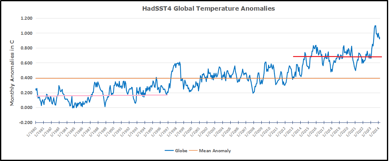
A longer view of SSTs
The graph above is noisy, but the density is needed to see the seasonal patterns in the oceanic fluctuations. Previous posts focused on the rise and fall of the last El Nino starting in 2015. This post adds a longer view, encompassing the significant 1998 El Nino and since. The color schemes are retained for Global, Tropics, NH and SH anomalies. Despite the longer time frame, I have kept the monthly data (rather than yearly averages) because of interesting shifts between January and July. 1995 is a reasonable (ENSO neutral) starting point prior to the first El Nino.
The sharp Tropical rise peaking in 1998 is dominant in the record, starting Jan. ’97 to pull up SSTs uniformly before returning to the same level Jan. ’99. There were strong cool periods before and after the 1998 El Nino event. Then SSTs in all regions returned to the mean in 2001-2.
SSTS fluctuate around the mean until 2007, when another, smaller ENSO event occurs. There is cooling 2007-8, a lower peak warming in 2009-10, following by cooling in 2011-12. Again SSTs are average 2013-14.
Now a different pattern appears. The Tropics cooled sharply to Jan 11, then rise steadily for 4 years to Jan 15, at which point the most recent major El Nino takes off. But this time in contrast to ’97-’99, the Northern Hemisphere produces peaks every summer pulling up the Global average. In fact, these NH peaks appear every July starting in 2003, growing stronger to produce 3 massive highs in 2014, 15 and 16. NH July 2017 was only slightly lower, and a fifth NH peak still lower in Sept. 2018.
The highest summer NH peaks came in 2019 and 2020, only this time the Tropics and SH were offsetting rather adding to the warming. (Note: these are high anomalies on top of the highest absolute temps in the NH.) Since 2014 SH has played a moderating role, offsetting the NH warming pulses. After September 2020 temps dropped off down until February 2021. In 2021-22 there were again summer NH spikes, but in 2022 moderated first by cooling Tropics and SH SSTs, then in October to January 2023 by deeper cooling in NH and Tropics.
Then in 2023 the Tropics flipped from below to well above average, while NH produced a summer peak extending into September higher than any previous year. Despite El Nino driving the Tropics January 2024 anomaly higher than 1998 and 2016 peaks, following months cooled in all regions, and the Tropics continued cooling in April, May and June along with SH dropping, suggesting that the peak might be reached, though now in July and August NH warming has again pulled the global anomaly higher.
What to make of all this? The patterns suggest that in addition to El Ninos in the Pacific driving the Tropic SSTs, something else is going on in the NH. The obvious culprit is the North Atlantic, since I have seen this sort of pulsing before. After reading some papers by David Dilley, I confirmed his observation of Atlantic pulses into the Arctic every 8 to 10 years.
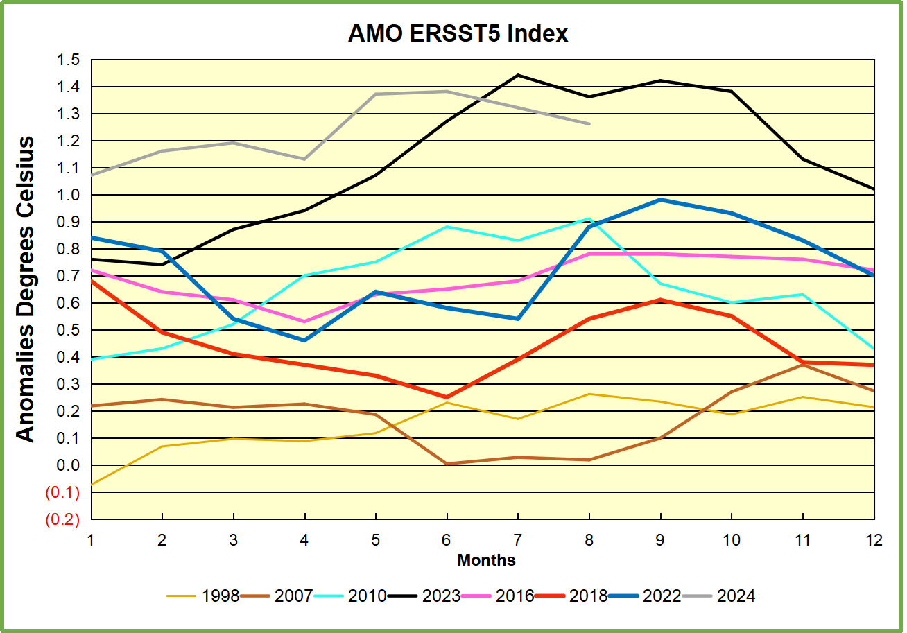
Contemporary AMO Observations
Through January 2023 I depended on the Kaplan AMO Index (not smoothed, not detrended) for N. Atlantic observations. But it is no longer being updated, and NOAA says they don’t know its future. So I find that ERSSTv5 AMO dataset has current data. It differs from Kaplan, which reported average absolute temps measured in N. Atlantic. “ERSST5 AMO follows Trenberth and Shea (2006) proposal to use the NA region EQ-60°N, 0°-80°W and subtract the global rise of SST 60°S-60°N to obtain a measure of the internal variability, arguing that the effect of external forcing on the North Atlantic should be similar to the effect on the other oceans.” So the values represent sst anomaly differences between the N. Atlantic and the Global ocean.
The chart above confirms what Kaplan also showed. As August is the hottest month for the N. Atlantic, its variability, high and low, drives the annual results for this basin. Note also the peaks in 2010, lows after 2014, and a rise in 2021. Then in 2023 the peak was holding at 1.4C before declining. An annual chart below is informative:
Note the difference between blue/green years, beige/brown, and purple/red years. 2010, 2021, 2022 all peaked strongly in August or September. 1998 and 2007 were mildly warm. 2016 and 2018 were matching or cooler than the global average. 2023 started out slightly warm, then rose steadily to an extraordinary peak in July. August to October were only slightly lower, but by December cooled by ~0.4C.
Now in 2024 the AMO anomaly started higher than any previous year, then leveled off for two months declining slightly into April. Remarkably, May shows an upward leap putting this on a higher track than 2023, and rising slightly higher in June. In July and August 2024 the anomaly declined and is now lower than the peak reached in 2023.
The pattern suggests the ocean may be demonstrating a stairstep pattern like that we have also seen in HadCRUT4.
The purple line is the average anomaly 1980-1996 inclusive, value 0.18. The orange line the average 1980-202404, value 0.39, also for the period 1997-2012. The red line is 2013-202404, value 0.66. As noted above, these rising stages are driven by the combined warming in the Tropics and NH, including both Pacific and Atlantic basins.
The oceans are driving the warming this century. SSTs took a step up with the 1998 El Nino and have stayed there with help from the North Atlantic, and more recently the Pacific northern “Blob.” The ocean surfaces are releasing a lot of energy, warming the air, but eventually will have a cooling effect. The decline after 1937 was rapid by comparison, so one wonders: How long can the oceans keep this up? And is the sun adding forcing to this process?
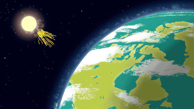
Space weather impacts the ionosphere in this animation. Credits: NASA/GSFC/CIL/Krystofer Kim
Footnote: Why Rely on HadSST4
HadSST is distinguished from other SST products because HadCRU (Hadley Climatic Research Unit) does not engage in SST interpolation, i.e. infilling estimated anomalies into grid cells lacking sufficient sampling in a given month. From reading the documentation and from queries to Met Office, this is their procedure.
HadSST4 imports data from gridcells containing ocean, excluding land cells. From past records, they have calculated daily and monthly average readings for each grid cell for the period 1961 to 1990. Those temperatures form the baseline from which anomalies are calculated.
In a given month, each gridcell with sufficient sampling is averaged for the month and then the baseline value for that cell and that month is subtracted, resulting in the monthly anomaly for that cell. All cells with monthly anomalies are averaged to produce global, hemispheric and tropical anomalies for the month, based on the cells in those locations. For example, Tropics averages include ocean grid cells lying between latitudes 20N and 20S.
Gridcells lacking sufficient sampling that month are left out of the averaging, and the uncertainty from such missing data is estimated. IMO that is more reasonable than inventing data to infill. And it seems that the Global Drifter Array displayed in the top image is providing more uniform coverage of the oceans than in the past.
USS Pearl Harbor deploys Global Drifter Buoys in Pacific Ocean