Month: July 2025

Claim: Climate Crisis Food Price Inflation Delivered Victory to President Trump

Essay by Eric Worrall

Nothing to do with Biden and Kamala…

Rising food prices driven by climate crisis threaten world’s poorest, report finds

High cost of staples due to extreme weather could lead to more malnutrition, political upheaval and social unrest

Sarah Butler
Mon 21 Jul 2025 09.01 AEST

New research links last year’s surges in the price of potatoes in the UK, cabbages in South Korea, onions in India, and cocoa in Ghana to weather extremes that “exceeded all historical precedent prior to 2020”.

It found food price spikes can have a wider economic impact, making it harder for economies to keep down overall inflation and so, for example, bring interest rates down. A hot dry spring in the UK this year, for example, partly drove unexpectedly high UK inflation figures published last week, dampening expectations for further interest rate cuts this summer.

The report also suggests “high rates of inflation can directly alter election outcomes in modern democracies”.

Maximilian Kotz, a Marie Curie postdoctoral research fellow at Barcelona Supercomputing Center and the lead author of the report, said: It is clear the cost of living played a role in last year’s election in the US.

He added: “These effects are going to continue to become worse in the future. Until we get to net zero emissions extreme weather will only get worse, but it’s already damaging crops and pushing up the price of food all over the world.

“People are noticing, with rising food prices No 2 on the list of climate impacts they see in their lives, second only to extreme heat itself.

Read more: https://www.theguardian.com/business/2025/jul/21/rising-food-prices-driven-by-climate-crisis-threaten-worlds-poorest-report-finds

The study referenced by the article (I think);

Climate extremes, food price spikes, and their wider societal risks

Maximilian Kotz, Markus Donat, Tom Lancaster, Miles Parker, Pete Smith, Anna Taylor Smith and Sylvia H Vetter

Accepted Manuscript online 13 June 2025 • © 2025 The Author(s). Published by IOP Publishing Ltd

Article information

Abstract

2024 was the hottest year on record, with global temperatures exceeding 1.5°C above preindustrial climate conditions for the first time and records broken across large parts of Earth’s surface. Among the widespread impacts of exceptional heat, rising food prices are beginning to play a prominent role in public perception, now the second most frequently cited impact of climate change experienced globally, following only extreme heat itself. Recent econometric analysis confirms that abnormally high temperatures directly cause higher food prices, as impacts on agricultural production translate into supply shortages and food price inflation. These analyses track changes in overall price aggregates which are typically slow-moving, but specific food goods can also experience much stronger short-term spikes in response to extreme heat. In this perspective, we document numerous examples from recent years in which food prices of specific goods spiked in response to climate extremes. By evaluating the extremity of the associated climate conditions, we thereby build a global and climatological context for this phenomenon. We further review the knock-on societal risks which these effects may bring with the ongoing intensification of extremes under climate change. These range from increasing economic inequality and the burden on health systems, as well as destabilising monetary and political systems. We discuss challenges and priorities for research and policy to address these risks.

Read more: https://iopscience.iop.org/article/10.1088/1748-9326/ade45f/meta

The main study hilights the risk for low income households;

A catalyst for wider societal risks

Importantly, these climate-driven food price spikes can aggravate risks across a range of sectors of society. First, rising food prices have direct implications for food security, particularly for low-income households. This can result in a) households spending the same but buying less (either going hungry or depending on sources of charity); b) spending the same but buying cheaper options (typically cutting out nutritious foods like fruits and vegetables which are more expensive sources of calories) c) spending an even higher proportion of their income on food (with knock on effects on other areas of essential expenditure). These effects can be strongly regressive given the substantial disparities in the share of income spent on food by low- and high-income households. For example, in the USA the lowest income quintile spends approximately 33% of income on food compared to 8% in the highest income quintile. The fact that larger price increases occur in hotter and typically poorer countries will further amplify these effects

Fourth, food price inflation associated with climate-extremes may come to bear increasing political relevance. Anecdotal evidence from across history often cites food price increases as a precursor to political unrest and social upheaval (from the French and Russian revolutions of the 18th and 20th centuries, to the 2008/09 food crisis and 2011 Arab Spring). Such links are substantiated further by evidence showing a robust relationship between food prices and social unrest at monthly time-scales. Moreover, high rates of inflation can directly alter election outcomes in modern democracies. For example, high inflation reduced support for incumbent Democrats in the 2024 US election, and boosted support for extremist, anti-system and populist parties in elections held in advanced economies since 1948. These effects can be particularly strong when inflation affects real wages, as is the case with food prices.

Read more: Same link as above

The suggestion climate change is a major driver of food inflation is absurd, given the impact climate policies in the USA and elsewhere have on farm input and food distribution prices. For example California, arguably the most extreme green state in the union, farmers and truckers pay more for diesel that pretty much anywhere else in the USA. Such prices are a consequence of California’s regulatory hostility towards fossil fuel.

EIA Diesel Prices
EIA diesel prices. Source EIA.gov

These higher input prices, driven by state regulations, also appear to be impacting food prices in California, along with all the other environmental regulations California inflicts on farmers. California with its benign climate and fertile farmlands should have the cheapest food prices in the union, but that isn’t the case.

Grocery Basket Prices by State
Grocery Basket Prices by State. Source World Population Review, Fair Use, Low Resolution Image to Identify the Subject.

Obviously diesel prices aren’t the only factor, California’s overregulation of industry and radical minimum wage policies also play a part. But diesel prices are important to farming and shipping of produce.

California governor Gavin Newsom appears to have belatedly realised his administration could be the next victim of climate policy inflation voter backlash, if California does not change course.

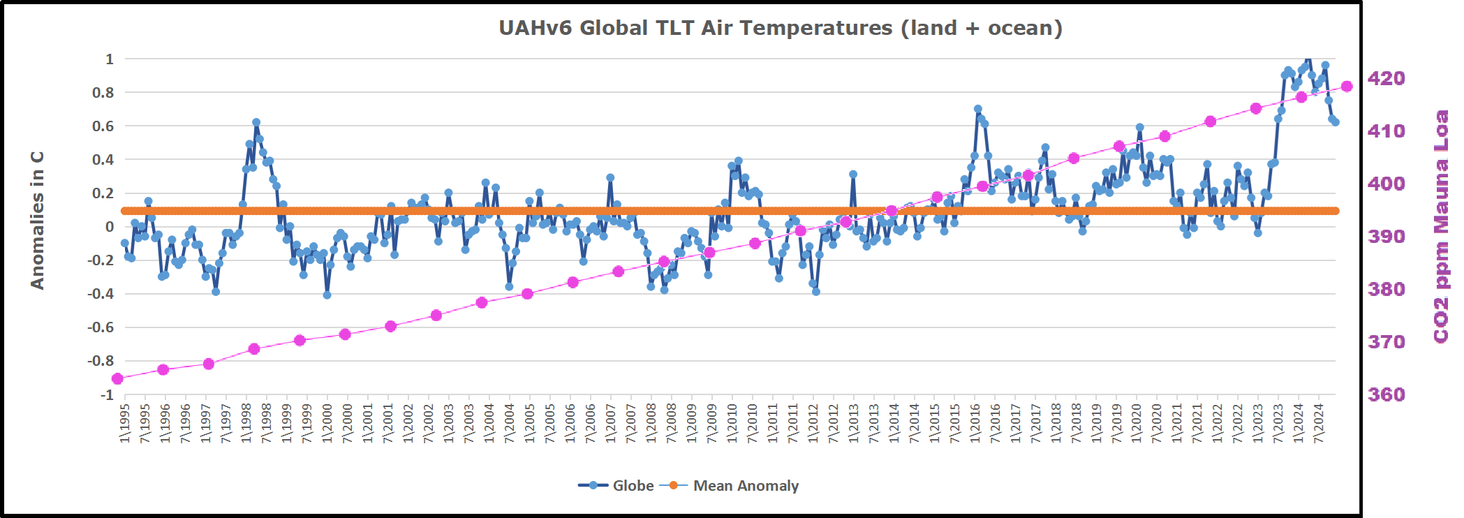
And of course there is the fact that overall global farm yields are rising, a direct contradiction of Kotz’s claims that global warming is harming food production. Farming has always been susceptible to weather. Temporary shortages caused by individual weather events are blips which have no long term impact on rising global agricultural productivity.

Extended crop yield meta-analysis data do not support upward SCC revision

Scientific Reports volume 15, Article number: 5575 (2025) Cite this article

Abstract

The Biden Administration raised its Social Cost of Carbon (SCC) estimate about fivefold based in part on global crop yield decline projections estimated on a meta-analysis data base first published in 2014. The data set contains 1722 records but half were missing at least one variable (usually the change in CO2) so only 862 were available for multivariate regression modeling. By re-examining the underlying sources I was able to recover 360 records and increase the sample size to 1222. Reanalysis on the larger data set yields very different results. While the original smaller data set implies yield declines of all crop types even at low levels of warming, on the full data set global average yield changes are zero or positive even out to 5 °C warming.

Read more: https://www.nature.com/articles/s41598-025-90254-2

But let’s say I’m wrong. Lets play a thought experiment – what if climate driven food price inflation is a major factor?

Kotz admits that in a climate ravaged world, the most important factor in whether people get to eat regularly is personal wealth. Instead of gambling your nation’s future on an elusive global climate agreement, the safest solution to such a threat is to implement aggressive pro-growth policies, to lift as many of your own people as possible out of poverty.

There has never been and will never be a meaningful global climate agreement, so it is futile to hope the future will be any different. No nation would choose mass starvation over cheating on any future climate agreement.

Past agreements, implemented at great cost to those nations which took them seriously, had no impact on the global rise of global CO2. There is no reason to believe future agreements will be any different.

Mauna Loa CO2 Levels
Original source NOAA, annotated to show significant geopolitical climate events.

Lifting your own people out of poverty regardless of CO2 emissions would shield your own people from any climate disruption. And of course, if all nations followed the same strategy, and focussed on economic growth and boosting agricultural productive capacity rather than smashing their economies with carbon quotas, there would be more than enough global wealth to take care of any remaining poor people. Everyone would have enough to eat.

This is only a thought experiment. The claim we face an agricultural climate crisis is absurd, there is no evidence global warming and CO2 has had any negative impact on agriculture. Even NASA has repeatedly admitted the world is visibly greening.

My point is, Kotz’s claims fail on multiple levels. Not only is his claim that climate change is damaging agriculture not supported by the evidence, Kotz’s suggested remedy of attempting to achieve Net Zero also does not make sense. And while food price inflation did cause a drop in support for Democrats, that food price inflation was because of Democrat policies, not because of climate change.

The only safe solution, as always, is to maximise economic growth, to maximise our capacity to deal with whatever the future throws at us.


Discover more from Watts Up With That?

Subscribe to get the latest posts sent to your email.

via Watts Up With That?

https://ift.tt/rqVgsGS

July 21, 2025 at 08:10PM

SH and Tropics Lead UAH Cooling June 2025

The post below updates the UAH record of air temperatures over land and ocean. Each month and year exposes again the growing disconnect between the real world and the Zero Carbon zealots.  It is as though the anti-hydrocarbon band wagon hopes to drown out the data contradicting their justification for the Great Energy Transition.  Yes, there was warming from an El Nino buildup coincidental with North Atlantic warming, but no basis to blame it on CO2.

As an overview consider how recent rapid cooling  completely overcame the warming from the last 3 El Ninos (1998, 2010 and 2016).  The UAH record shows that the effects of the last one were gone as of April 2021, again in November 2021, and in February and June 2022  At year end 2022 and continuing into 2023 global temp anomaly matched or went lower than average since 1995, an ENSO neutral year. (UAH baseline is now 1991-2020). Then there was an usual El Nino warming spike of uncertain cause, unrelated to steadily rising CO2 and now dropping steadily.

For reference I added an overlay of CO2 annual concentrations as measured at Mauna Loa.  While temperatures fluctuated up and down ending flat, CO2 went up steadily by ~60 ppm, a 15% increase.

Furthermore, going back to previous warmings prior to the satellite record shows that the entire rise of 0.8C since 1947 is due to oceanic, not human activity.

gmt-warming-events

The animation is an update of a previous analysis from Dr. Murry Salby.  These graphs use Hadcrut4 and include the 2016 El Nino warming event.  The exhibit shows since 1947 GMT warmed by 0.8 C, from 13.9 to 14.7, as estimated by Hadcrut4.  This resulted from three natural warming events involving ocean cycles. The most recent rise 2013-16 lifted temperatures by 0.2C.  Previously the 1997-98 El Nino produced a plateau increase of 0.4C.  Before that, a rise from 1977-81 added 0.2C to start the warming since 1947.

Importantly, the theory of human-caused global warming asserts that increasing CO2 in the atmosphere changes the baseline and causes systemic warming in our climate.  On the contrary, all of the warming since 1947 was episodic, coming from three brief events associated with oceanic cycles. And in 2024 we saw an amazing episode with a temperature spike driven by ocean air warming in all regions, along with rising NH land temperatures, now dropping below its peak.

Chris Schoeneveld has produced a similar graph to the animation above, with a temperature series combining HadCRUT4 and UAH6. H/T WUWT

image-8

See Also Worst Threat: Greenhouse Gas or Quiet Sun?

June 2025 SH and Tropics Lead UAH Temps Lower banner-blog

With apologies to Paul Revere, this post is on the lookout for cooler weather with an eye on both the Land and the Sea.  While you heard a lot about 2020-21 temperatures matching 2016 as the highest ever, that spin ignores how fast the cooling set in.  The UAH data analyzed below shows that warming from the last El Nino had fully dissipated with chilly temperatures in all regions. After a warming blip in 2022, land and ocean temps dropped again with 2023 starting below the mean since 1995.  Spring and Summer 2023 saw a series of warmings, continuing into 2024 peaking in April, then cooling off to the present.

UAH has updated their TLT (temperatures in lower troposphere) dataset for June 2025. Due to one satellite drifting more than can be corrected, the dataset has been recalibrated and retitled as version 6.1 Graphs here contain this updated 6.1 data.  Posts on their reading of ocean air temps this month are behind the update from HadSST4.  I posted recently on SSTs June 2025 Ocean SSTs: NH Warms, SH Cools.These posts have a separate graph of land air temps because the comparisons and contrasts are interesting as we contemplate possible cooling in coming months and years.

Sometimes air temps over land diverge from ocean air changes. In July 2024 all oceans were unchanged except for Tropical warming, while all land regions rose slightly. In August we saw a warming leap in SH land, slight Land cooling elsewhere, a dip in Tropical Ocean temp and slightly elsewhere.  September showed a dramatic drop in SH land, overcome by a greater NH land increase. 2025 has shown a sharp contrast between land and sea, first with ocean air temps falling in January recovering in February.  Then land air temps, especially NH, dropped in February and recovered in March. Now in June SH land dropped markedly and NH land down slightly, while ocean air temps rose slightly in NH, offset by cooling in SH and Tropics.

Note:  UAH has shifted their baseline from 1981-2010 to 1991-2020 beginning with January 2021.   v6.1 data was recalibrated also starting with 2021. In the charts below, the trends and fluctuations remain the same but the anomaly values changed with the baseline reference shift.

Presently sea surface temperatures (SST) are the best available indicator of heat content gained or lost from earth’s climate system.  Enthalpy is the thermodynamic term for total heat content in a system, and humidity differences in air parcels affect enthalpy.  Measuring water temperature directly avoids distorted impressions from air measurements.  In addition, ocean covers 71% of the planet surface and thus dominates surface temperature estimates.  Eventually we will likely have reliable means of recording water temperatures at depth.

Recently, Dr. Ole Humlum reported from his research that air temperatures lag 2-3 months behind changes in SST.  Thus cooling oceans portend cooling land air temperatures to follow.  He also observed that changes in CO2 atmospheric concentrations lag behind SST by 11-12 months.  This latter point is addressed in a previous post Who to Blame for Rising CO2?

After a change in priorities, updates are now exclusive to HadSST4.  For comparison we can also look at lower troposphere temperatures (TLT) from UAHv6.1 which are now posted for June 2025.  The temperature record is derived from microwave sounding units (MSU) on board satellites like the one pictured above. Recently there was a change in UAH processing of satellite drift corrections, including dropping one platform which can no longer be corrected. The graphs below are taken from the revised and current dataset.

The UAH dataset includes temperature results for air above the oceans, and thus should be most comparable to the SSTs. There is the additional feature that ocean air temps avoid Urban Heat Islands (UHI).  The graph below shows monthly anomalies for ocean air temps since January 2015.

In 2021-22, SH and NH showed spikes up and down while the Tropics cooled dramatically, with some ups and downs, but hitting a new low in January 2023. At that point all regions were more or less in negative territory.

After sharp cooling everywhere in January 2023, there was a remarkable spiking of Tropical ocean temps from -0.5C up to + 1.2C in January 2024.  The rise was matched by other regions in 2024, such that the Global anomaly peaked at 0.86C in April. Since then all regions have cooled down sharply to a low of 0.27C in January.  In February 2025, SH rose from 0.1C to 0.4C pulling the Global ocean air anomaly up to 0.47C, where it stayed in March and April. In May drops in NH and Tropics pulled the air temps over oceans down despite an uptick in SH. At 0.43C, ocean air temps were similar to May 2020, albeit with higher SH anomalies. Now in June Global ocean air anomaly is little changed despite a slight rise in NH.

Land Air Temperatures Tracking in Seesaw Pattern

We sometimes overlook that in climate temperature records, while the oceans are measured directly with SSTs, land temps are measured only indirectly.  The land temperature records at surface stations sample air temps at 2 meters above ground.  UAH gives tlt anomalies for air over land separately from ocean air temps.  The graph updated for June is below.

Here we have fresh evidence of the greater volatility of the Land temperatures, along with extraordinary departures by SH land.  The seesaw pattern in Land temps is similar to ocean temps 2021-22, except that SH is the outlier, hitting bottom in January 2023. Then exceptionally SH goes from -0.6C up to 1.4C in September 2023 and 1.8C in  August 2024, with a large drop in between.  In November, SH and the Tropics pulled the Global Land anomaly further down despite a bump in NH land temps. February showed a sharp drop in NH land air temps from 1.07C down to 0.56C, pulling the Global land anomaly downward from 0.9C to 0.6C. In March that drop reversed with both NH and Global land back to January values, holding there in April.  In May sharp drops in NH and Tropics land air temps pulled the Global land air temps back down close to February value. In June the Global land air drop was significant, down from 0.67C to 0.55C despite a small rise in the Tropics.

The Bigger Picture UAH Global Since 1980

The chart shows monthly Global Land and Ocean anomalies starting 01/1980 to present.  The average monthly anomaly is -0.03, for this period of more than four decades.  The graph shows the 1998 El Nino after which the mean resumed, and again after the smaller 2010 event. The 2016 El Nino matched 1998 peak and in addition NH after effects lasted longer, followed by the NH warming 2019-20.   An upward bump in 2021 was reversed with temps having returned close to the mean as of 2/2022.  March and April brought warmer Global temps, later reversed

With the sharp drops in Nov., Dec. and January 2023 temps, there was no increase over 1980. Then in 2023 the buildup to the October/November peak exceeded the sharp April peak of the El Nino 1998 event. It also surpassed the February peak in 2016. In 2024 March and April took the Global anomaly to a new peak of 0.94C.  The cool down started with May dropping to 0.9C, and in June a further decline to 0.8C.  October went down to 0.7C,  November and December dropped to 0.6C. February went down to 0.5C, then back up to 0.6C in March and April driven by the bounce in NH land air temps, followed by May’s return to 0.5C, and June slightly lower at 0.48C.

The graph reminds of another chart showing the abrupt ejection of humid air from Hunga Tonga eruption.

Note on Ocean Cooling Not Yet Fully Appearing in UAH Dataset

The above chart shows sea surface temperature anomalies (SSTA)  in the North Atlantic 0 to 60N.  The index is derived from ERSSTv.5 by subtracting the global anomalies from the North Atlantic anomalies, the differences as shown in the chart. The baseline of  0.0C is the average for the years 1951 to 1980.  The mean anomaly since 1980 is in purple at 0.33C, and persisted throughout up to 2018. The orange line is the average anomaly in the the last six years, 2019 to 04/2025 inclusive, at 0.84C. The remarkable spikes in 2023 and 2024 drove that rise to exceed 1.4C, which has been cut in half over the last 10 months.  As Dr. Humlum observed, such oceanic changes usually portend air temperature changes later on.

TLTs include mixing above the oceans and probably some influence from nearby more volatile land temps.  Clearly NH and Global land temps have been dropping in a seesaw pattern, nearly 1C lower than the 2016 peak.  Since the ocean has 1000 times the heat capacity as the atmosphere, that cooling is a significant driving force.  TLT measures started the recent cooling later than SSTs from HadSST4, but are now showing the same pattern. Despite the three El Ninos, their warming had not persisted prior to 2023, and without them it would probably have cooled since 1995.  Of course, the future has not yet been written.

via Science Matters

https://ift.tt/krEuV7Q

July 21, 2025 at 07:05PM

Leeds Professors: “Only 3 years left” to Avert Climate Catastrophe

Essay by Eric Worrall

Yet another climate deadline.

Only 3 years left – new study warns the world is running out of time to avoid the worst impacts of climate change

Published: July 20, 2025 2.20pm AEST

  1. Piers Forster Professor of Physical Climate Change; Director of the Priestley International Centre for Climate, University of Leeds
  2. Debbie Rosen Research and Innovation Development Manager for the Priestley Centre for Climate Futures, University of Leeds

Bad climate news is everywhere.  Africa is being hit particularly hard by climate change and extreme weather, impacting lives and livelihoods.

We are living in a world that is warming at the fastest rate since records began. Yet, governments have been slow to act.

But so far, only 25 countries, covering around 20% of global emissions, have submitted their plans, known as Nationally Determined Contributions. In Africa, they are Somalia, Zambia and Zimbabwe. This leaves 172 still to come. 

But arguably only one of the submitted plans – the UK’s – is compatible with the Paris Agreement.

Our report shows that human-caused global warming reached 1.36°C in 2024. This boosted average global temperatures (a combination of human-induced warming and natural variability in the climate system) to 1.52°C. In other words, the world has already reached the level where it has warmed so much that it cannot avoid significant impacts from climate change. There is no doubt we are in dangerous waters.

Just five of the G20 countries have submitted their 2035 plans: Canada, Brazil, Japan, the United States and the United Kingdom. But the G20 is responsible for around 80% of global emissions. This means that South Africa’s current G20 presidency can help to ensure that the world prioritises efforts to help developing countries finance their transition to a low-carbon economy.

Read more: https://theconversation.com/only-3-years-left-new-study-warns-the-world-is-running-out-of-time-to-avoid-the-worst-impacts-of-climate-change-261229

The referenced “our report”;

Indicators of Global Climate Change 2024: annual update of key indicators of the state of the climate system and human influence

Piers M. Forster,Chris Smith,Tristram Walsh,William F. Lamb,Robin Lamboll,Christophe Cassou,Mathias Hauser,Zeke Hausfather,June-Yi Lee,Matthew D. Palmer,Karina von Schuckmann,Aimée B. A. Slangen,Sophie Szopa,Blair Trewin,Jeongeun Yun,Nathan P. Gillett,Stuart Jenkins,H. Damon Matthews,Krishnan Raghavan,Aurélien Ribes,Joeri Rogelj,Debbie Rosen,Xuebin Zhang,Myles Allen,Lara Aleluia Reis,Robbie M. Andrew,Richard A. Betts,Alex Borger,Jiddu A. Broersma,Samantha N. Burgess,Lijing Cheng,Pierre Friedlingstein,Catia M. Domingues,Marco Gambarini,Thomas Gasser,Johannes Gütschow,Masayoshi Ishii,Christopher Kadow,John Kennedy,Rachel E. Killick,Paul B. Krummel,Aurélien Liné,Didier P. Monselesan,Colin Morice,Jens Mühle,Vaishali Naik,Glen P. Peters,Anna Pirani,Julia Pongratz,Jan C. Minx,Matthew Rigby,Robert Rohde,Abhishek Savita,Sonia I. Seneviratne,Peter Thorne,Christopher Wells,Luke M. Western,Guido R. van der Werf,Susan E. Wijffels,Valérie Masson-Delmotte,and Panmao Zhai

Abstract

In a rapidly changing climate, evidence-based decision-making benefits from up-to-date and timely information. Here we compile monitoring datasets (published at https://doi.org/10.5281/zenodo.15639576; Smith et al., 2025a) to produce updated estimates for key indicators of the state of the climate system: net emissions of greenhouse gases and short-lived climate forcers, greenhouse gas concentrations, radiative forcing, the Earth’s energy imbalance, surface temperature changes, warming attributed to human activities, the remaining carbon budget, and estimates of global temperature extremes. This year, we additionally include indicators for sea-level rise and land precipitation change. We follow methods as closely as possible to those used in the IPCC Sixth Assessment Report (AR6) Working Group One report.

The indicators show that human activities are increasing the Earth’s energy imbalance and driving faster sea-level rise compared to the AR6 assessment. For the 2015–2024 decade average, observed warming relative to 1850–1900 was 1.24 [1.11 to 1.35] °C, of which 1.22 [1.0 to 1.5] °C was human-induced. The 2024-observed best estimate of global surface temperature (1.52 °C) is well above the best estimate of human-caused warming (1.36 °C). However, the 2024 observed warming can still be regarded as a typical year, considering the human-induced warming level and the state of internal variability associated with the phase of El Niño and Atlantic variability. Human-induced warming has been increasing at a rate that is unprecedented in the instrumental record, reaching 0.27 [0.2–0.4] °C per decade over 2015–2024. This high rate of warming is caused by a combination of greenhouse gas emissions being at an all-time high of 53.6±5.2 Gt CO2e yr−1 over the last decade (2014–2023), as well as reductions in the strength of aerosol cooling. Despite this, there is evidence that the rate of increase in CO2 emissions over the last decade has slowed compared to the 2000s, and depending on societal choices, a continued series of these annual updates over the critical 2020s decade could track decreases or increases in the rate of the climatic changes presented here.

 – Discussion started: 05 May 2025

 – Revised: 11 Jun 2025

 – Accepted: 13 Jun 2025

 – Published: 19 Jun 2025

Read more: https://essd.copernicus.org/articles/17/2641/2025/

You have to delve into the study to find the 3 years reference;

The values in Table 8 are all greater than zero, implying that we have not yet emitted the amount of CO2 that would commit us to these levels of warming. However, including the uncertainty in ZEC (as in Table S8), non-CO2 emission and forcing uncertainty, and underrepresented Earth system feedbacks results in negative RCB estimates for limiting warming to low temperature limits with high likelihood. A negative RCB for a specific temperature limit would mean that the world is already committed to this amount of warming and that net negative emissions would therefore be required to return to the temperature limit after a period of overshoot. The assumption behind such a calculation is that we can treat the warming impact of positive and negative net emissions as approximately symmetric. While the claim of symmetry is likely valid for small emissions values, some model studies have shown that it holds less well for reversal of larger emissions (Canadell et al., 2021; Zickfeld et al., 2021; Vakilifard et al., 2022; Pelz et al., 2025). As such, larger exceedances of the RCB for a particular temperature target would decrease the likelihood that the temperature target could still be achieved by an equivalent amount of net negative emissions.

Note that the 50 % RCB estimate of 130 Gt CO2 would be exhausted in a little more than 3 years if global CO2 emissions remain at 2024 levels (42 Gt CO2 yr−1; see Table 1). This is not expected to correspond exactly to the time that 1.5 °C global warming level is reached due to uncertainty associated with committed warming from past CO2 emissions (the ZEC) as well as ongoing warming and cooling contributions from non-CO2 emissions. For comparison, our estimate of 2024 anthropogenic warming (1.36 °C) and the recent rate of increase (0.27 °C per decade) would suggest that continued emissions at current levels would cause human-induced global warming to reach 1.5 °C in approximately 5 years.

Read more: Same link as above

This deadline will no doubt join all the other 3 years or 5 years or 10 years to save the world nonsense deadlines which have come and gone. Even if we wanted to there is no plausible path to meaningfully reducing emissions in such a short timeframe.

The world has already touched 1.5C global warming, and nothing bad happened. This appears to have prompted some rather panicked spin, at least in some quarters, to downgrade 1.5C to more of a guideline than a climate emergency.

The most interesting part of the article for me was the reference to the US nationally determined contributions plan for 2035, which was submitted in December 2024 by the Biden administration. The Biden plan committed the USA to a 61-65% reduction in emissions compared to 2005.

That submission was effectively rendered null and void by President Trump’s withdrawal from the Paris Agreement. Perhaps in the UN bubble world the authors of the quoted article inhabit, the USA is still a full Paris Agreement partner. Or maybe they think President Trump is an anomaly, a brief pushback by conservative reactionaries before the inevitable return of business as usual.


Discover more from Watts Up With That?

Subscribe to get the latest posts sent to your email.

via Watts Up With That?

https://ift.tt/ZhPqY0a

July 21, 2025 at 04:01PM

Climate Oscillations 10: Aleutian Low – Beaufort Sea Anticyclone (ALBSA)

By Andy May

The Aleutian Low – Beaufort Sea Anticyclone climate index or ALBSA is designed to compare the Aleutian Low Pressure and the Beaufort Sea High Pressure Centers. The intent is to relate air circulation patterns in the North Pacific and Arctic to climate and the timing of spring sea ice and snow melt.

Calculation method:

The ALBSA index is calculated using 4 points from the NCEP/NCAR Reanalysis Dataset: The following 850mb geopotential height points are used in the calculation:

N: 75° N, 170° W

S: 50° N, 170° W

E: 55° N, 150° W

W: 55° N, 200° W (160° E)

ALBSA = [E – W] – [N – S]

Use of the ALBSA index

Christopher Cox and his colleagues at NOAA developed ALBSA as an indicator of snowmelt timing in the Pacific Arctic on the North Slope of Alaska (Cox, et al., 2019). The timing is influenced by the marine air drawn (advected) to the Beaufort Sea Arctic region from the Aleutian low pressure region. When air is drawn from the Aleutians to the Beaufort Sea, it warms the area, and an early snow melt is observed on the North Slope of Alaska. The pattern illustrated in figure 1 is for 2002 when an early snowmelt was observed in May.

Figure 1. The air circulation pattern for May 2002, when the North Slope snow melted early. The four points used in the computation of the ALBSA index are identified, the data used for the calculation is from the NCEP-NCAR reanalysis dataset. The precise points used are identified in the text above. The contours are temperature (K) and the arrows are wind vectors at 850 mb (~1.5 km). The blue dot is Utqiaġvik and the red dot is Oliktok, both towns are in Alaska. The dashed brown line is the high-pressure ridge. Source: (Cox, et al., 2019).

Figure 1 illustrates the typical circulation pattern for years with early melting snow and ice. The air from the Aleutian low pressure region moves eastward and then trends northward through the Bering Strait to the Chukchi and Beaufort Seas. The average ALBSA 850 mb geopotential height (GPH) anomaly in May 2002 was about 69 meters and for the entire spring (March-June) it was 91.1 meters.

For comparison the same map is presented for 1988 as figure 2, when the snowmelt was late. In that year it did not start until June.

Figure 2. A map of the ALBSA Index in 1988, a late snowmelt year. Notice the circulation is not through the Bering Strait, but to Northern Canada. The blue arrow is the Beaufort Sea anticyclone (“BSA”), with easterly winds, it only appears in late years. These winds delay the melt. “AL” identifies the Aleutian Low Pressure region. Source: (Cox, et al., 2019).

The major characteristic of late years is the presence of the Beaufort Sea Anticyclone (BSA), this pushes cold Arctic air to the North Slope which delays melting. For the month of June, the ALBSA 850 mb geopotential height (GPH) anomaly was 7.9 meters and for the 1988 spring it was -90.3 meters. That is the North-South difference was much larger than the east-west difference in 850 mb geopotential height.

Like many other climate oscillations, the ALBSA index has been trending positive in recent decades. That means the Beaufort Sea Anticyclone has been weakening, causing a warmer North Slope. This is illustrated in figure 3.

Figure 3. Both the spring ALBSA (gray) and the 5-year smoothed spring ALBSA (orange) are plotted. The late snowmelt year 1988, and the early snowmelt year of 2002 are marked. In addition, the 1977 and 1997 PDO climate shifts from post 8 are marked.

As illustrated in figure 1, the 2002 spring had an early melt and no Beaufort Sea Anticyclone. In that year the May ALBSA anomaly was +68.9 m and the average spring ALBSA anomaly was +91.1 m, the melt occurred May 23. In 1988 the melt was very late, June 18, and the spring average ALBSA anomaly was -90.3 m. That spring had a strong Beaufort Sea anticyclone, which kept the North Slope of Alaska cold for a longer period.

The correlation between ALBSA and HadCRUT5 is poor, and the trends do not match. However, it does correlate decently with the NPI, which was discussed in post #8. NPI and ALBSA are compared in figure 4. They are not perfectly correlated but they both trend positively since the 1980s.

Figure 4. A comparison of the ALBSA spring 850-mb GPH anomaly, both one-year and five-year averages to the full-year and five year average NPI from post #8.

ALBSA correlates with snowmelt in Northern Alaska and the onset of sea ice melting in the adjacent seas. It also captures some of the variability in the NPI.

Discussion

The timing of snow and sea ice melting is important because the albedo of ice and snow is very high, whereas the albedo of meltwater is very low. This contrast makes a significant difference in the absorption of solar radiation and the resulting warming rate of the surface and lower troposphere as the sun re-enters the polar sky in the spring. Measurements of absorbed energy on the North Slope of Alaska have shown that early melts, for example May 13, 2016, can absorb 30% or more solar energy than late melts, for example June 18, 2017 (Cox C., et al., 2018). Further, as sea ice melts, it allows heat trapped under the ice to escape into the atmosphere.

AR6 does not mention ALBSA or the NPI or discuss if they are reproduced in the CMIP6 climate models. However, given that the models do not reproduce the NAO or AO (see post 9) or the Aleutian Low very well (AR6, page 1381) we assume that ALBSA is not reproduced well by the models. The PDO is discussed in AR6, and it is related to both the NPI and ALBSA. The PDO is very poorly reproduced in the CMIP6 climate models (AR6, page 427 & 503). AR6 often refers to the PDO as “PDV” and claims that since the CMIP6 models cannot duplicate it, it must be random internal variablity, even though the PDO oscillations are statistically significant (Mantua, et al., 1997) & (Ebbesmeyer, et al., 1990).

It is logical that ALBSA affects the pattern of Northern Hemisphere warming and cooling, but it does not correlate well with HadCRUT5. The next post will discuss the Oceanic Niño Index or ONI, which is used to define the El Niño and La Niña ENSO states.

Download the bibliography here.

Previous posts in this series:

Musings on the AMO

The Bray Cycle and AMO

Climate Oscillations 1: The Regression

Climate Oscillations 2: The Western Hemisphere Warm Pool (WHWP)

Climate Oscillations 3: Northern Hemisphere Sea Ice Area

Climate Oscillations 4: The Length of Day (LOD)

Climate Oscillations 5: SAM

Climate Oscillations 6: Atlantic Meridional Model

Climate Oscillations 7: The Pacific mean SST

Climate Oscillations 8: The NPI and PDO

Climate Oscillations 9: Arctic & North Atlantic Oscillations


Discover more from Watts Up With That?

Subscribe to get the latest posts sent to your email.

via Watts Up With That?

https://ift.tt/pPjFOah

July 21, 2025 at 12:07PM