
Recently Michael Connolly presented the evidence contradicting assumptions built into GCMs (Global Climate Models). This post consists of the exhibits he used, and additional Connolly comments in italics from a similar talk this month to Doctors for Disaster Preparedness. (Video embedded later in post.)
Michael Connolly:
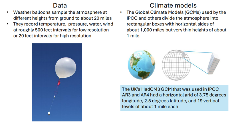
I’m an engineer and a scientist. As an engineer, I use computer models to design and make things. As a scientist, I look at the data to see if my computer models are correct. So, what we did at the center for environmental research and earth sciences (CERES) is that we looked at the data from 20 million radio balloons.
We then asked, can we look at this data and see how we can use it to check the computer models? And we found there’s two types of balloons. One: the average weather balloon does about a 100 measurements as it goes up to the stratosphere. But the ones which measure ozone do a measurement about once every second. So you have maybe four or 5,000 measurements on each sample. But all of the climate models, and by the way, nobody in the climate model community bothered to check the data to see if their models were correct, which I find very bizarre. But what all of the model community do is they divide the earth into a number of little boxes. So on a horizontal scale the boxes are about 1,000 mi long and on a vertical scale they’re about less than a mile in height.
They then make a number of assumptions about how the air behaves within each of these boxes. So their first assumption is that the air in each box is in a state which we call thermodynamic equilibrium. which I’ll explain in a few minutes. So they assume that on a horizontal scale the air in a box is in equilibrium over a distance of a 1,000 miles. But on a vertical scale only in equilibrium for slightly less than a mile.
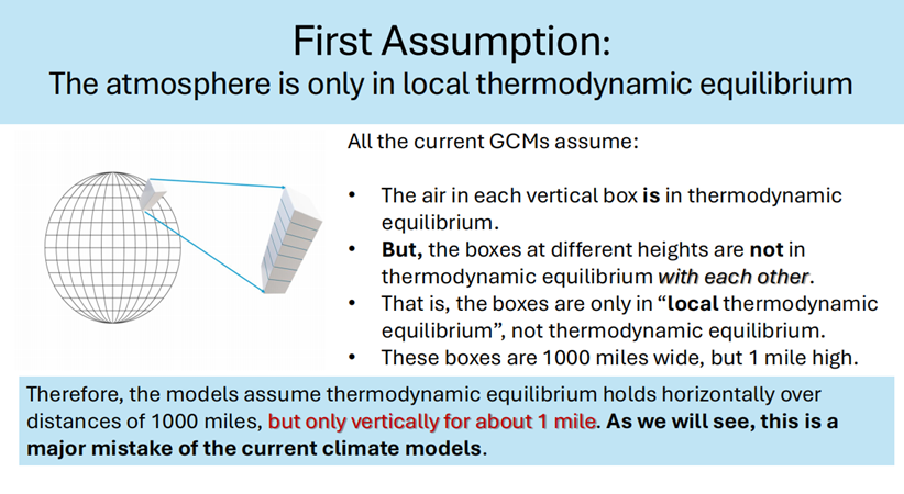 And they also assume that the different boxes are not in thermodynamic equilibrium with each other. Because if it turns out that the boxes are in thermodynamic equilibrium with each other, all of the assumptions of the climate models collapse because Einstein and his co-authors over a 100 years ago showed that if a system was in thermodynamic equilibrium, if you put in a greenhouse gas into that system, it would absorb more energy. But if it’s in thermodynamic equilibrium, it emits more energy. So increasing the level of greenhouse gases will increase the rate of absorption but also increase the rate of emission. So there’s no net change due to the radiation. So if it turns out that the assumption that the the different boxes aren’t in thermodynamic equilibrium is false, then the whole theory of man-made global uh warming collapses.
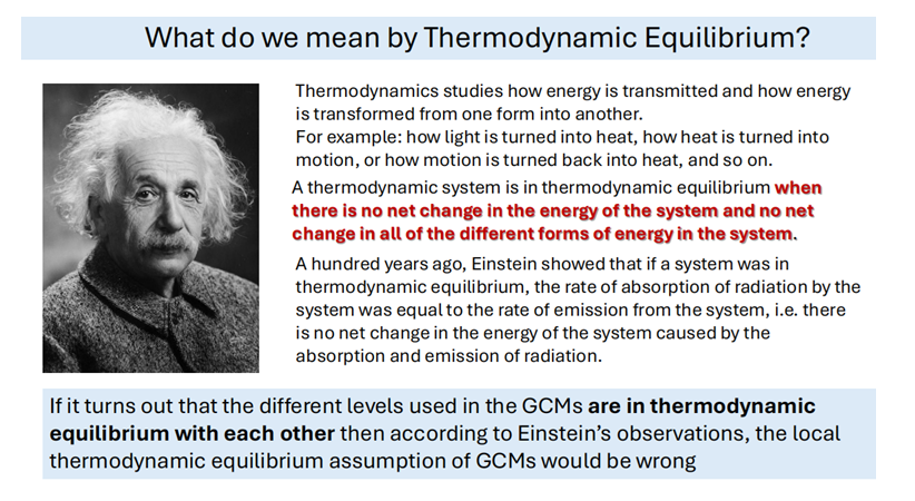
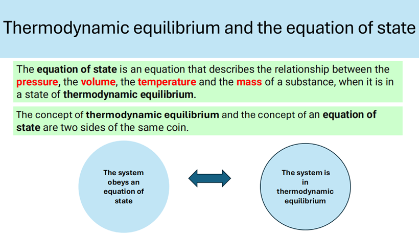
So how do we know if something is in thermodynamic equilibrium or not? Well, what you do is you take a system and you do all the measurements of the different parameters involved and if you can describe the system in what’s called an equation of state with using these parameters, then we say the state is in thermodynamic equilibrium. So in other words, obeying an equation of state is one side of the coin of being in thermodynamic equilibrium. They’re both different sides of the same coin.
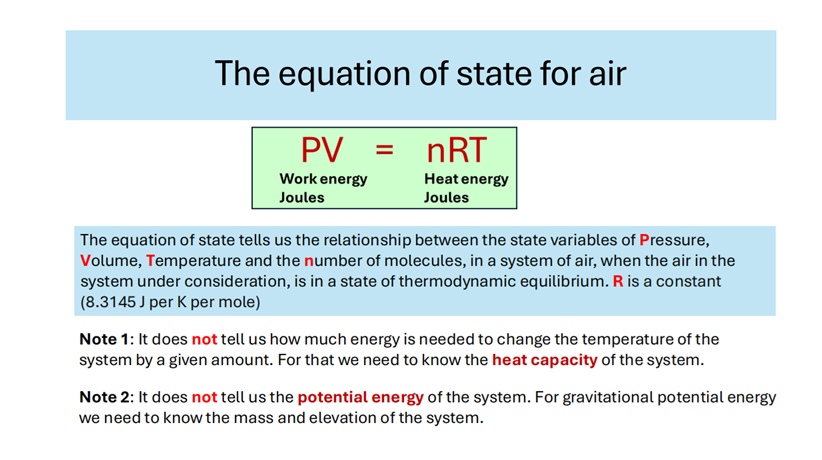
So for the air, the equation of state is this. It’s called the ideal gas law. And this is the equation that’s used by the climate modelers in treating the different boxes as being in thermodynamic equilibrium. You can see down there it tells you the relationship between the different parameters, but it doesn’t tell you how much energy it would take to change the temperature of a system. For that you need to know the heat capacity of the system. And it doesn’t tell you anything about potential energy. In other words, if I take a cubic meter of air and lift it up and keep it at the same temperature and pressure, it would obey the same equation, but it would have gravitational potential energy because it takes energy to lift it up. That’s not reflected in the equation of state.
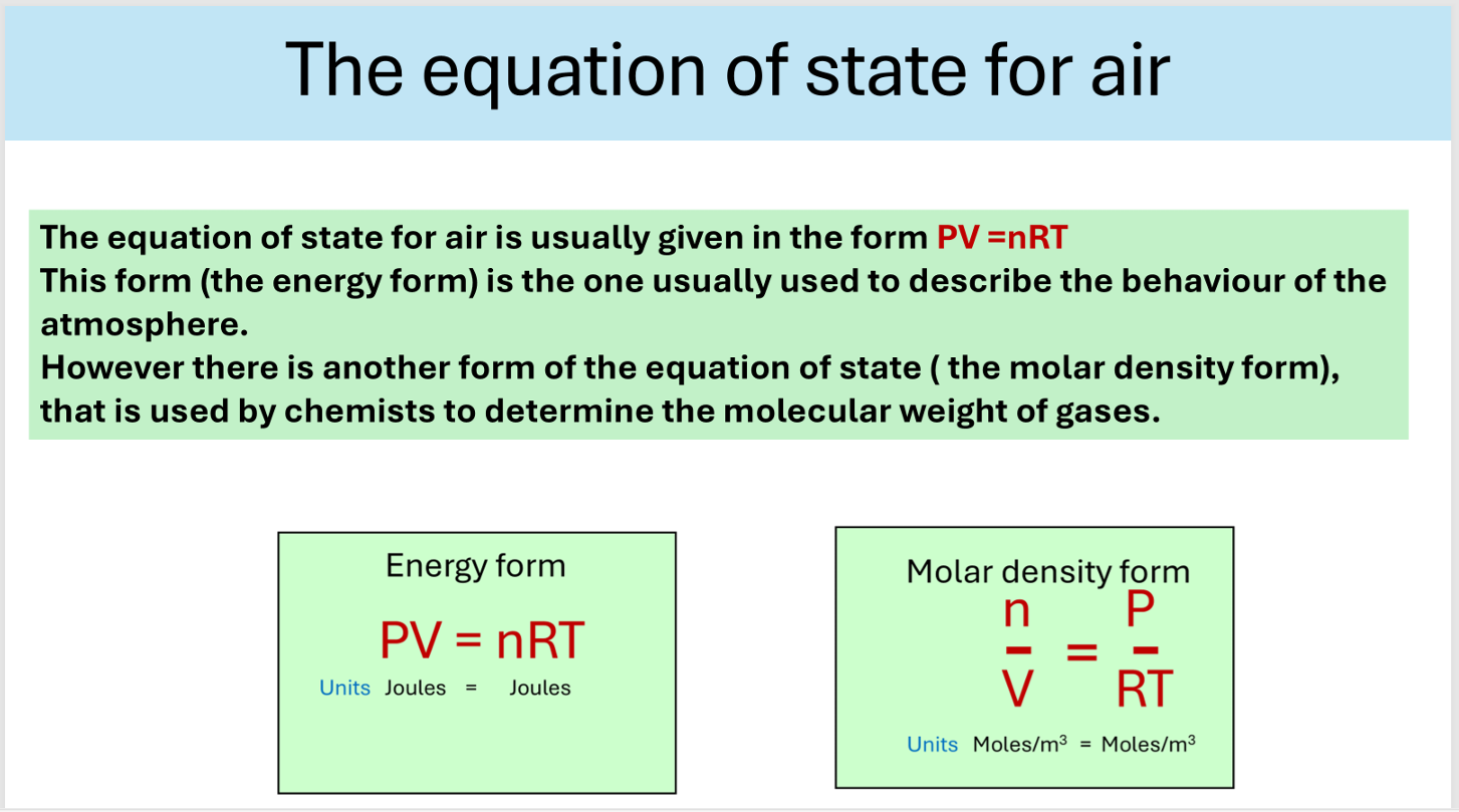
As a chemist I thought there was something dead obvious to do. The equation of state can be rewritten in a different form called the molar density form, and this form has been used by chemists for hundreds of years to determine the molecular weight of new gases. So we asked what happens if we describe the atmosphere in terms of molar density form instead of the energy form? We were the first and still the only people to have done this.
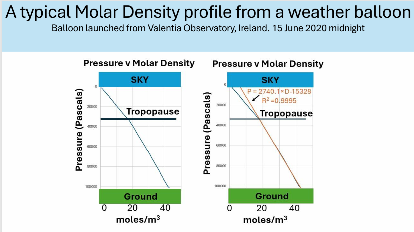
When we did that we got a big surprise. We found that if you plot the molar density versus pressure you get these two straight lines. Now this means that the atmosphere in the troposphere, that’s the lower bit, is obeying an equation of state. So that means it’s in thermodynamic equilibrium. And when you get to the tropopause it turns into another straight line. Now this is quite common in studying materials. If you can describe it in terms of one equation of state and then it changes into another equation of state, we call it a change of phase. For example, you can describe water using the gaseous water using the gas laws, but then when it turns into liquid water, you have to use a different equation of state.
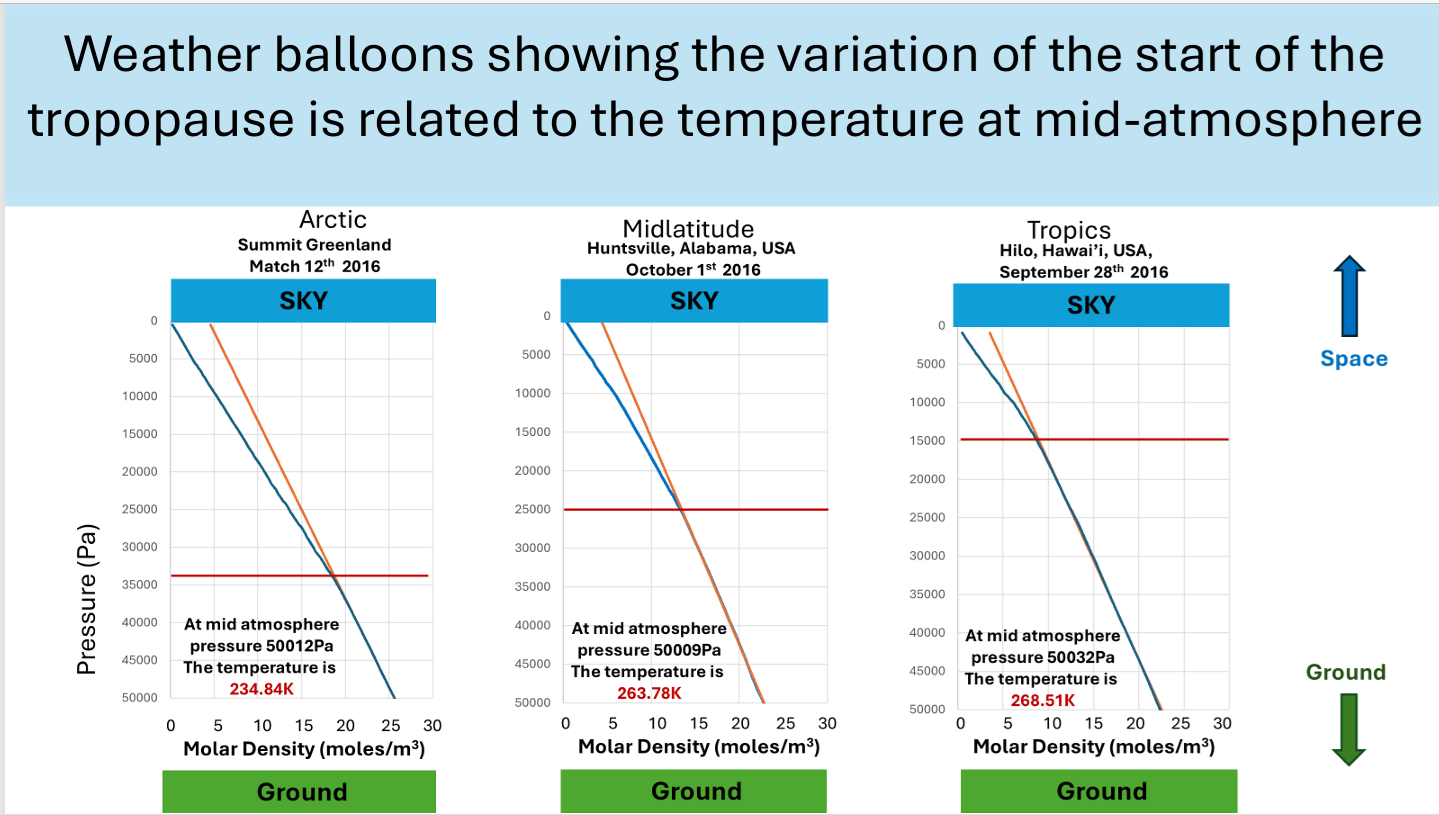
Now we studied all the different weather balloons from all around the world and we found that this phenomenon occurred in all of them. The only difference was that in the tropics the change of phase occurred at a higher altitude and in the Arctic and polar regions it occurred at a lower altitude. So, when we were here in Tucson 5 years ago, we made a video for the entire year of all of the radio balloon data for Tucson for 2018. And the reason for this video is that looking at a static graph like that, you don’t see any changes. Now, in the models that they’re using, the different boxes are isolated from each other, if you put energy into one of the boxes, it would kind of stay there. But if they’re in thermodynamic equilibrium, you put energy into one box, then all of the boxes will change because all of the energy will be distributed throughout the system. When you look at the video, the behavior of the boundary layer position moves up and down.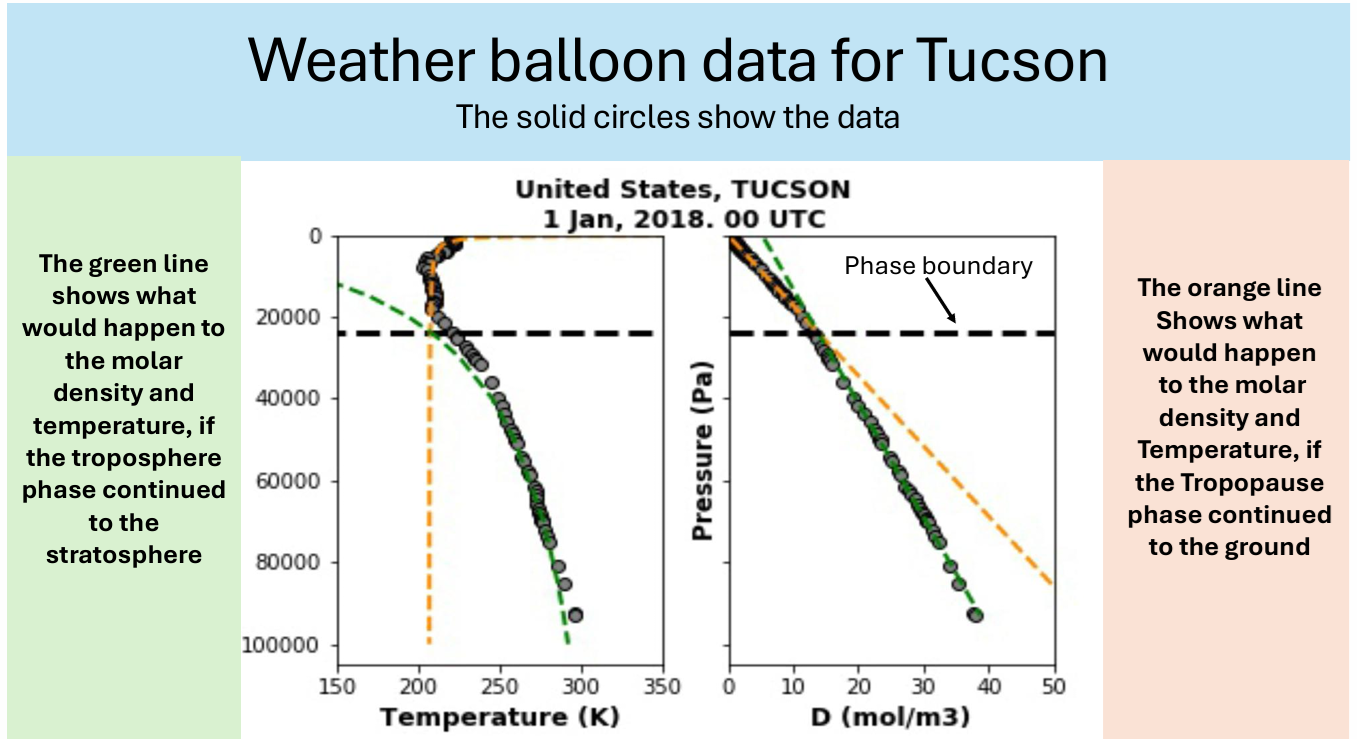
But also the temperature: if it moves to the right, the temperature is increasing. If it moves to the left, the temperature is decreasing. And what you will see once you watch the video, it’s all synchronized. In other words, if a change occurs, if the troposphere is warming up and the temperature is moving to the right, the tropopause moves down, the tropopause moves in the opposite direction. So in other words, when the troposphere heats up, the tropopause cools down. when the troposphere cools down the tropopause heats up and it does so in a synchronized way. So that synchronization shows that it’s thermodynamically connect connected. The idea that all of these boxes are not in thermodynamic equilibrium is contradicted by this data. [The referenced video starts at 10 minutes into the embedded presentation below.]
So that’s the first assumption. Now looking at the second assumption.
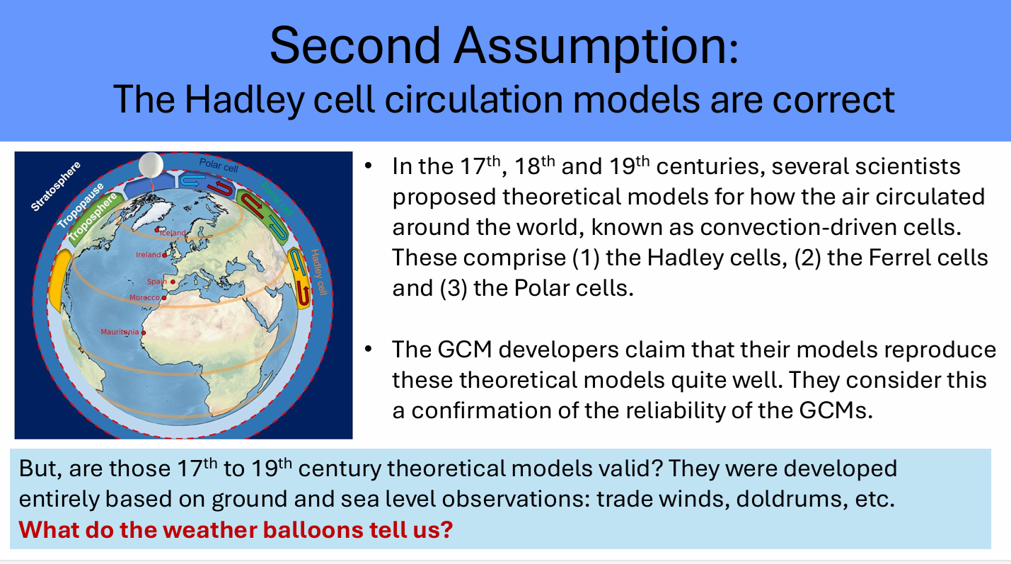
Back in the day when I was 17 or something, Hadley was looking to explain the trade winds. So he came up with this idea of what happens: The very hot temperatures landing on the equator heated up the atmosphere. here and this hot air then rose up. Then as it rose up it started to move towards the poles and as it moved towards the poles it cooled down and you got this circular phenomenon. They came up with three different types of circular cells: the Hadley cells; the ferral cells and the polar cells. But all of these this theoretical stuff was based on ground measurements.
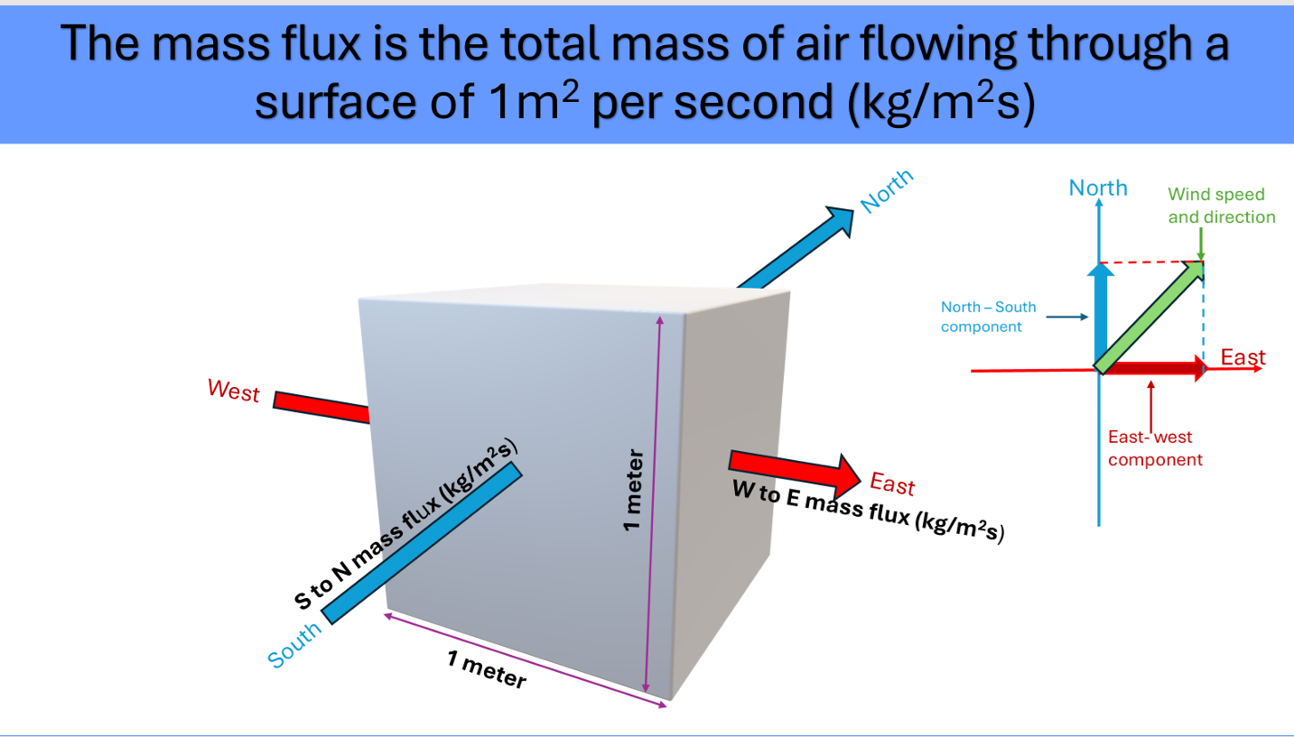
And again uh nobody bothered to check whether this is true or not. So I’ll just show how we checked it. But first of all I just want to explain what’s meant by mass flux. So if you take a a square meter and you measure the air flowing through it and what weight of air that is the mass flux. So in the weather balloons they give you the speed of the air and they give you the direction in which it’s it’s going. So you can use this to calculate the mass flux. So we said fine. So can we use this to check the idea of the Hadley cells and that and it turns out that you can. So we did and we published a paper two years ago.
We found first of all if you take a balloon and you launch it up through one of these cells then if Hadley is correct you would expect the hot air was rising here in the tropics and that drags in the air from the colder regions and then it hits the tropopause. Now, when Hadley came up with the idea, nobody knew the tropopause existed, and it’s only 30 years before I was born that it was actually discovered. So, that’s telling something about my age.
Anyway, if you send a balloon up through the atmosphere, you would expect the mass flux flow to flow in that direction down at the lower levels. And then as you go up at some stage it would shift over and start going in the opposite directions. So since that was available that mass flux we could measure from the balloon data we did that and we got a surprise.
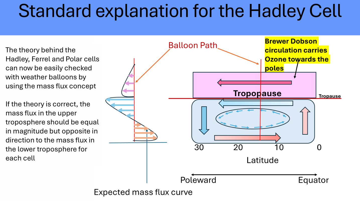
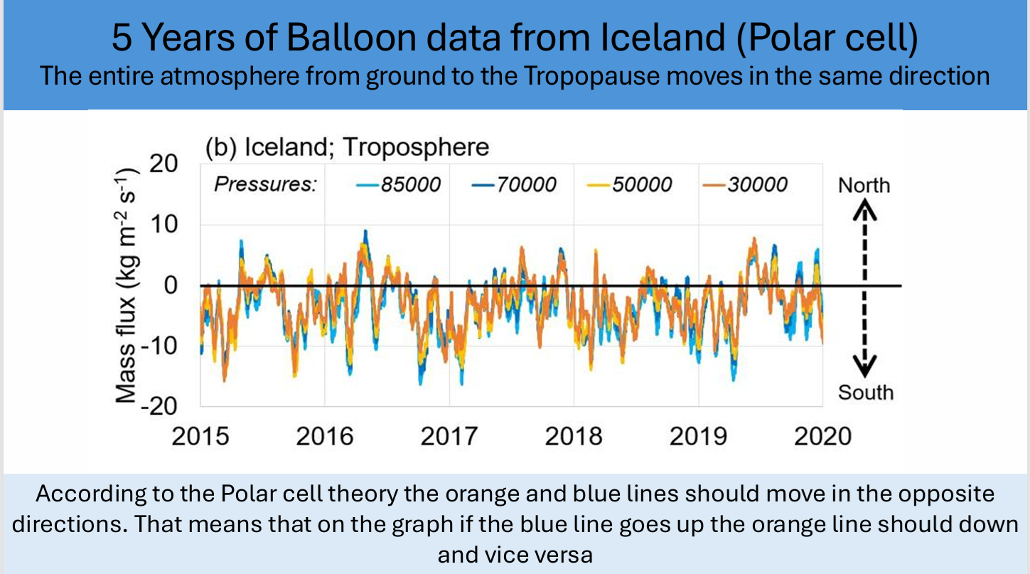
There was absolutely no circulation patterns at all. Instead what the atmosphere was doing. So if we point here you can see these ones are the lower ones. So you have the direction the north south direction of the mass flux. These are the ones at the lower half of the troposphere. These are the ones in the opposite half of the troposphere.
For a Hadley cell you would expect these ones to be flowing in the opposite direction to these ones. But instead what we find is they all flow in the same direction. And in a very unusual pattern. What happens is here it’s flowing south then the atmosphere slows down over a couple of days goes back and forth and so on. So instead of this circular pattern what’s happening is the whole atmosphere is moving like a giant pendulum back and forth. So we have the atmosphere going one way, then after a few days it turns around and comes back in the opposite direction. And this is for Iceland but we found the exact same thing occurred for all the different stations.
 So in that published paper we we took a station from each of the different five climate types and we found the exact same sort of thing happened. Now people said: okay so maybe it’s going back and forward on a daily basis but over a period of a year it might average out. So we average the data over the five years for each of the stations.
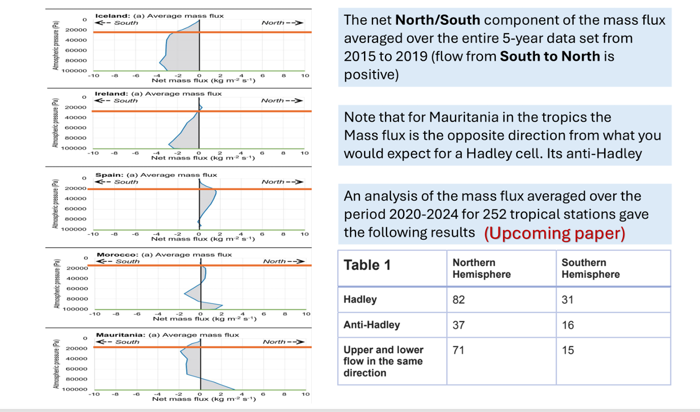
And since we published that paper, we’ve analyzed over 250 of the weather stations in the tropics. And we found for these 82% of them are Hadley. 73 in the northern hemisphere. So the majority are not Hadley cells. And in the southern hemisphere they’re equally balanced. But the problem with even the ones that were Hadley cells is you can see here the mass flux grow flowing in this direction the area under the curve is not the same as the one up above. And if it was a proper Hadley cell, they’d have to be the same. So what we found is for none of them this worked out. So they don’t exist, right?
via Science Matters
July 21, 2025 at 11:49AM


