

The media and governmental reports focus on total accumulated numbers which are big enough to scare people to do as they are told. In the absence of contextual comparisons, citizens have difficulty answering the main (perhaps only) question on their minds: What are my chances of catching Covid19 and dying from it? The map shows a lot of cases, and the chart looks like an hockey, going upward on a straight line. So why do I say canadians are safer than it looks like from such images?
First let’s look at daily numbers to see where we are and how we got here. All the statistics come from Canada Public Health Coronavirus disease (COVID-19): Outbreak update.

By showing daily tests, new cases and reported deaths, we can see how the outbreak has built up over the last 2 months or so. The green line show how testing has grown to a sustained daily rate of 30,000 (all numbers are smoothed with 7 day averages ending with the stated date.) Note that the curve is now descending after peaking at 1800 on May 3, now down to 1156 new cases per day. This lower rate of infections is despite the highest rate of testing since the outbreak began. Deaths have also peaked at 177 on May 6, down to 121 yesterday. The percentage of people testing positive is down to 4%, and deaths are 0.42% of the tests administered.
But it matters greatly where in Canada you live. The map at the top show how Quebec is leading the nation in both cases and deaths. Quebec has always celebrated being a distinct society, but not in this way. The same chart for Quebec epidemic looks like this (from the same dataset). This province has about 23% of the national population and does about 25% of the tests. But Quebec contributes 56% of the cases and 62% of the deaths, as of yesterday. Here how the outbreak has gone in La Belle Province.

Cases have dropped off recently, from 1100 May 9 down to 737 yesterday. Deaths are slowing declining also from 110 on May 7 to 83 yesterday. But clearly everywhere else in Canada, people are much safer than those living in Quebec. So what is going on?

To enlarge image, open in new tab.
The graph shows that people are dying in group homes, the majority in CHSLD (long term medical care facilities) and also in PSA (private seniors’ residences). The huge majority of Quebecers in other, more typical living arrangements have very little chance of dying from this disease. Not even prisoners are much at risk.
Of course the other dimension is years of age, since this disease has spread mostly among people suffering from end-of-life frailties. A previous post reported that the Netherlands parliament was provided with the type of guidance everyone wants to see.

For canadians, the most similar analysis is this one from the Daily Epidemiology Update: :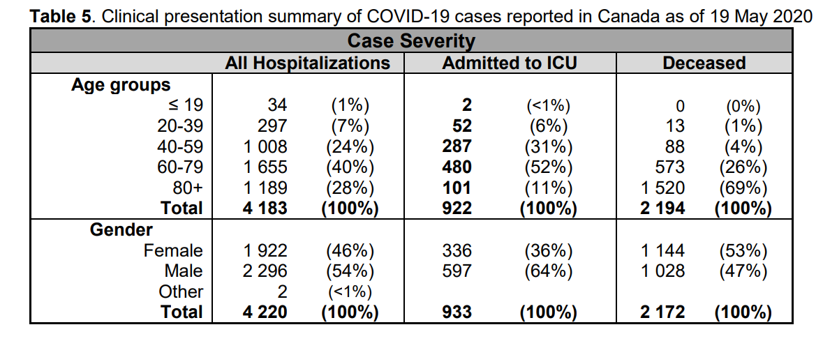
The table presents only those cases with a full clinical documentation, which resulted in 2194 deaths compared to the 5842 total reported. The %s show that under 60 years old, few adults and almost no children have anything to fear.
via Science Matters
May 19, 2020 at 05:54PM

Reblogged this on uwerolandgross.
LikeLike