Month: April 2022

Week in review – climate edition

by Judith Curry

A few things that caught my eye these past weeks

We find that ocean warming and ice shelf melting respond to long-term changes in the atmosphere – specifically the Southern Hemisphere westerly winds. [link]

The magic and mystery of turbulence [link]

Interpreting extreme climate impacts from large ensemble simulations – are they unseen or unrealistic? [link]

Past world economic production constrains current energy demands [link]

Problems with datasets used to estimate trends in extreme rainfall [link]

Could ‘lost crops’ help us adapt to climate change? [link]

Role of the Pacific Decadal Oscillation in driving US temperature predictability [link]

The Greenland ice sheet is melting from the inside out, as well as the outside in.[link]

Earth’s melting glaciers contain less ice than scientists thought [link]

The Lancet: mortality from non optimal temperatures.  With warming, the largest decline in overall excess death ratio occurred in South-eastern Asia, whereas excess death ratio fluctuated in Southern Asia and Europe. [link]

We provide new estimates of the interannual variability in supraglacial lake areas and volumes around the entire East Antarctic Ice Sheet. [link]

Arctic glaciers and ice caps through the Holocene [link]

Overview article on atmospheric rivers [link]

Millions of historical monthly rainfall observations taken in the UK and Ireland rescued by citizen scientists [link]

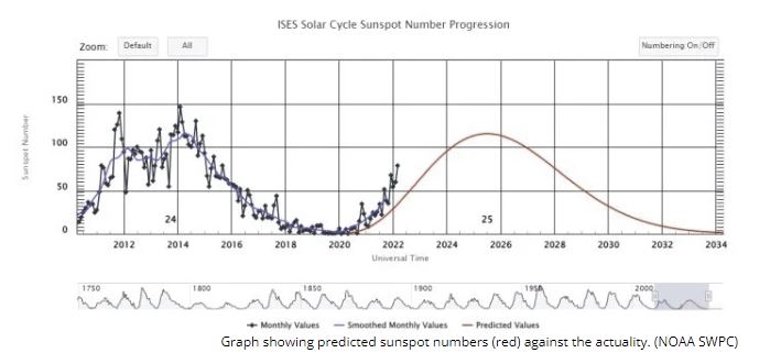
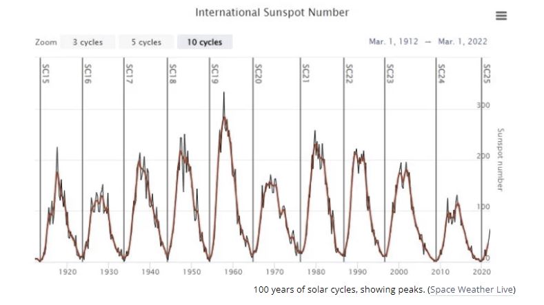
What was the Carrington event? [link]

Where did the water from Mars’ ancient rivers and lakes go? [link]

“Surface ocean warming and acidification driven by rapid carbon release precedes Paleocene-Eocene Thermal Maximum” [link]

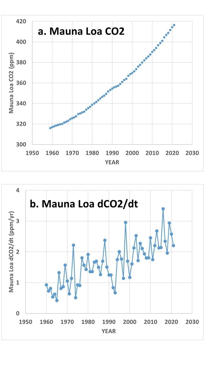
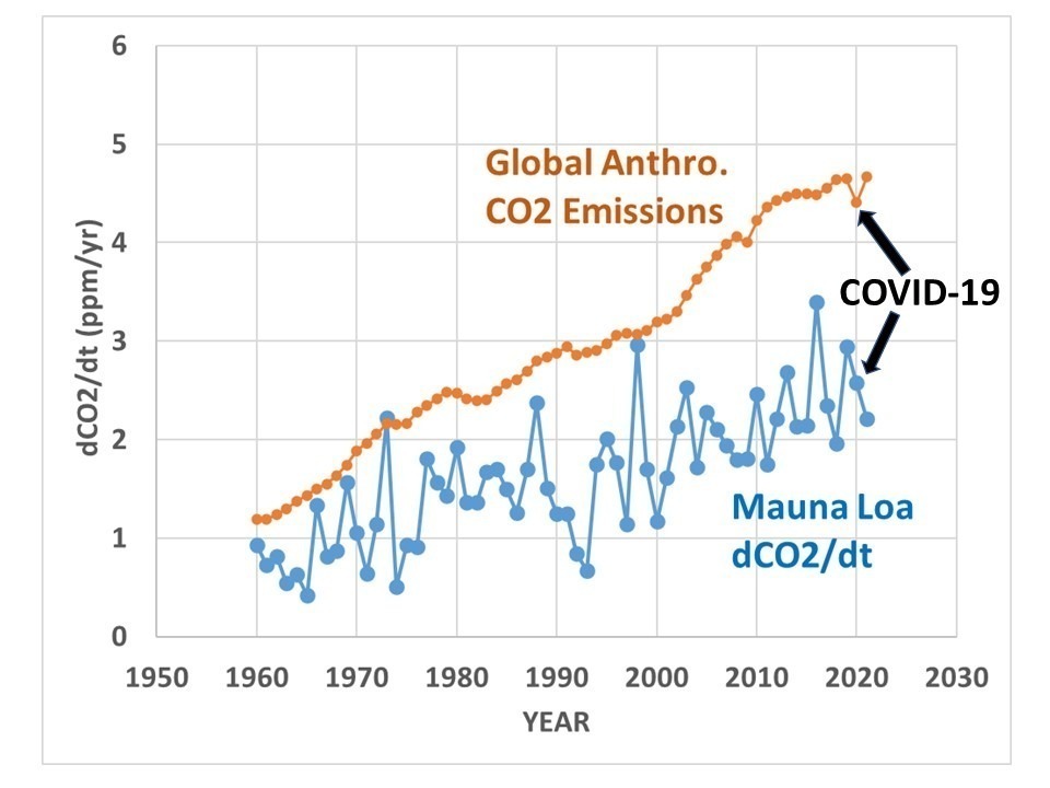
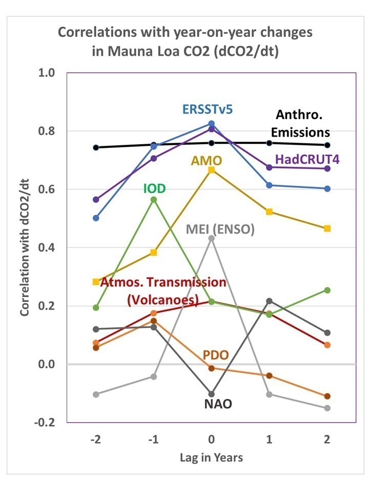
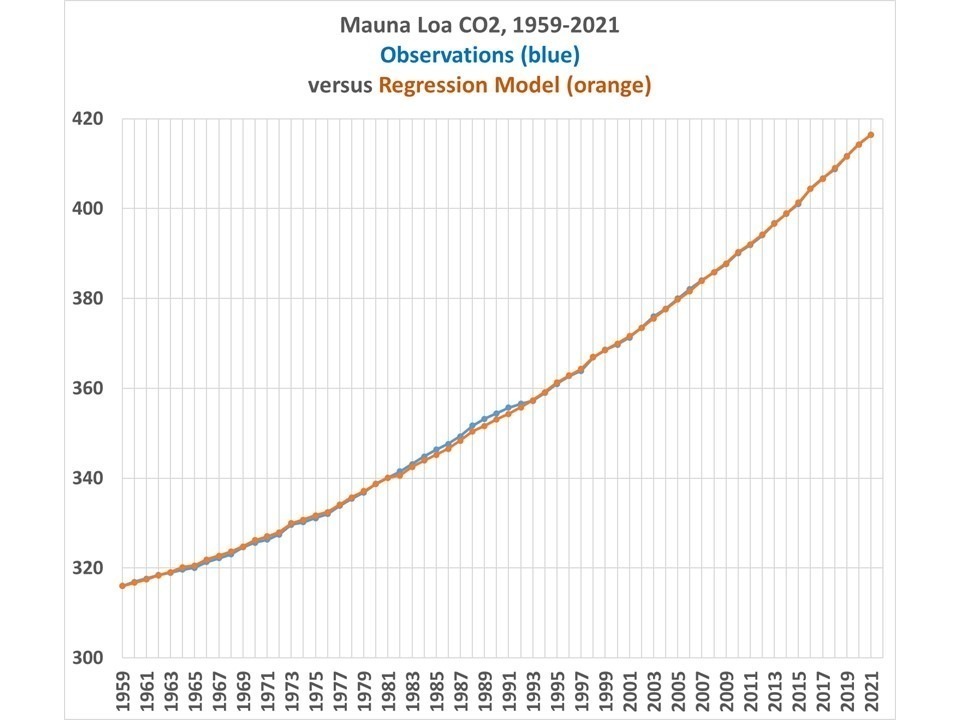
“… the CO2 airborne fraction has decreased by 0.014 ± 0.010 decade−1 since 1959. This suggests that the combined land–ocean sink has been able to grow at least as fast as anthropogenic emissions” [link]

links between coastal marine and terrestrial #heatwaves around Australia. [link]

Transient sea level response to external forcing [link]

Tropical methane emissions explain large fraction of recent global increase [link]

Ancient El Ninos reveals limits to future climate projections [link]

The potential for soil carbon storage in croplands to mitigate global warming is much smaller than previously suggested, [link]

Comparison of Holocene temperature reconstructions based on GISP2 ice cores [link]

Net carbon uptake has kept pace with increasing CO2 emissions [link]

permafrost peatlands in Europe and Western Siberia will soon surpass a climatic tipping point under scenarios of moderate-to-high warming. https://go.nature.com/3JgzAVi

Discrepancies in changes in precipitation characterization over the US [link]

Good article on cloud seeding [link]

Technology and policy

Its time for rooftop solar to compete with other renewables [link]

India kept extreme poverty below 1% despite pandemic [link]

The green U.S. supply chain rules set to unspool and rattle the global economy [link]

Storage requirements in a 100% renewable electricity system: extreme events and interannual variability [link]

America’s approach to energy security is broken [link]

Extracting rare earth elements from waste with a flash of heat [link]

Green energy goes greener with a way to recycle solar panels [link]

Why a waterless cleaning method for solar panels could be a major breakthrough for clean energy: [link]

Research showed that human activities posed the biggest threats to coastlines with seagrasses, savannas, or coral reefs. Coastlines with deserts, forests, and salt marshes fared a little better. [link]

The 1.5 degree goal is all but dead [link]

The farmer’s climate change adaptation challenge in least developed countries https://escholarship.org/content/qt5b55x5w5/qt5b55x5w5_noSplash_d0113e7b3a75cdffebc33d2a603a59df.pdf

Germany’s energy fiasco [link]

How to create the U.S. arsenal of energy: a roadmap for energy security [link]

Debunking energy demand [link]

Surging electric bills threaten California climate goals [link]

Let them eat carbon: Entrenching poverty by limiting fossil fuel investment won’t solve climate change, [link]

Questioning the expanding use of croplands for biofuels [link]

Disruptions to supplies of hydrogen and helium have led to cancellation of routine weather balloon launches [link]

We can’t wait for speculative tech to save us from climate change [link]

How not to interpret the emissions scenarios in the IPCC report [link]

These energy innovations could transform how we mitigate climate change [link]

Drivers of increased crop production [link]

Wind project developer charged in deaths of golden eagles [link]

Carbon Brief summary of AR6 WGIII report [link]

UK doubles down on nuclear power despite fierce opposition [link]

A new method for recycling plastics [link]

Climate as a risk factor for armed conflict [link]

Forests help reduce global warming in more ways than one [link]

“This article explores the various impacts on economic growth in the IPCC scenarios that limit the average global temperature increase in 2100 to 1.5oC. It finds that the impacts are generally small and that in no case is ‘degrowth’ required.” [link]

Life in the world’s hottest city [link]

SwissRe: update on global catastrophe losses (no trend since 1990) [link]

The Left’s climate playbook is already outdated [link]

Oceans + carbon removal: It’s complicated [link]

Replacing conventional irrigation with the efficient irrigation can lead to double benefits: improved water savings and reduced moist heat stress! For details, see our recent paper in Earth’s Future (AGU): https://agupubs.onlinelibrary.wiley.com/doi/abs/10.1029/2021EF002642

The case for cold climate heat pumps [link]

Wind and solar proponent’s arithmetic problem [link]

New type of UV light makes indoor air as safe as outdoors for airborne virus [link]

Climate change is spurring a movement to build storm proof homes [link]

‘Climate smart’ policies could increase southern Africa’s crops by up to 500% [link]

About science and scientists

Free speech: a history from Socrates to social media [link]

New research has revealed fascinating details about the #evolution of humans living in Europe during the #Neolithic Revolution and the notable physiological changes they experienced in a short period of time. https://ancient-origins.net/news-evolution-human-origins/evolution-of-europeans-0016620

Dinosaur wars: the nastiest feud in science [link]

Cocooning philosophers in academia: nostalgia for the ‘bad’ old days [link]

Against scientific gatekeeping [link]

What happens in our brains when we change our minds [link]

What happens when the scientists disagree? Scientific dissent should be engaged with, not suppressed [link[

Fascinating history of climate science in Russia [link]

Myside bias, rational thinking and intelligence [link]

Dissident philosophers [link]

The future is vast: longtermism’s perspective on humanity’s past, present, future [link]

Climate clues from the past prompt a new look at history [link]

The philosopher redefining equality [link]

via Climate Etc.

https://ift.tt/HcrkZua

April 9, 2022 at 12:27PM

Twistin’ with Gallup’s Extreme Weather Poll

Opinion by Kip Hansen – 9 April 2022

I was at a dinner dance recently and the dance floor was mostly empty with two exceptions:  When the music was Latin American (like the bachata) or when, miracle of miracles, Chubby Checker and his band treated us to “Let’s Twist Again” which resulted in a dance floor so crowded we could barely twist in place. 

The Twist?  Yes, still a very popular dance and also a very popular journalistic approach to all sorts of news,  especially with the results of national polls.

The latest example, of which there is never a dearth or drought, is the Gallup Poll about Climate Change and Extreme Weather.  The linked .pdf file only gives the questions and answers for questions 14 through 27 out of a larger poll:  “Turning to something else, 14. I’m going to read you a list of environmental problems…”.

The poll is trumpeted by the NY Times as:

“One-Third of Americans Faced Extreme Weather in Recent Years, Survey Finds — Hurricanes and winter weather, such as snow, ice storms and blizzards, were the most common events cited, according to a Gallup poll.”

Gallup itself says: “Extreme Weather Has Affected One in Three Americans”.  Despite the odd Chubby Checker-esque text at Gallup, at least they properly placed the linked report in their “Politics” section.

What did they find?  In reality,  they found that one-in-three had been affected by weather that they did not like.    I would have thought it would be higher than that as Americans are forever complaining about too much or too little: rain, sunshine, warmth, breeze, snow and other weather phenomena.    Some of that weather might be considered “extreme” only if one means significantly more or less than is normally experienced day-to-day, season-to-season, or year-to-year. 

What kind of “extreme weather”?   Ever since Global Warming has taken hold of the public imagination – 43% of respondents reported that they worry a “Great Deal” about climate change, down from 46% in 2020 – the weather has been getting colder and colder and winter’s snowier and snowier. 

Thus 12% of all Americans and 36% of those affected by extreme weather reported that they had been affected by these two types of extreme weather:  Extreme cold and  Snow/Ice storm/Blizzard

Only 5% of Americans reported being affect by Extreme heat.

Now Hurricanes and Tornadoes are extreme weather phenomena and affected 6% and 4% of Americans respectively.  There were only two hurricanes and only one of those was a major hurricane which made landfall in the Continental U.S., major Hurricane Ida, which caused a lot of damage on the Gulf Coast of Louisiana.  Hurricane Nicholas was a tropical storm until moments before/after landfall and barely made hurricane status.  In addition, 5%  of Americans were affected by the non-weather related (but included in Gallup’s total) Fire or wildfire and Earthquakes.

One further oddity, Gallup “adjusts” for Gender, Race, Age, Education, Party I.D., and Ideology.  Yet the numbers they use for “Totals” on the question on Extreme Weather are the weight-adjusted numbers from the Party I.D.  columns.

Click here to see full sized in new tab/window

The clearest result of the Gallup poll is that the media, including the weather channels both broadcast and streaming, have had great success convincing the population that weather is getting worse and that we are seeing extreme weather more and more, despite factual evidence to the contrary.

# # # # #

Author’s Comment:

Extreme Weather is a marketing meme developed by weather broadcasters to raise interest, viewership and market share. You know who they are.

The IPPCists use Extreme Weather to attempt to frighten the populace into accepting  UN IPCC dictated energy policy and bring about draconian social and political changes.

Weather is weather.  Sometimes its wild – always has been – always will be.

Polls are political – always – always have been – always will be.

Thanks for reading.

# # # # #

via Watts Up With That?

https://ift.tt/rds7hBw

April 9, 2022 at 12:11PM

Experts Adrift: Solar Cycle 25 already twice as active as expected

There’s an electromagnetic ball of fire that is 1.3 million times the size of Earth and just 8 minutes away by photon, and we really have no idea what’s going there.

Most experts thought this solar cycle would be as quiet as the last, but it’s ramping up fast. The sun is working itself up to a peak in a few years time. Experts thought there would be around 30 sunspots at the moment. Instead there are 60. The only thing we know for sure is that the Sun is a mystery and we are in the baby days of the science of Space Weather.

Climate models assume the solar wind and magnetic field has no effect on our climate.  But we find solar patterns everywhere from the prehistoric climate of Greenland, the North Atlantic jet stream, and even in human fertility and lifespan and jellyfish plagues.

Historians will mock us for trying to predict Earths climate without having the foggiest notion of what the sun will do next.

Solar Cycle 24 was fairly quiet as far as solar cycles go, with a peak of 114 sunspots; the average is 179. The Solar Cycle Prediction Panel predicted that the 25th cycle since record-keeping began would be similarly quiet, with a peak of 115 sunspots. By contrast, the number of sunspots for the last 18 months has been consistently higher than predictions. At time of writing, the Sun has 61 sunspots, and we’re still over three years from solar maximum.

Solar Cycle 25, bigger than expected. Graph sunspot activity.

Solar Cycle 25, bigger than expected. Graph sunspot activity.

It’s not the strength of the previous cycle that matters, but the length:

A solar cycle following a longer cycle, they noticed, was likely to be on the weaker side. But a cycle following a shorter cycle was likely to be stronger. Solar Cycle 23 was long, which is consistent with the weakness of Solar Cycle 24. But Solar Cycle 24 was also short, coming in at just under 10 years.

This, McIntosh and his colleagues predicted in 2020, meant that Solar Cycle 25 was likely to be stronger – perhaps among the strongest on record. And the climbing sunspot numbers would suggest they may have been onto something.

“Scientists have struggled to predict both the length and the strength of sunspot cycles because we lack a fundamental understanding of the mechanism that drives the cycle,” McIntosh said at the time.

100 years of solar cycles, showing peaks. (Space Weather Live)

100 years of solar cycles, showing peaks. (Space Weather Live)

Climate modelers think the Sun is just a ball of light, and fill all the gaps in their understanding with “CO2”.

These solar cycles we don’t understand leave a mark on Earth’s atmospheric pressure, the  Central European floodswind and rain in Chile, Australia and Asia and even in the groundwater recharge rate in China. Maybe that matters?

Spaceweatherlive.

10 out of 10 based on 1 rating

via JoNova

https://ift.tt/EKlejVL

April 9, 2022 at 11:41AM

Explaining Mauna Loa CO2 Increases with Anthropogenic and Natural Influences

SUMMARY

The proper way of looking for causal relationships between time series data (e.g. between atmospheric CO2 and temperature) is discussed. While statistical analysis alone is unlikely to provide “proof” of causation, use of the ‘master equation’ is shown to avoid common pitfalls. Correlation analysis of natural and anthropogenic forcings with year-on-year changes in Mauna Loa CO2 suggest a role for increasing global temperature at least partially explaining observed changes in CO2, but purely statistical analysis cannot tie down the magnitude. One statistically-based model using anthropogenic and natural forcings suggests ~15% of the rise in CO2 being due to natural factors, with an excellent match between model and observations for the COVID-19 related downturn in global economic activity in 2020.

Introduction

The record of atmospheric CO2 concentration at Mauna Loa, Hawaii since 1959 is the longest continuous record we have of actual (not inferred) atmospheric CO2 concentrations. I’ve visited the laboratory where the measurements are taken and received a tour of the facility and explanation of their procedures.

The geographic location is quite good for getting a yearly estimate of global CO2 concentrations because it is largely removed from local anthropogenic sources, and at a high enough altitude that substantial mixing during air mass transport has occurred, smoothing out sudden changes due to, say, transport downwind of the large emissions sources in China. The measurements are nearly continuous and procedures have been developed to exclude data which is considered to be influenced by local anthropogenic or volcanic processes.

Most researchers consider the steady rise in Mauna Loa CO2 since 1959 to be entirely due to anthropogenic greenhouse gas emissions, mostly from the burning of fossil fuels. I won’t go into the evidence for an anthropogenic origin here (e.g. the decrease in atmospheric oxygen, and changes in atmospheric carbon isotopes over time). Instead, I will address evidence for some portion of the CO2 increase being natural in origin. I will be using empirical data analysis for this. The results will not be definitive; I’m mostly trying to show how difficult it is to determine cause-and-effect from the available statistical data analysis alone.

Inferring Causation from the “Master Equation”

Many processes in physics can be addressed with some form of the “master equation“, which is a simple differential equation with the time derivative of one (dependent) variable being related to some combination of other (independent) variables that are believed to cause changes in the dependent variable. This equation form is widely used to describe the time rate of change of many physical processes, such as is done in weather forecast models and climate models.

In the case of the Mauna Loa CO2 data, Fig. 1 shows the difference between the raw data (Fig. 1a) and the more physically-relevant year-to-year changes in CO2 (Fig. 1b).

Fig. 1. Mauna Loa CO2 data, 1959-2021, show as (a) yearly average values, and (b) year-on year changes in those values (dCO2/dt).

If one believes that year-to-year changes in atmospheric CO2 are only due to anthropogenic inputs, then we can write:

dCO2/dt ~ Anthro(t),

which simply means that the year-to-year changes in CO2 (dCO2/dt, Fig. 1b) are a function of (due to) yearly anthropogenic emissions over time (Anthro(t)). In this case, year-on-year changes in Mauna Loa CO2 should be highly correlated with yearly estimates of anthropogenic emissions. The actual relationship, however, is clearly not that simple, as seen in Fig. 2, where the anthropogenic emissions curve is much smoother than the Mauna Loa data. 

Fig. 2. Mauna Loa year-on-year observed changes in CO2 versus estimate of global anthropogenic emissions.

Therefore, there are clearly natural processes at work in addition to the anthropogenic source. Also note those natural fluctuations are much bigger than the ~6% reduction in emissions between 2019 and 2020 due to the COVID-19 economic slowdown, a point that was emphasized in a recent study that claimed satellite CO2 observations combined with a global model of CO2 transports was able to identify the small reduction in CO2 emissions.

So, if you think there are also natural causes of year-to-year changes in CO2, you could write,

dCO2/dt ~ Anthro(t) + Natural(t),

which would approximate what carbon cycle modelers use, since it is known that El Nino and La Nina (as well as other natural modes of climate variability) also impact yearly changes in CO2 concentrations.

Or, if you think year-on-year changes are due to only sea surface temperature, you can write,

dCO2/dt ~ SST(i),

and you can then correlate year-on-year changes in CO2 to a dataset of yearly average SST.

Or, if you think causation is in the opposite direction, with changes in CO2 causing year-on-year changes in SST, you can write,

dSST/dt ~ CO2(t),

in which case you can correlate the year-on-year changes in SST with CO2 concentrations.

In addition to the master equation having a basis in physical processes, it avoids the problem of linear trends in two datasets being mistakenly attributed to a cause-and-effect relationship. Any time series of data that has just a linear trend is perfectly correlated with every other time series having just a linear trend, and yet that perfect correlation tells us nothing about causation.

But when we use the time derivative of the data, it is only the fluctuations from a linear trend that are correlated with another variable, giving some hope of inferring causation. If you question that statement, imagine that Mauna Loa CO2 has been rising at exactly 2 ppm per year, every year (instead of the variations seen in Fig. 1b). This would produce a linear trend, with no deviations from that trend. But in that case the year-on-year changes are all 2 ppm/year, and since there is no variation in those data, they cannot be correlated with anything, because there is no variance to be explained. Thus, using the master equation we avoid inferring cause-and-effect from linear trends in datasets.

Now, this data manipulation doesn’t guarantee we can infer causation, because with a limited set of data (63 years in the case of Mauna Loa CO2 data), you can expect to get some non-zero correlation even when no causal relationship exists. Using the ‘master equation’ just puts us a step closer to inferring causation.

Correlation of dCO2/dt with Various Potential Forcings

Lag correlations of the dCO2/dt data in Fig. 1b with estimates of global anthropogenic CO2 emissions, and with a variety of natural climate indicies, are shown in Fig. 3.

Fig. 3. Lag correlations of Mauna Loa dCO2/dt with various other datasets: Global anthropogenic emissions, tropical sea surface temperature (ERSST), global average surface temperature (HadCRUT4), the Atlantic Multi-decadal Oscillation (AMO), the Indian Ocean Dipole (IOD), the Multivariate ENSO Index (MEI), Mauna Loa atmospheric transmission (mostly major volcanoes),the Pacific Decadal Oscillation (PDO), and the North Atlantic Oscillation (NAO).

The first thing we notice is that the highest correlation is achieved with the surface temperature datasets, (tropical SST or global land+ocean HadCRUT4). This suggests at least some role for increasing surface temperatures causing increasing CO2, especially since if I turn the causation around (correlate dSST/dt with CO2), I get a very low correlation, 0.05.

Next we see that the yearly estimates of global anthropogenic CO2 emissions is also highly correlated with dCO2/dt. You might wonder, if the IPCC is correct and all of the CO2 increase has been due to anthropogenic emissions, why doesn’t it have the highest correlation? The answer could be as simple as noise in the data, especially considering the emissions estimates from China (the largest emitter) are quite uncertain.

The role of major volcanic eruptions in the Mauna Loa CO2 record is of considerable interest. When the atmospheric transmission of sunlight is reduced from a major volcanic eruption (El Chichon in 1983, and especially Pinatubo in 1991), the effect on atmospheric CO2 is to reduce the rate of rise. This is believed to be the result of scattered, diffuse sky radiation penetrating deeper into vegetation canopies and causing enhanced photosynthesis and thus a reduction in atmospheric CO2.

Regression Models of Mauna Loa CO2

At this point we can choose whatever forcing terms in Fig. 3 we want, and do a linear regression against dCO2/dt to get a statistical model of the Mauna Loa CO2 record. 

For example, if I use only the anthropogenic term, the regression model is:

dCO2/dt = 0.491*Anthro(t) + 0.181,

with 57.8% explained variance.

Let’s look at what those regression terms mean. On average, the yearly increase in Mauna Loa CO2 equals 49.1% of total global emissions (in ppm/yr) plus a regression constant of 0.181 ppm/yr. If the model was perfect (only global anthropogenic emissions cause the CO2 rise, and we know those yearly emissions exactly, and Mauna Loa CO2 is a perfect estimate of global CO2), the regression constant of 0.181 would be 0.00. Instead, the anthro emissions estimates do not perfectly capture the rise in atmospheric CO2, and so a 0.181 ppm/yr “fudge factor” is in effect included each year by the regression to account for the imperfections in the model. It isn’t known how much of the model ‘imperfection’ is due to missing source terms (e.g. El Nino and La Nina or SST) versus noise in the data.

By using additional terms in the regression, we can get a better fit to the Mauna Loa data. For example, I chose a regression model that includes four terms, instead of one: Anthro, MEI, IOD, and Mauna Loa atmospheric transmission. In that case I can improve the regression model explained variance from 57.8% to 82.3%. The result is shown in Fig. 4.

Fig. 4. Yearly Mauna Loa CO2 observations versus a 4-term regression model based upon anthropogenic and natural forcing terms.

In this case, the only substantial deviations of the model from observations is due to the El Chichon and Pinatubo volcanoes, since the Pinatubo event caused a much larger reduction in atmospheric CO2 than did El Chichon, despite the volcanoes producing very similar reductions in solar transmission measurements at Mauna Loa.

In this case, the role of anthropogenic emissions is reduced by 15% from the anthro-only regression model. This suggests (but does not prove) a limited role for natural factors contributing to increasing CO2 concentrations.

The model match to observations during the COVID-19 year of 2020 is very close, with only a 0.02 ppm difference between model and observations, compared to the 0.24 ppm estimated reduction in total anthropogenic emissions from 2019 to 2020.

Conclusions

The Mauna Loa CO2 data need to be converted to year-to-year changes before being empirically compared to other variables to ferret out possible causal mechanisms. This in effect uses the ‘master equation’ (a time differential equation) which is the basis of many physically-based treatments of physical systems. It, in effect, removes the linear trend in the dependent variable from the correlation analysis, and trends by themselves have no utility in determining cause-versus-effect from purely statistical analyses.

When the CO2 data are analyzed in this way, the greatest correlations are found with global (or tropical) surface temperature changes and estimated yearly anthropogenic emissions. Curiously, reversing the direction of causation between surface temperature and CO2 (yearly changes in SST [dSST/dt] being caused by increasing CO2) yields a very low correlation.

Using a regression model that has one anthropogenic source term and three natural forcing terms, a high level of agreement between model and observations is found, including during the COVID-19 year of 2020 when global CO2 emissions were reduced by about 6%.


via Roy Spencer, PhD.

https://ift.tt/IXp6vzS

April 9, 2022 at 10:45AM